Bootstrap 4 brings many changes and new features to the grid system we are all so familiar with from version 3. The new grid is now powered by flexbox, lots of utility classes have been renamed, and a new XL breakpoint has been added.
When we first wrote this article, Bootstrap 4 was supposed to have two separate grids. Shortly after we published it, a new Alpha was released, making flexbox the only layout mode of the framework as well as introducing some new features. We have updated the article to reflect those changes.
1. Basic Grid
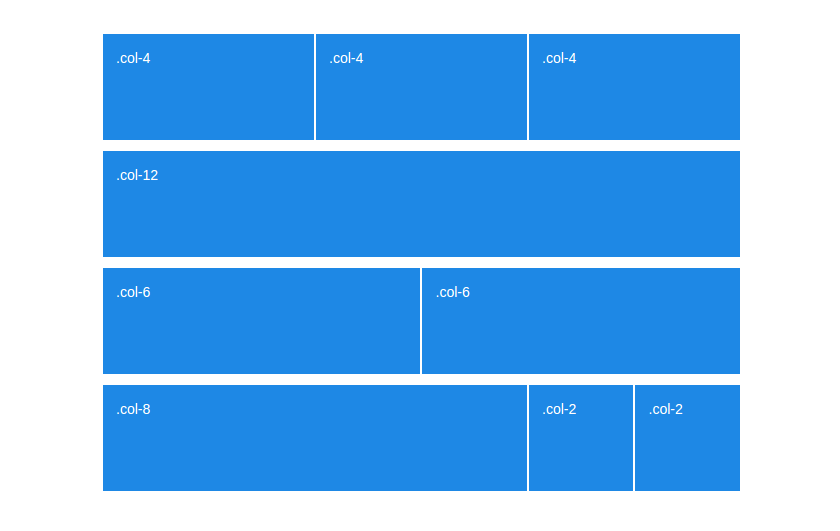
By now everyone knows how the Bootstrap grid works. We've got rows separated into 12 equal pieces, and columns that go inside the rows. Each column can take anywhere from 1 to 12 spaces:
<div class="row">
   <div class="col-xs-2">.col-xs-2</div>
   <div class="col-xs-4">.col-xs-4</div>
   <div class="col-xs-6">.col-xs-6</div>
</div>
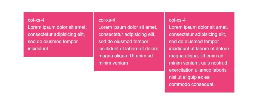
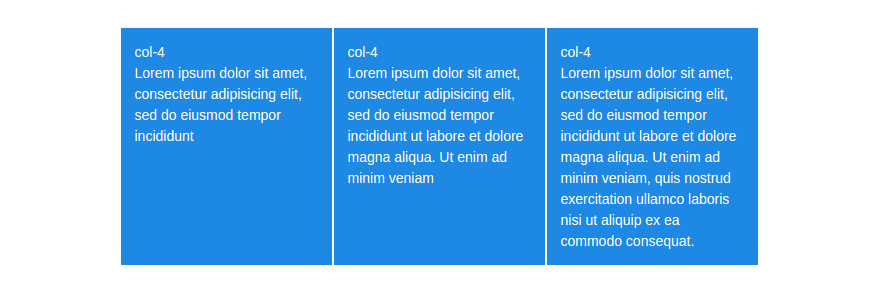
Structurally nothing has changed, the grid still has rows and 12 columns. However, there are changes in the width of containers, as well as other small stuff like the lowest breakpoint tier being renamed from .col-xs- to simply .col-
<div class="row">
   <div class="col-2">.col-2</div>
   <div class="col-4">.col-4</div>
   <div class="col-6">.col-6</div>
</div>
To help you better visualize the changes, we've prepared side-by-side demos of both new flex and old non-flex grids. You can check them out below:
2. Automatic Layout
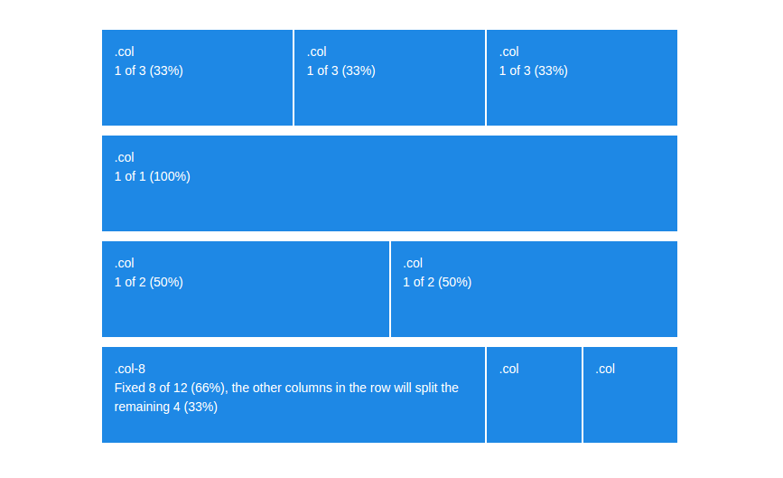
A cool new feature of the Bootstrap 4 grid is the auto-layout mode. It lets developers leave out the size of columns, making them automatically distribute the space in that row.
<div class="row">
    <div class="col">.col</div>
    <div class="col">.col</div>
    <div class="col">.col</div>
</div>
Sizeless columns share the available space equally, always filling up the entire row. If we want a column to be bigger or smaller, we can still do that with a .col-size class.
3. Column Wrapping
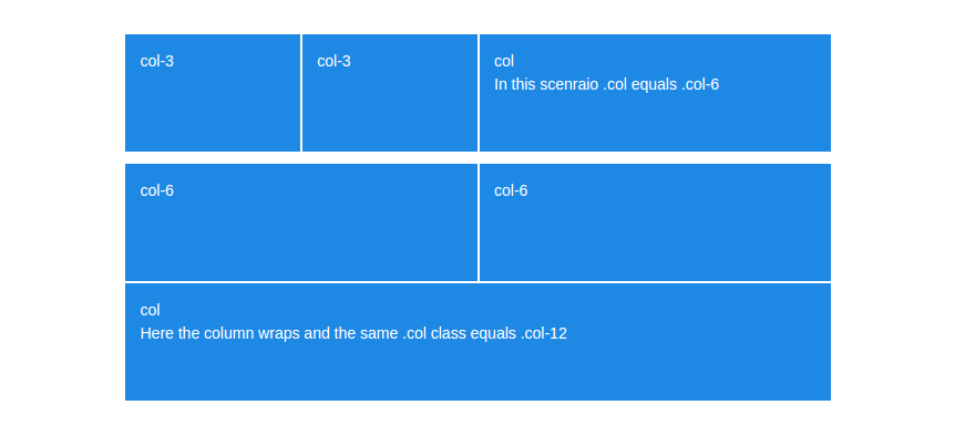
When the sum of all columns in a row is over 12, the first extra column will move to the next line. This is known as column wrapping and works the same way it did in non-flexbox bootstrap.
<div class="row">
   <div class="col-6">.col-6</div>
   <div class="col-6">.col-6</div>
   <div class="col-3">.col-3, This column will move to the next line.</div>
</div>
The only thing to note here is that when using the auto layout, a sizeless column that took up only a couple of spaces, can take up the entire row once it wraps.
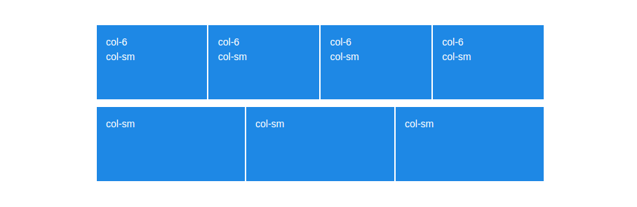
4. Responsive Grid
As we mentioned in the intro, Bootstrap 4 has a new XL grid tier on top of the old ones. Now the grid media queries look like this:
- Extra small (xs) - below 576px
- Small (sm) - between 576px and 768px
- Medium (md) - between 768px and 992px
- Large (lg) - between 992px and 1200px
- Extra Large (xl) - over 1200px
Other than that, there haven't been any changes to the way responsiveness works.
5. Column Height
The old grid system was built on floated elements and because of that every column has a different height, depending on the content it holds.
In flexbox layouts all cells in a row are aligned to be as tall as the column with most content.
6. Horizontal Alignment
In old Bootstrap, positioning columns horizontally is done via an offset system. Offsets work like empty columns and allow us to move elements to the right (e.g an .col-xs-offset-3 moves the column 3 spaces to the right). This can be a little annoying as we need to manually adjust the amount of spaces needed.
<div class="row">
    <div class="col-xs-6 col-xs-offset-3">This column is now centered.</div>
</div>
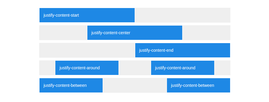
Thanks to the justify-content property, horizontal positioning in flex-strap is as easy as adding the correct class.
<div class="row justify-content-center">
    <div class="col-6">All columns in that row will be automatically centered.</div>
</div>
Also, if you want to use offsets, you can still do that as well! Just keep in mind that the classes are now shortened to .offset-xs-*.
7. Vertical Alignment
There are no options for vertical alignment in the Bootstrap 3 grid. The only way to do any sort of vertical positioning is using custom CSS and it is often messy.
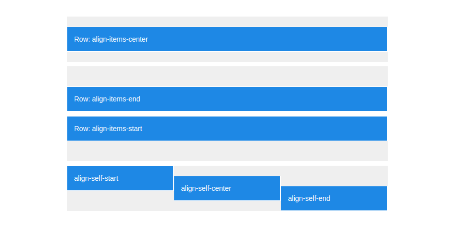
Flexbox, on the other hand, is great at layout alignment and gives us not one, but two ways to vertically position columns:
Vertically align the whole row:
<div class="row align-items-center">
    <div class="col">Middle</div>
</div>
<div class="row align-items-end">
    <div class="col">Bottom</div>
</div>
<div class="row align-items-start">
    <div class="col">Top</div>
</div>
Align individual columns within the row:
<div class="row">
    <div class="col align-self-start">Top</div>
    <div class="col align-self-center">Middle</div>
    <div class="col align-self-end">Bottom</div>
</div>
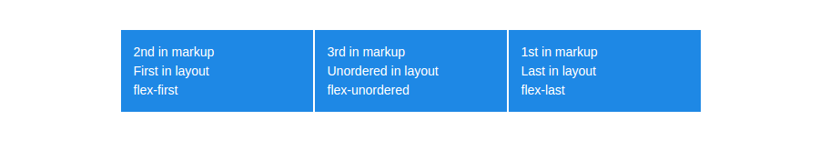
8. Reordering Columns
With the old grid system, if we wanted to swap around the order of columns we needed to use push and pullwhile manually adjusting the correct amount of places to move left and right.
<div class="row">
    <div class="col-xs-4 col-xs-push-8"> This column will move 8 spaces to the right. </div>
    <div class="col-xs-8 col-xs-pull-4"> This column will move 4 spaces to the left.</div>
</div>
Anyone who has used flexbox before knows that it has a built-in order property. The way Bootstrap devs have implemented it is via three ordering classes:
- .flex-first - Displayed first.
- .flex-last - Displayed last.
- .flex-unordered - Displayed between first and last.
No manual calculations are required. If you need to order more than 3 columns (which rarely happens) you can use push&pull or the order property via CSS.
Conclusion
Looking back at the points covered in the article, its pretty clear that going full flexbox brings a lot of great features and makes the grid system much more advanced and versatile. The only real drawback is the lack of support for IE9 and older browsers (all modern clients have full flexbox compatibility), if you don't have to support those you're good to go.
This wraps up our introduction to the new Bootstrap 4 grid system. Feel free to bookmark the demo page for quick future reference. We hope we've been helpful! Happy coding :)
by :Danny Markov
#bootstrap