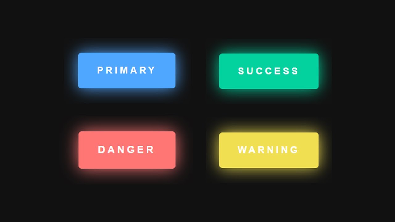
In this video, you are going to learn how to design colorful hover buttons for semantic purposes (primary, success, danger, warning) using CSS box-shadow. You can easily use these buttons on your website depending on the purposes of the buttons. Let’s see how to design these colorful hover buttons.
Subscribe: https://www.youtube.com/channel/UCNDmzGYwwT3rdY3xQuW8QOA
Source code
index.html
<!DOCTYPE html>
<html lang="en" dir="ltr">
  <head>
    <meta charset="utf-8">
    <title>Colourful Hover Buttons For Semantic Purposes</title>
    <link rel="stylesheet" href="style.css">
  </head>
  <body>

    <!--button area start-->
    <button class="btn btn-primary">Primary</button>
    <button class="btn btn-success">Success</button>
    <button class="btn btn-danger">Danger</button>
    <button class="btn btn-warning">Warning</button>
    <!--button area end-->

  </body>
</html>
style.css
body{
  margin: 0;
  padding: 0;
  height: 100vh;
  display: flex;
  justify-content: center;
  align-items: center;
  font-family: "Segoe UI", sans-serif;
  background: #111;
}

.btn{
  color: #fff;
  border: none;
  margin: 20px;
  padding: 20px 30px;
  font-size: 15px;
  font-weight: 600;
  text-transform: uppercase;
  letter-spacing: 4px;
  cursor: pointer;
  border-radius: 5px;
  transition: 0.5s;
  transition-property: box-shadow;
}

.btn-primary{
  background: #50A7FF;
  box-shadow: 0 0 25px #50A7FF;
}

.btn-primary:hover{
  box-shadow: 0 0 5px #50A7FF,
              0 0 25px #50A7FF,
              0 0 50px #50A7FF,
              0 0 100px #50A7FF;
}

.btn-success{
  background: #03D29F;
  box-shadow: 0 0 25px #03D29F;
}

.btn-success:hover{
  box-shadow: 0 0 5px #03D29F,
              0 0 25px #03D29F,
              0 0 50px #03D29F,
              0 0 100px #03D29F;
}

.btn-danger{
  background: #FF7675;
  box-shadow: 0 0 25px #FF7675;
}

.btn-danger:hover{
  box-shadow: 0 0 5px #FF7675,
              0 0 25px #FF7675,
              0 0 50px #FF7675,
              0 0 100px #FF7675;
}

.btn-warning{
  background: #F0DF51;
  box-shadow: 0 0 25px #F0DF51;
}

.btn-warning:hover{
  box-shadow: 0 0 5px #F0DF51,
              0 0 25px #F0DF51,
              0 0 50px #F0DF51,
              0 0 100px #F0DF51;
}
#html #css
4.60 GEEK