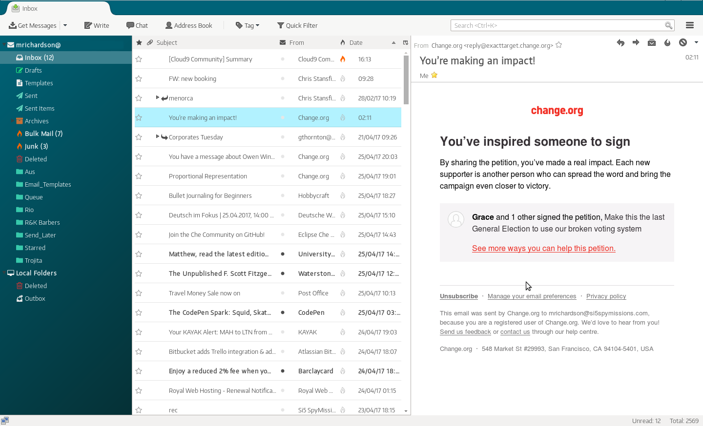
Our latest post on the Thunderbird redesign drew a lot of buzz from industry press. Some people loved the new, modern look, others preferred Thunderbird’s current default version. As a result, the mockups stirred some lively conversation on social media sites like Reddit and few other places on the Web, including OMGUbuntu, Antyweb or the Thunderbird Twitter.
According to Joey Sneddon, a reporter at OMGUbuntu: “The end result is pretty stunning,” and it seemed that he’s not alone in that opinion. The feedback on our redesign efforts was most kind and we really appreciate the support we received from the community.
Some comments pointed out that our version of Thunderbird still has issues—I actually couldn’t agree more. Working on the mockups was mostly a way for me to scratch itches that have been bugging me for some time. As they have now become a working theme, those suggestions from the comments will be particularly valuable and will help make some upgrades to the first version.
What Happened Next?
I didn’t expect the mockups to go viral like that. Watching the number of views on Dribbble skyrocket felt fantastic, as did observing the spread of discussions of the theme over the Web. Such a reaction gives us a good reason to think that a big part of the Thunderbird user base believes the current look and feel are due for a refresh. On the other hand, the discussions also revealed that many Thunderbird users love the current experience—and we respect and value their opinion as well. We learned that it is important to keep a proper balance between these two types of users.
Then, a question emerged—”What can we do next?”
We got in touch with Richard Marti and Ben Bucksh from the Thunderbird core team to discuss possibilities. We wanted to establish how to enhance user retention and make Thunderbird more user-friendly for potential and current users. We also learned how Thunderbird is built which helped with planning iterations.
It also became clear Thunderbird’s key problem is being perceived as either dead or stagnant, a label which the team behind it couldn’t affort to let stick to their product.
On April, my redesign version was brought to life. The first version of the theme was created by spymastermatt, who did a great job and managed to recreate our redesign really closely. This version is not the official one, but more of a fan effort that has since become quite popular on the Web. As of today, the “Monterail” theme has over 670 stars on GitHub. Installing it is fairly simple, although not a one-click affair. If you’d feel safer doing it using a guide, here’s a short one.
Shortly thereafter, Richard Marti created an official add-on available for all platforms, using original icons and colors from the design. That was an incredible but welcome surprise, we see it as a great milestone for the redesign.

The discussion did not end there. For the past couple of months we’ve been exchanging emails with the core team and working on upgrades to the existing official theme. Drawing on incoming feedback and bugs reported by users, we’ve been working together with the Thunderbird team on refining our designs.
Finally, we started to think about how we can upgrade current look and feel of the product. Maybe using the “Monterail” theme or its next version?
#thunderbird #product design #user experience
