How to use Calendar in Angular 9
Hello programming buddies! In this Angular 9 Calendar tutorial, we are going to learn how to implement and use various calendar modules using Bootstrap and ngx-bootstrap datepicker plugin.
We are going to use datepicker to implement Calendar.
Date pickers is a generic, predictable, consistent and often viewed as a reliable UI component for date selection. We are going to integrate date-picker with the ngx-bootstrap plugin.
A user can select and navigation between various dates using calendar UI templates, set ranges for scheduling multiple appointments and meetings.
Datepicker is a highly configurable component that adds calendar view functionality to your web and mobile templates. You can customize the date format and language, restrict the selectable date ranges.
In this tutorial, we will walk through the following steps to describe how to use Calendar in Angular component with convenient features mentioned below:
Table of Contents
- Angular 9 Calendar Integration Example
- Setting up Angular Project
- Configure Calendar Module in Angular 9
- Import Date Picker in AppModule
- Use Basic Calendar in Angular
- Adding Animation in Calendar
- Angular 9/8 Date Range Picker in Calendar
- Hide Calendar Datepicker UI on Scroll
- Set Min & Max Date in Datepicker
- DatePicker with Angular Reactive Form
- Conclusion
Angular 9 Calendar Integration Example
Following is the comprehensive step by step guide on integrating the calendar in Angular application.
Setting up Angular Project
Run the following command to create a new angular application.
ng new angular-calendar-app
Get inside the project folder:
cd angular-calendar-app
Once the angular app is downloaded from npm, then go through the given below steps.
Configure Calendar Module in Angular 9
In order to work with dates in Angular, we need to install the two packages via node package manager (npm).
First, run the command to install Bootstrap 4:
npm install bootstrap --save
Next, we are going to install ngx-bootstrap package in our Angular app and it works only with Bootstrap.
npm install ngx-bootstrap --save
Then, Add the Bootstrap, NGX Datepicker CSS path in angular.json file to enable the styling of Bootstrap and Calendar UI components.
"styles": [
     "node_modules/bootstrap/dist/css/bootstrap.min.css",
     "node_modules/ngx-bootstrap/datepicker/bs-datepicker.css",
     "src/styles.css"
]
Start the app in the browser using the given below command:
ng serve --open
Import Date Picker in AppModule
To get started with the calendar, we need to import the date picker in Angular’s main module file.
Open app.module.ts file and add the following code.
import { BrowserModule } from '@angular/platform-browser';
import { NgModule } from '@angular/core';

import { AppComponent } from './app.component';

// Datepicker module
import { BrowserAnimationsModule } from '@angular/platform-browser/animations';
import { BsDatepickerModule } from 'ngx-bootstrap/datepicker';

@NgModule({
  declarations: [
    AppComponent
  ],
  imports: [
    BrowserModule,
    BrowserAnimationsModule,
    BsDatepickerModule.forRoot()
  ],
  providers: [],
  bootstrap: [AppComponent]
})

export class AppModule { }
Use Basic Calendar in Angular
In this step, we will learn how to create a simple calendar, Add the following code in your Angular template.
<div class="container">
  <div class="row">
    <div class="col-xs-12 col-12 col-md-4 form-group">
      <input type="text"
            placeholder="Datepicker"
            class="form-control"
            bsDatepicker>
    </div>
    <div class="col-xs-12 col-12 col-md-4 form-group">
      <input type="text"
            placeholder="Daterangepicker"
            class="form-control"
            bsDaterangepicker>
    </div>
  </div>
</div>
To display the calendar module on the screen, a user needs to click on the HTML input field, and then a user can select a date fro the Calendar view.

Adding Animation in Calendar
Adding animation in Angular Calendar is comfortable with ngx-bootstrap. Add the following HTML code in your angular template.
<div class="container">
  <div class="row">
    <div class="col-xs-12 col-12 col-md-4 form-group">
      <input
      type="text"
      placeholder="Datepicker"
      class="form-control"
      bsDatepicker
      [bsConfig]="{ isAnimated: true }">
    </div>
  </div>
</div>
For enabling the animation in Calendar, we bind bsConfig tag, set isAnimated value to true in HTML input field.
Angular 9/8 Date Range Picker in Calendar
Integrating Date Range Picker in Calendar is turned on by just adding the bsDaterangepicker directive in datepicker HTML input field.
<div class="container">
  <div class="row">
    <div class="col-xs-12 col-12 col-md-4 form-group">
      <input
      type="text"
      placeholder="Datepicker"
      class="form-control"
      bsDatepicker
      bsDaterangepicker
      [bsConfig]="{ isAnimated: true }">
    </div>
  </div>
</div>
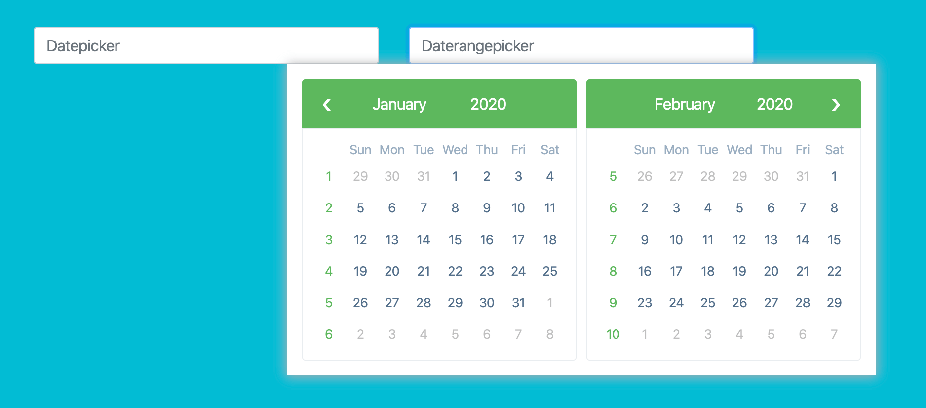
You can see the Calendar template will popup with two calendar view, in here you can set the dates between two ranges.
Hide Calendar Datepicker UI on Scroll
In this step, i am going to tell you how can you easily hide the Datepicker Calendar UI on user scrolling, usually calendar pop up box stays visible when the user scrolls.
The datepicker UI seems a bit awkward, let’s add the following code in your template, and it surely fixes the hide on scroll issue.
<div class="container">
  <div class="row">
    <div class="col-xs-12 col-12 col-md-4 form-group">
      <input
      placeholder="Datepicker"
      class="form-control"
      bsDatepicker>
    </div>
  </div>
</div>
Code goes to angular.component.ts file:
import { Component, HostListener, ViewChild } from '@angular/core';
import { BsDatepickerDirective } from 'ngx-bootstrap/datepicker';
import { componentFactoryName } from '@angular/compiler';

@Component({
  selector: 'app-root',
  templateUrl: './app.component.html',
  styleUrls: ['./app.component.css']
})

export class AppComponent {
  @ViewChild(BsDatepickerDirective, { static: false }) datepicker: BsDatepickerDirective;

  @HostListener('window:scroll')
  onScrollEvent() {
    this.datepicker.hide();
  }
}
Import HostListener, ViewChild and BsDatepickerDirective API at the top of your angular component.
The @ViewChild() directive access the datepicker properties, bind the scroll event with HostListener scroll event to call the this.datepicker.hide() method to hide the calendar on the scroll.
Set Min & Max Date in Datepicker
Now, we are going to learn the easy way to set up the min and max date range in Angular DatePicker calendar.
The input field requires to add minDate and maxDate properties. Check out the given below example where we are using minDate for declaring previous dates and maxDate for current and future days for the upcoming 10 days.
<div class="container">
  <div class="row">
    <div class="col-xs-12 col-12 col-md-4 form-group">
      <input
      placeholder="Datepicker"
      class="form-control"
      bsDatepicker
      [minDate]="minDate"
      [maxDate]="maxDate">
    </div>
    <div class="col-xs-12 col-12 col-md-4 form-group">
      <input
      placeholder="Datepicker"
      class="form-control"
      bsDaterangepicker
      [minDate]="minDate"
      [maxDate]="maxDate">
    </div>
  </div>
</div>
Add the following code in Angular TypeScript template.
import { Component } from '@angular/core';

@Component({
  selector: 'app-root',
  templateUrl: './app.component.html',
  styleUrls: ['./app.component.css']
})

export class AppComponent {
  minDate: Date;
  maxDate: Date;

  constructor() {
    this.minDate = new Date();
    this.maxDate = new Date();
    this.minDate.setDate(this.minDate.getDate() - 4);
    this.maxDate.setDate(this.maxDate.getDate() + 10);
  }
}
DatePicker with Angular Reactive Form
As we know, DatePicker is a form component, and it always a good practice to set the valid data in the form object.
Reactive forms provide a model-driven approach to handling form inputs whose values change over time. This guide shows you how to create and update a simple form control, progress to using multiple controls in a group, validate form values, and implement more advanced forms.
Reactive forms use an explicit and immutable approach to managing the state of a form at a given point in time. Each change to the form state returns a new state, which maintains the integrity of the model between changes.
To get more details about Reactive Forms, do check out: https://angular.io/guide/reactive-forms.
In this example, we will learn how to set up DatePicker with Angular Reactive Forms.
To get started with we need to import ReactiveFormsModule in the main app.module.ts file. Also import FormGroup, FormControl in app component file.
import { Component, OnInit } from '@angular/core';
import { FormBuilder, FormGroup } from '@angular/forms';

@Component({
  selector: 'app-root',
  templateUrl: './app.component.html',
  styleUrls: ['./app.component.css']
})

export class AppComponent implements OnInit {
  myForm: FormGroup;
  constructor(private fb: FormBuilder) {}

  ngOnInit() {
    this.myForm = this.fb.group({
      date: null,
      range: null
    });
  }
}
The FormGroup define using formGroupName for the form; the FormControl represents the individual form value and also responsible for holding the validation state.
Declare the formControlName in DatePicker component to communicate with the Reactive Forms.
<div class="container">
  <form [formGroup]="myForm">
    <div class="row">
      <div class="col-xs-12 col-12 col-sm-6 col-md-4 form-group">
        <input type="text" class="form-control mb-3" placeholder="Datepicker" bsDatepicker formControlName="date" />
        <pre *ngIf="myForm.value.date" class="code-preview">{{myForm.value.date | date}}</pre>
      </div>
      <div class="col-xs-12 col-12 col-sm-6 col-md-4 form-group">
        <input type="text" class="form-control mb-3" placeholder="Daterangepicker" bsDaterangepicker
          formControlName="range" />
        <pre *ngIf="myForm.value.range"
          class="code-preview">from {{myForm.value.range[0] | date}} to {{myForm.value.range[1] | date}}</pre>
      </div>
    </div>
  </form>
</div>
Conclusion
Finally, we have completed Angular 9 Calendar tutorial, In this tutorial we learned how to add ngx-bootstrap and datepicker plugin and how to use multiple Calendar modules in an Angular app. We also learned to add a simple and advance calendar in the Angular application.
Happy Coding!
#angular #web-development