Widgets on iOS can support 3 different sizes: small, medium, and large. In part 1 of this tutorial, we only added support for small widgets. Now we will add a medium widget and a large widget as well.
Note:_ You’ll need Xcode 12 Beta 2 or higher to follow this tutorial._
Supporting Different Widget Sizes
Open up the Emojibook project on Xcode and navigate to the Emojibook_Widget.swift file. To support different widget sizes, all we have to do is modify the arguments in the supportedFamilies modifier of the Emojibook_Widget struct. So go ahead and add .systemMedium and .systemLarge to the list of supported families.
// ...

	@main
	struct Emojibook_Widget: Widget {
	  private let kind: String = "Emojibook_Widget"

	  public var body: some WidgetConfiguration {
	    StaticConfiguration(
	      kind: kind,
	      provider: Provider(),
	      placeholder: PlaceholderView()
	    ) { entry in
	      Emojibook_WidgetEntryView(entry: entry)
	    }
	    .configurationDisplayName("Random Emoji")
	    .description("Display a widget with an emoji that is updated randomly.")
	    .supportedFamilies([.systemSmall, .systemMedium, .systemLarge])
	  }
	}
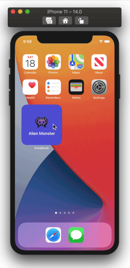
Now, run your app making sure the Emojibook WidgetExtension is the active scheme, and go into jiggle mode. Press the “+” button on the top left corner and select the Emojibook app. The Emojibook widget gallery will appear, you will now see the 3 different widget sizes you can add to your homescreen.
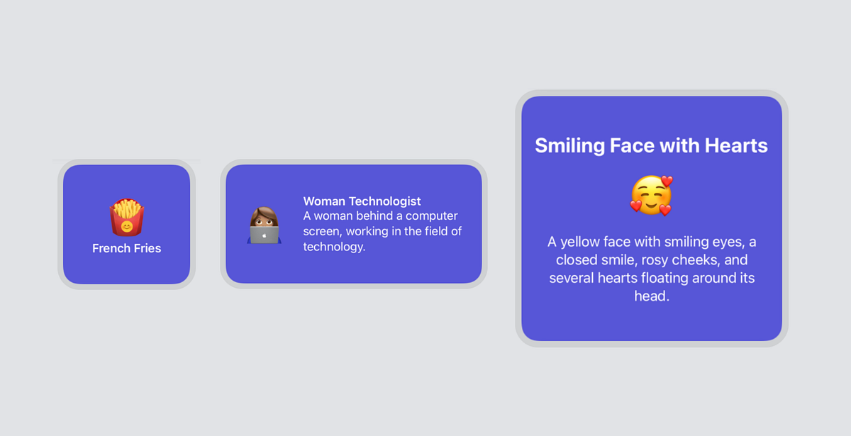
While these new widgets work, a lot of space is going unused, so we’re going to modify the views displayed for medium and large widgets. These widgets will show an emoji along with its name, and we’re also adding the emoji’s description. Navigate to EmojiWidgetView.swift and add a new Viewstruct called MediumEmojiWidgetView. Its content will be similar to the small widget, but we’re adding a Text element with the emoji’s description, like so:
// ...

	struct MediumEmojiWidgetView: View {

	  let emojiDetails: EmojiDetails

	  var body: some View {
	    ZStack {
	      Color(UIColor.systemIndigo)
	      HStack {
	        Text(emojiDetails.emoji)
	          .font(.system(size: 56))
	          .padding()
	        VStack(alignment: .leading) {
	          Text(emojiDetails.name)
	            .font(.headline)
	          Text(emojiDetails.description)
	        }
	        .foregroundColor(.white)
	        .padding([.top, .bottom, .trailing])
	      }
	    }
	  }
	}
Now add another View struct called LargeEmojiWidgetView. Its content will be the same as that of the MediumEmojiWidgetView, but it will be arranged a little differently:
// ...

	struct MediumEmojiWidgetView: View {
	  // ...
	}

	struct LargeEmojiWidgetView: View {

	  let emojiDetails: EmojiDetails

	  var body: some View {
	    ZStack {
	      Color(UIColor.systemIndigo)
	      VStack {
	        Text(emojiDetails.name)
	          .bold()
	          .font(.title)
	        Text(emojiDetails.emoji)
	          .font(.system(size: 60))
	          .padding()
	        Text(emojiDetails.description)
	          .font(.title3)
	      }
	      .foregroundColor(.white)
	      .multilineTextAlignment(.center)
	      .padding()
	    }
	  }
	}
#ios #swift #programming #software-development #xcode