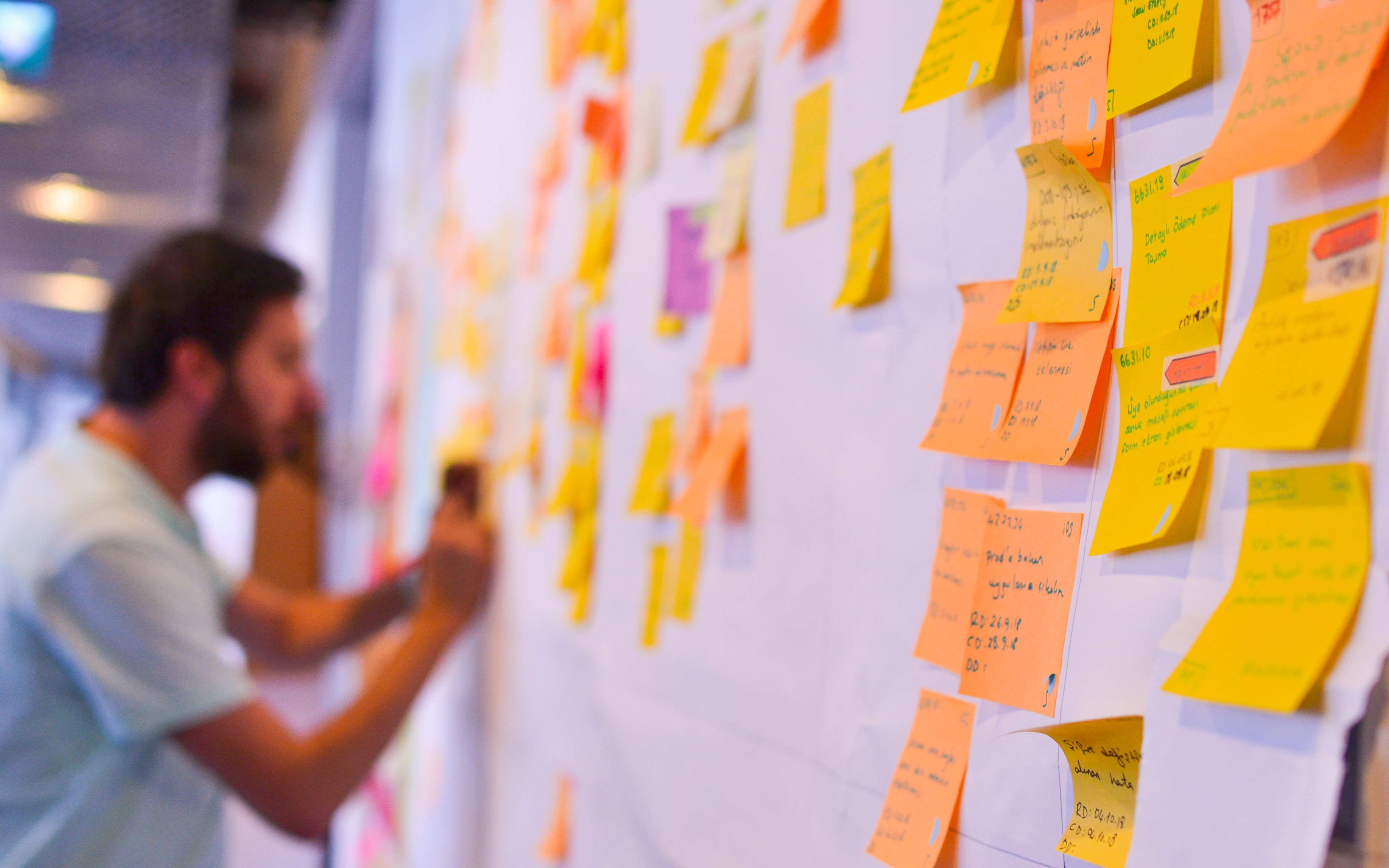
As a younger design engineer, I once heard, “if you can’t picture it, you don’t understand it”, which forever changed my approach to software development. It’s somewhat of a double-edged sword, however, as it’s crucial to encapsulate not only the vision or process within an application but also a UI that’s intuitive and not limited or constrained by that vision. And then when you add in today’s rapidly developing and changing software-centric environment - along with the complexities of tools such as web interfaces, mobile applications, and cybersecurity - graphical representations of problems and solutions become much more complicated but, at the same time, also a necessity.
Without these representations, the whole process often leads to a UI/UX that probably won’t meet preconceived expectations, which can also be due to a lack of effective communication or imagination when gathering the requirements. What I’ve learned is that it’s vital to flesh out and refine the requirements into only the pure, necessary interactions.
This is where pictorial representations of the operational requirements come into play. They are made to clarify the scope and scale of any problem to be solved. Being able to see how they align to requirements allows stakeholders to clearly and accurately explain goals and objectives to the rest of their team and ensures everyone is on the same page. When approaching projects in this way, I’ve experienced a surge of constructive interaction, which helps point out any misrepresentations to form a cohesive user experience.
Storyboarding: Going Beyond Agile
The biggest learning lesson is that we need to completely change our approach to software engineering lifecycle and go beyond agile methodology. This ensures that the vision and goals are understood before designing complex systems or data structures. To do that, we rely on storyboarding to prototype out the broad strokes of the overarching UI - focusing on workflow and data entry - resulting in a “back of the napkin” demo version of the completed app but lacking all functionality.
And due to the rapid nature of storyboarding, demos are often produced with a deliberate lack of cohesive UI design by varying layout and data input types throughout. By giving the end-user a larger swathe of potential design elements and structures, we can isolate what elements they prefer while also exploring ones they don’t.
From that horizontal slice, you can deep dive into one feature and implement a vertical slice of functionality within that prototype app. The combination of the broad (but shallow) UI with a (narrow but focused) implementation allows the user to experience how the app could look and function given that design.
Telehealth as a Use Case
This recently happened when working on a telehealth solution with the VA where we used two similar sections in the app to demonstrate the uses, advantages, and disadvantages of UI switches versus segmented controls. When we conducted a demo during an onsite mock simulation, we quickly discovered that UI elements (e.g. the buttons) had to be much larger, more widely spaced, and less prone to missed taps when moving around the hospital, versus sitting and testing it from a desk.
Had we not gone through this visual exercise, we wouldn’t have identified those elements that needed to be changed. Trying to make changes or incorporating requirements further down the road would’ve caused headaches, wasted resources, and delayed the launch of the app.
#user experience #software developent #applications #user interface #soa architecture #storyboard
