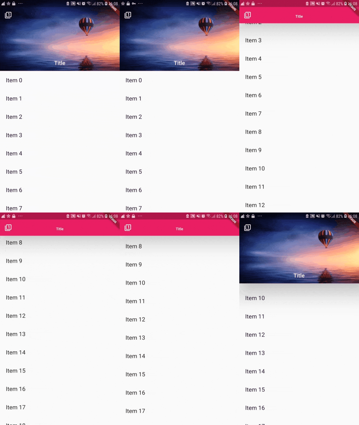
Flutter - SliverAppBar Examples
SliverAppBar is a kind of app bar in Flutter that’s compatible with CustomScrollView. SliverAppBar is usually used as the first child of CustomScrollView’s slivers. This widget allows you to easily create an app bar with various scrolling efects.
A very basic SliverAppBar consisting of title only without any effect can be created with this code:
  slivers: <Widget>[
    SliverAppBar(
      title: Text("SliverAppBar Title"),
    )
  ],
Below are some examples of SliverAppBar with various scroll effects.
Shrinking Header
In the last few years, maybe you have seen some apps, either web or mobile, which have header section that will be shrinked when the user scrolls down the page. It can also be done using SliverAppBar. What we need to set is expandedHeight and flexibleSpace. expandedHeight, as the name suggests, is the height of the app bar when it’s fully expanded. In flexibleSpace, you can pass a widget that will be rendered when the app bar is expanded, typically a FlexibleSpaceBar.
  SliverAppBar(
    title: Text("SliverAppBar Title"),
    expandedHeight: 220.0,
    flexibleSpace: FlexibleSpaceBar(
        centerTitle: true,
        title: Text('Title',
            style: TextStyle(
              color: Colors.white,
              fontSize: 16.0,
            )),
        background: Image.network(
          'https://images.pexels.com/photos/443356/pexels-photo-443356.jpeg?auto=compress&cs=tinysrgb&dpr=2&h=650&w=940',
          fit: BoxFit.cover,
        )
    ),
  ),
To modify scrolling behavior, there are three properties you need to control: pinned, floating, and snap.
If pinned is true, the app bar will always be visible at the top of the scroll view. In other word, the app bar will be sticky at the top. Otherwise, the app bar will disappear when you scroll down.
The second property, floating, makes it possible for the app bar to be displayed at the top of the screen. If you set it to false, you have to scroll up until you reach the top element under the app bar in order to make the app bar expanded again. If you set it to true, just scroll up a little bit and the app bar will be expanded again. You can see the comparison below.
pinned: true, floating: false, snap: false

pinned: true, floating: true, snap: false

The last property is snap which can only be used if pinned and floating are both set to true. If you set snap to true, then try to scroll down when the app bar is not expanded, you’ll see that the app bar will be snapped into the view.
pinned: true, floating: false, snap: true

Leading Widget
Another thing you can add is a leading Widget. It’s a small area that’s rendered on the top left before the title. Usually it’s used to render logo or drawer icon.
  SliverAppBar(
    leading: IconButton(
      icon: Icon(Icons.filter_1),
      onPressed: () {
        // Do something
      }
    ),
    ...
  ),
Options
Below is the list of available options you can pass in the constructor.

Full Code
  import 'package:flutter/material.dart';

  void main() => runApp(SilverAppBarExample());

  class SilverAppBarExample extends StatelessWidget {
    @override
    Widget build(BuildContext context) {
      return MaterialApp(
        home: Scaffold(
          body: CustomScrollView(
            slivers: <Widget>[
              SliverAppBar(
                leading: IconButton(
                  icon: Icon(Icons.filter_1),
                  onPressed: () {
                    // Do something
                  }
                ),
                expandedHeight: 220.0,
                floating: true,
                pinned: true,
                snap: true,
                elevation: 50,
                backgroundColor: Colors.pink,
                flexibleSpace: FlexibleSpaceBar(
                    centerTitle: true,
                    title: Text('Title',
                        style: TextStyle(
                          color: Colors.white,
                          fontSize: 16.0,
                        )),
                    background: Image.network(
                      'https://images.pexels.com/photos/443356/pexels-photo-443356.jpeg?auto=compress&cs=tinysrgb&dpr=2&h=650&w=940',
                      fit: BoxFit.cover,
                    )
                ),
              ),
              new SliverList(
                  delegate: new SliverChildListDelegate(_buildList(50))
              ),
            ],
          ),
        ),
      );
    }

    List _buildList(int count) {
      List<Widget> listItems = List();

      for (int i = 0; i < count; i++) {
        listItems.add(new Padding(padding: new EdgeInsets.all(20.0),
            child: new Text(
                'Item ${i.toString()}',
                style: new TextStyle(fontSize: 25.0)
            )
        ));
      }

      return listItems;
    }
  }
☞ Flutter
☞ Flutter UI - Stadia App Concept - Full Tutorial
☞ Flutter Responsive UI for Learning Platform App
☞ How to implement Barcodes and QR Codes in Flutter
#flutter #ios
