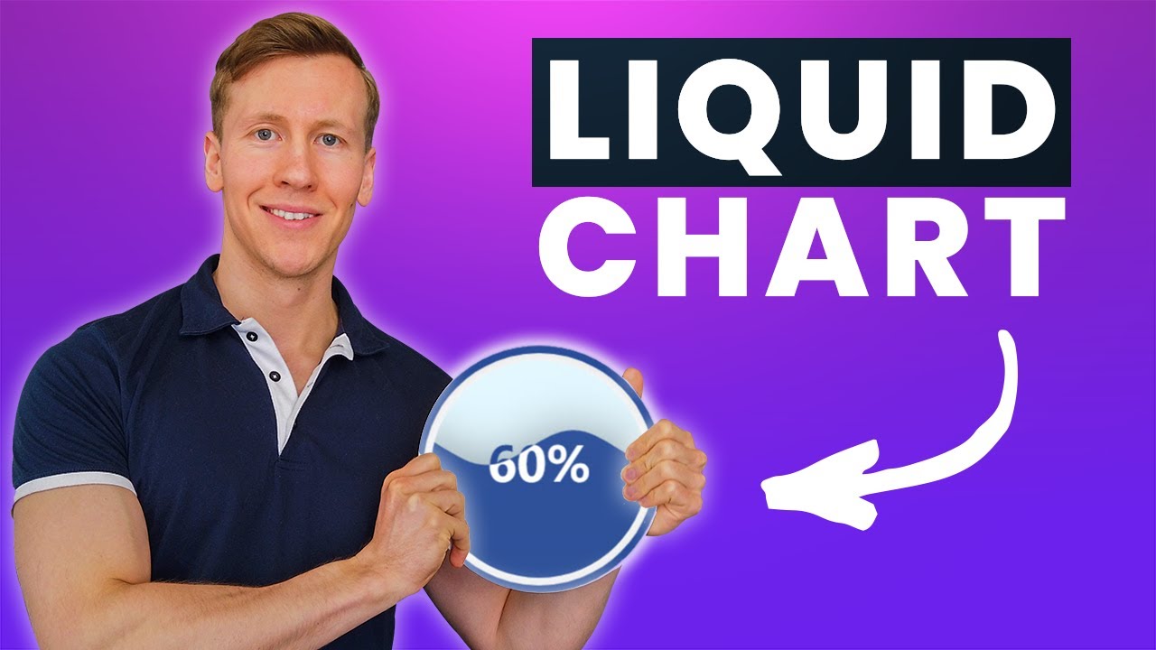
This tutorial will show you how to turn the values from an Excel File into animated liquid/water polo charts using the Python library ‘pyecharts’. Pyecharts will render the liquid charts in an HTML file. So, if you want to spice up your next presentation or if you are tired of the Standard Excel charts, this tutorial might be interesting for you.
Download all the files from the tutorial [Google Drive]:
👉 https://bit.ly/3vExeID
Subscribe: https://www.youtube.com/c/CodingIsFun/featured
#python #excel
4.30 GEEK