Have you ever noticed that inline plots in Jupyter notebooks tend to look… bad?
They’re either blurry or too small — and the default behavior for rescaling images in iPython is to retain the original resolution, meaning that enlarged images look extra blurry.
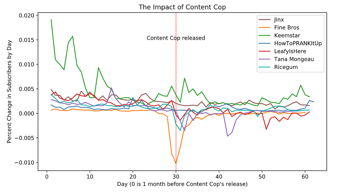
Here’s an example from my latest project, in which I analyzed the popular web series “Content Cop.” Notice how fuzzy the text and lines look? And I bet you couldn’t even tell that the red vertical line is dashed.
What if I told you these problems could be solved with one line of code?
Simply type the following into a Jupyter notebook cell before drawing your plots.
%config InlineBackend.figure_format = 'svg'
#jupyter #data-science #jupyter-notebook #matplotlib #data-visualization
1.80 GEEK