Note: The datasets are scraped and cleaned from 2017’s report made by the Indonesia’s Central Agency on Statistics and can be downloaded in CSV format here.
Most income inequality studies are done on a global level, where different countries are compared to each other, and a ranking based on GDP per capita (or other metrics such as the Big Mac Index) is then established. Nonetheless, recent studies have begun to localize the problems, zooming in to regional, city, and even on district settings. Exploring income inequality in granular level not only demonstrates the growing availability of such datasets, but also reflects our growing desire to tackle this problem at its root.
In this article, we are going to explore and understand the income inequality problem that has plagued Indonesia especially acorss its cities. This exploratory work will use GDP per capita as a variable of interest that represents an individual annual income level. With the ground rules and outlines setup, let us begin!
The Datasets
First, we are going to ensure that the required datasets are placed in the appropriate directory. Let us name the directory as dataset for demonstration purposes.
mkdir dataset && cd dataset
- GDP Per Capita CSV
The GDP per capita CSV contains information about the 521 cities in Indonesia and its corresponding GDP per capita as reported by Indonesia’ Central Agency on Statistics. The numbers are in thousands of Rupiah (1 USD is approximately 14,700 Rupiah as of this writing in August 2020,).
- Indonesia Administration Shapefile
Download from this link and unzip the file inside your dataset directory. This will be the geographical layer that demarcates all city regions in Indonesia.
Initializing the Project
Next, we are going to import the necessary dependencies. Ensure you have the following packages:
- Geopandas
- Seaborn
- Descartes
- PySAL
- Mapclassify
import geopandas as gpd
import matplotlib.pyplot as plt
import seaborn as sns
import numpy as np
import pandas as pd
import descartes
from sklearn import cluster
import pysal as ps
import mapclassify
%matplotlib inline
Load and Pre-process the Datasets
## Load the Shapefile
gdf = gpd.read_file('./dataset/idn_admbnda_adm2_bps_20200401.shp')

### Removing the prefix 'Kota' ('City' in English)
gdf['ADM2_EN'] = gdf['ADM2_EN'].str.replace('Kota ', '')

## Load the GDP_per_capita CSV and fill the NA value with 0
city_df = pd.read_csv('./dataset/city_gdp.csv', index_col=0)
city_df = city_df.fillna(0)
city_df = city_df.drop(['ADM1_EN'], axis=1)
city_df
Spatial Table Join
After loading and processing both of the datasets, we are going to perform a spatial table join to combine the raw city information (containing attributes such as area size, city name, _e_tc) with the GDP per capita data, using the city name as the key.
## Table join using ADM2_EN as key
joined_df = gdf.join(city_df.set_index('ADM2_EN'), on='ADM2_EN')
joined_df['gdp_capita'] = joined_df['gdp_capita'].fillna(0)
Exploratory Spatial Data Analysis (ESDA)
Visualizing GDP per Capita by Quantiles
At this point, we are going to take a quick peek into the spatial distribution of GDP per capita across the Indonesian cities. We are going to use geopandas’ plot function to do this, and aggregate the target values based on quantiles.
## Plot based on quantiles

joined_df.plot(column='gdp_capita',
               cmap='RdYlBu',
               legend=True,
               scheme='quantiles',
               figsize=(15, 10)
)
ax.set_axis_off()

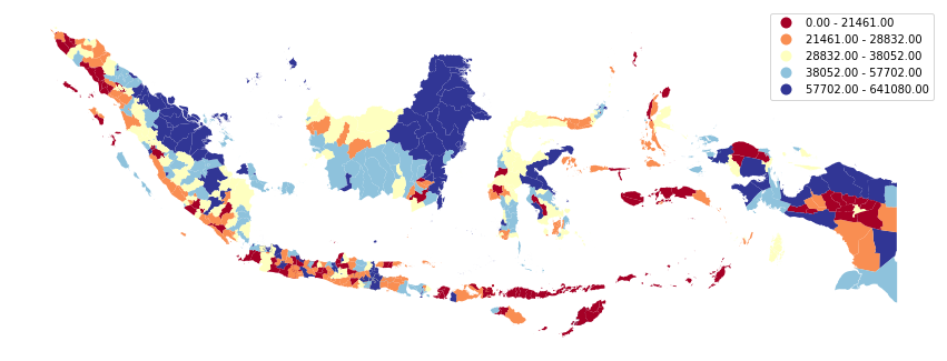
Spatial Distribution of GDP per capita across Indonesia’s Cities based on 5-class Quantiles
Nice! The map looks pretty. Let’s continue.
#visualization #indonesia #income-inequality #machine-learning #data-science