SwiftUI’s second iteration didn’t give us an out-of-the-box implementation for UICollectionView, but it did gift us with two powerful components, LazyVGrid and LazyHGrid, to build powerful grid-based layouts.
In the next few sections, we’ll explore:
- How to build SwiftUI grids
- How to set up items of a grid
- How to construct different kinds of grid layouts
- How to define sections in SwiftUI grids
Let’s get started.
SwiftUI Grids
As the name suggests, LazyVGrid is used to position views vertically, whereas LazyHGrid is used to set them in a horizontal direction. It’s important to note that the items are loaded lazily on demand.
To set up the type of grid layout, we need to specify an array of grid items in the initializer.
GridItem basically lets you specify the individual item size, the spacing between them, and the alignment within rows for LazyHGrid and for columns in a LazyVGrid.
Let’s look at the different ways of creating grid items.
How to Set Up Grid Items
The following code shows one way of creating a grid layout with a two-element row or two-element column based on where we’re passing it in.
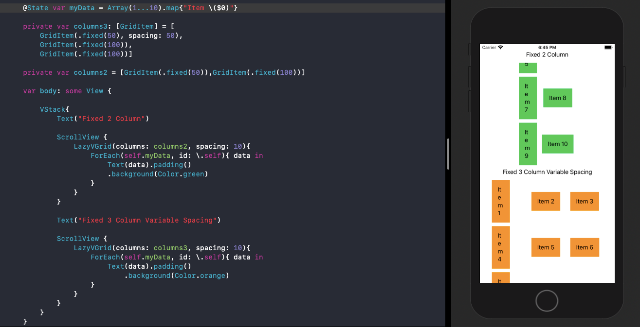
private var columns: [GridItem] = [
    GridItem(.fixed(50)),
    GridItem(.fixed(100))
]
The above GridItem array can be passed into a LazyVGrid or LazyHGrid. Let’s see how:
LazyVGrid(columns: columns, alignment: .center, spacing: 10)
Essentially, the SwiftUI grid created from the above layout would have two elements in each column of a row, with the first one sized 50 and the other one at 100. The spacing defined inside the LazyVGrid initializer above is between each row.
We can set the interspacing between columns in the following way:
private var columns: [GridItem] = [
    GridItem(.fixed(50), spacing: 50),
    GridItem(.fixed(100)),
    GridItem(.fixed(100))
]
Let’s look at the SwiftUI grids in action with the above two column types:
#swiftui #mobile #swift #programming #ios