Data visualizations generally serve one of two goals: to present or to explore data. Here I rely on the former and use a combination of python’s Matplotlib and Seaborn package to accomplish that.
This article will give a brief overview of my findings presented in a project for Practicum’s Data Analyst program. Stay tuned for a part 2, where I’ll show you how to create similar graphs that were used for this project.
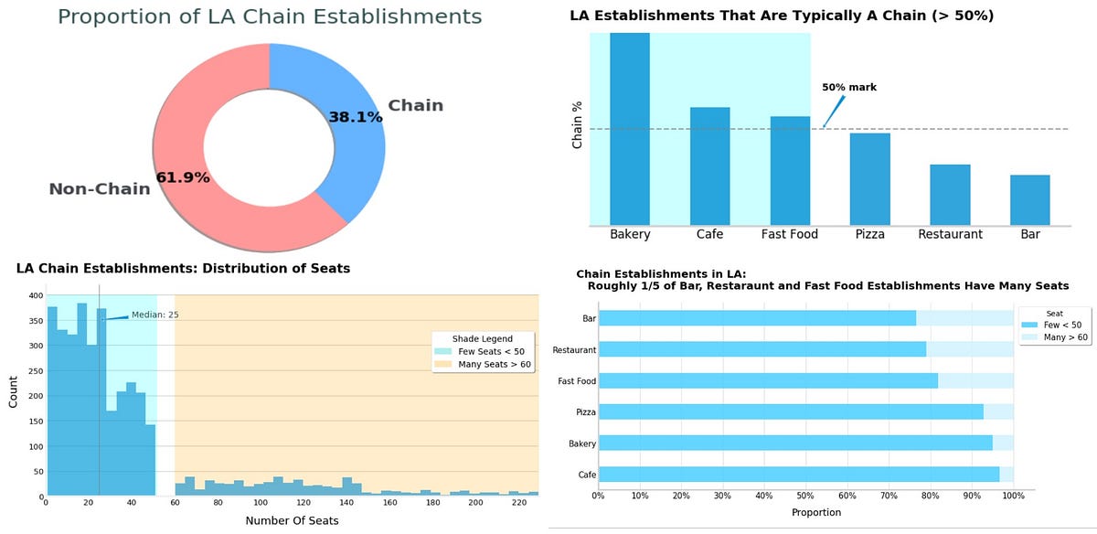
The Assignment
You’ve decided to open a small robot-run cafe in Los Angeles. The project is promising but expensive, so you and your partners decide to try to attract investors. They’re interested in the current market conditions — will you be able to maintain your success when the novelty of robot waiters wears off?
Draw an overall conclusion and provide recommendations on restaurant type and number of seats. Make a presentation of your research to share with investors — the target audience.
#storytelling-for-business #python-matplotlib #python