Data analysis and storytelling goes hand by hand in the world of analytics. There have always been a need of effective communication when it comes to convey our ideas and be persuasive. As its said — a picture is worth a million words, data visualization is also a similar thing. It expresses the insights of the data right in front of our eyes and plays a vital role when seeing the data.
Its kinda impossible that anyone working on data visualization with python has not used plotly. Plotly is one of the most widely used data visualization library on python. However, we will be talking about an extension to the plain plotly today. Yes, I am talking about plotly express.
This is a high-level visualization library for generating advanced plots on python. It is a wrapper for plotly.py that exposes a simple syntax for complex charts. We can generate complex and rich interactive plots including faceting, maps, animations, trendlines etc with a single function call. In addition to that, it also comes with inbuilt datasets, color scales, themes and just like plotly.py, plotly express is also completely free. Being an open source package, this can be used in any way that suits our need even on the commercial applications. We can also export the plots created by plotly express via Orca or edit them in jupyter lab chart editor.
Just like other simple package installations, we can PIP INSTALL PLOTLY and are good to go with it. One of the nice things about plotly.express is that it is designed to work well with pandas.DataFrame objects, a very common data structure used within statistical analysis in Python. plotly.express also has comprehensive, easy to read documentation at https://www.plotly.express/plotly_express/
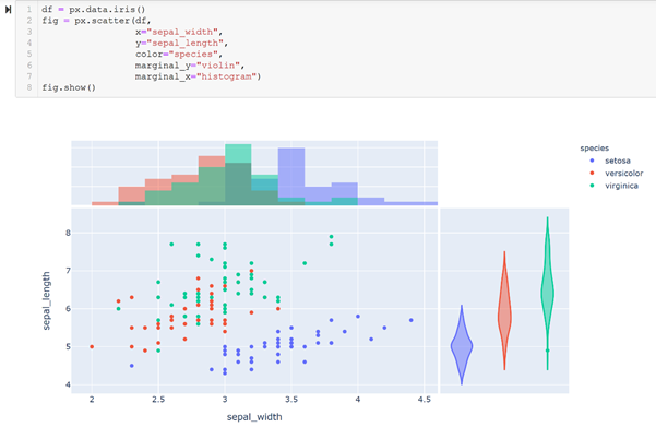
Now, without delaying it much, lets start plotting some visualizations with plotly express.
#plotly #data-analysis #data-science #data-visualization #express