Did you actually know that the first idea to present data in a visual form dates back to the 17th century? (I am always amazed when I see how some modern hypes are rooted in long-existing ideas)
While the world is drowning in data, with 2.5 quintillion bytes produced daily, while organisations are competing to employ the best talents to draw data insights and the data engineers are working hard to outsmart these requirements, there was a point in time when the only way to structure and understand data was reading tables on pieces of paper.
It only became possible to present statistical data in a visual form after the French mathematician Rene Dekart invented a two-dimensional coordinate system for displaying values in the 17th century. Later on, a Scottish man William Playfair pioneered with the line charts, bar charts and pie charts to present financial and statistical economic data.
_“I confess I was very anxious to find out if I was actually the first who applied the principles of geometry to matters of finance, as it had long before been applied to chronology with great success.” — _William Playfair, Lineal Arithemtic, 1798
In the picture below you can find a simple line chart, which he used to argue against England’s policy of financing colonial wars.
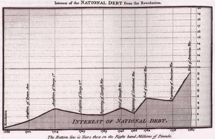
William Playfair, public domain
Now, the exciting part about this graph, is indeed the speed and precision with which you can identify the trend of growing debt.
#data-analysis #design #tableau #data-visualization #visual studio code