Do we need mega-dropdown hover menus in 2021? Probably not. Let’s explore things to keep in mind when designing and building a mega-dropdown, alternatives to hover menus and fine details for designing a better UX.
Complex websites often rely on complex navigation. When a website houses thousands of pages, often combined with micro-websites and hundreds of subsections, eventually the navigation will go deep and broad. And with such a complex multi-level navigation, showing the breadth of options requires quite a bit of space. Think of large eCommerce retailers and large corporate sites, catering to many audiences and having plenty of entry points.
No wonder that a common way to deal with this complexity is to expose customers to a large amount of navigation quickly. That’s exactly why mega-dropdowns have become somewhat an institution on the web — albeit mostly for complex and large projects. A mega-dropdown is essentially a large overlay that appears on a user’s action. Usually it includes a mixed bag of links, buttons, thumbnails and sometimes nested dropdowns and overlays on its own.
For decades, a common behavior for this kind of navigation is to open the menu on mouse hover. And for decades, a common user’s complaint about this pattern has been the absolute lack of certainty and control about how and when the sub-navigation opens and closes.
Sometimes the submenu appears unexpectedly, and sometimes it suddenly disappears, and sometime it stays on the screen for a while, although the mouse pointer is already in a very different part of the page, or on another page altogether.

One of the many. A mega-dropdown opening on hover on Wayfair.com. A common component for large retail stores. (Large preview)
Why Are Mega-Dropdowns Hover Menus Frustrating?
The main reason why mega-dropdowns can be cumbersome to use is because of a mismatch of intentions and expectations. With hover menus, we try to deduce and act on a particular intent by tracking mouse behavior, yet our customers might have very different objectives and very different limitations when accessing a page.
Customer’s behavior is usually unpredictable, even although our analytics might tell a slightly different story with data points gathered and normalized over a longer period of time. We just rarely can predict behavior accurately.
The common scenarios we usually explore are:
- The customer is aiming at the category link and travels there directly to explore the sub-navigation items in that category.
- The customer is moving the mouse towards a target on the screen, but the trajectory that the mouse has to travel covers a nav link that opens a mega-dropdown.
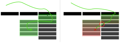
Hover tunnels can be frustrating to navigate. From: Dropdown Menus with More Forgiving Mouse Movement Paths. (Large preview)
However, there are also plenty of other situations to consider. Just to name a few:
- The customer wants to look up mega-dropdown options while typing in a search autocomplete. To do that, they have to keep re-opening mega-dropdown, or use separate browse tabs, positioned side by side.
- The customer might use a trackpad (or a mouse) to operate a large secondary display, so pointer movements will be slower, abrupt and inaccurate. This would cause the mega-dropdown to open involuntarily every time the user pauses when traveling to CTAs or shopping cart at the top of the page.
- The customer wants to open the category page, so they travel to the category link, click on it, but experience flickering because a mega-dropdown appears delayed.
- With nested sub-menus within a mega-dropdown, the customer wants to explore similar items within the category in which they currently are, but because of nesting, they have to re-open the mega-dropdown over and over again, and travel the same hover tunnel over and over again.
- Imagine a situation when you want to resize the window, and just as you are about to snap to the right edge of the window, a hover menu keeps showing up — just because you’ve moved your mouse cursor too closely.
- The user starts scrolling down slowly to assess the content on a page, but the menu keeps popping up. And every time the user bumps away a cursor to read the contents of the mega-dropdown, the menu accidentally disappears.
The problem is that we need to support all these intentions and all these accidents, but at the same time we need to make sure that we don’t create an annoying and frustrating experience for any of these cases either. Of course, as designers and developers, we’ve invented a number of techniques to tackle this problem.
#web-development
