Designing a complex user interface on Android with a nested view hierarchy used to be common. But with the introduction of ConstraintLayout, this has changed a lot. ConstraintLayout reduces a lot of the challenges of building complex layouts, as you can now design them using the GUI of Layout Editor by just dragging UI elements into a visual design editor instead of writing layout XML by hand.
You can take full advantage of this Layout Editor while using ConstraintLayout (part of Android Jetpack libraries). It uses a flat view hierarchy and also provides some performance benefits.
If you want more information regarding the performance benefits of ConstraintLayout, check out this Android developer’s blog post.
If you need more information on getting started and developing an application with Jetpack Compose, check out this article by a Senior Mobile Engineer Salih.
Overview of constraints
You must set at least two constraints, one horizontal and one vertical constraint, to position a view element properly on the screen.
If you do not have Autoconnection turned on, any view that you drop in the Layout Editor stays where you leave it without any constraints. However, when you run an app with a view element without any constraints, it is by default rendered to the position [0,0] (the top-left corner of the device screen).
Now, let’s look into the different types of constraints that you can set on a view element.
Types of constraints
Android Studio allows you to use the following types of constraints:
- Fixed constraint: A constraint that is specified using a hard-coded number.
- Adaptable constraint: A constraint that defines a relationship in relative and weighted terms.
- Absolute positioning: A numerical positioning, such as the position in x, y coordinates.
- Relative positioning: Views are positioned by specifying relationships with other views.
Some of the useful features that you can use with ConstraintLayout are listed below:
- Chains
- Bias
- Ratios
- Guideline
- Barrier
- Baseline
- Group
- Circular positioning
- Flow
- ConstraintSet
Let’s talk about these in more detail.
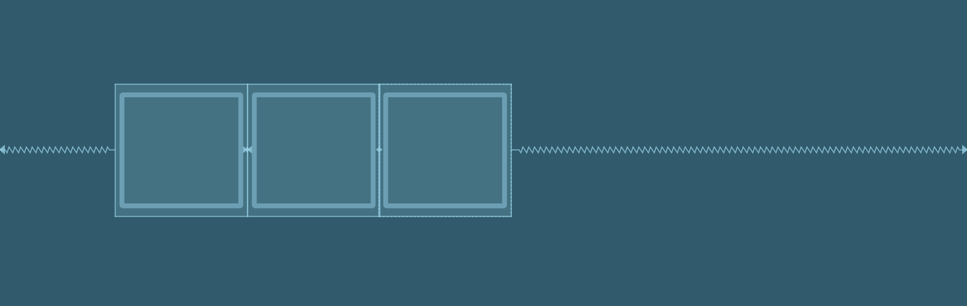
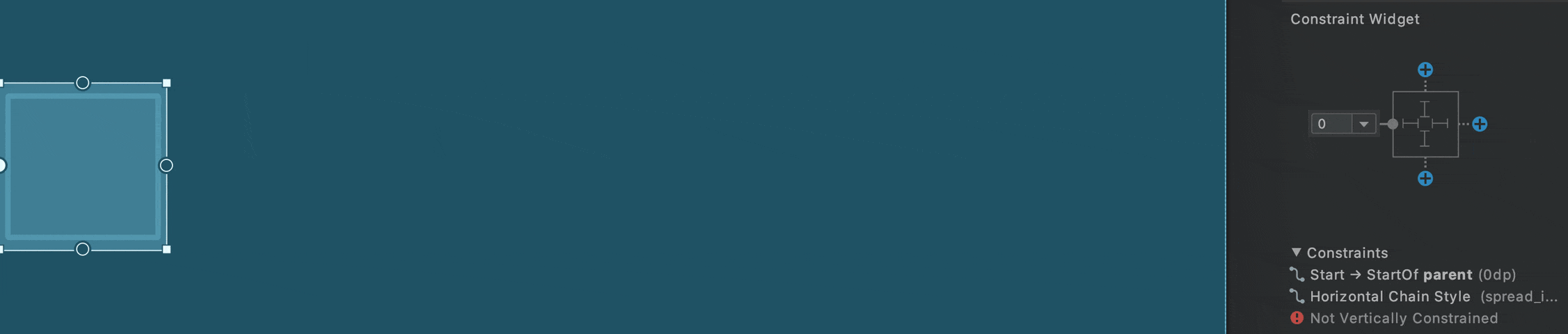
Chains
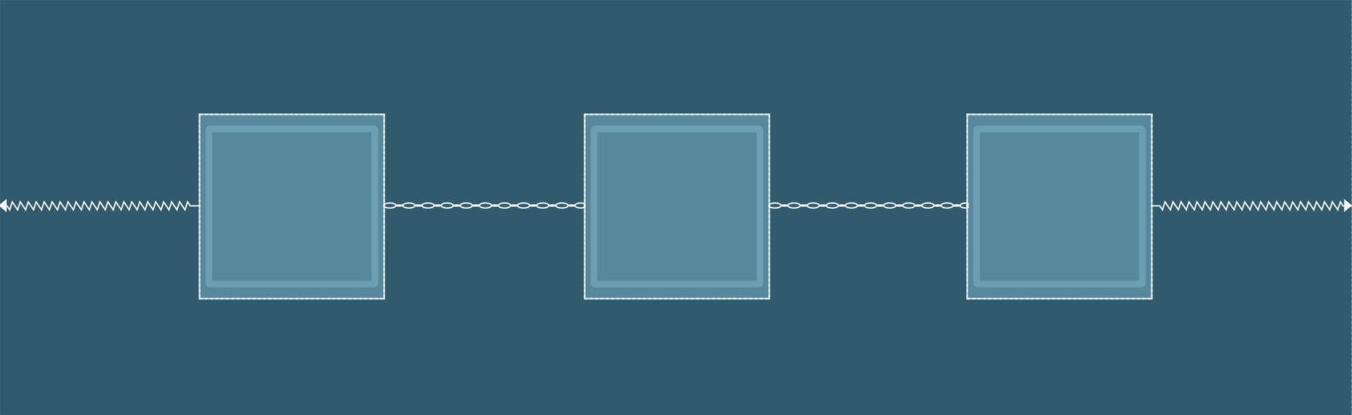
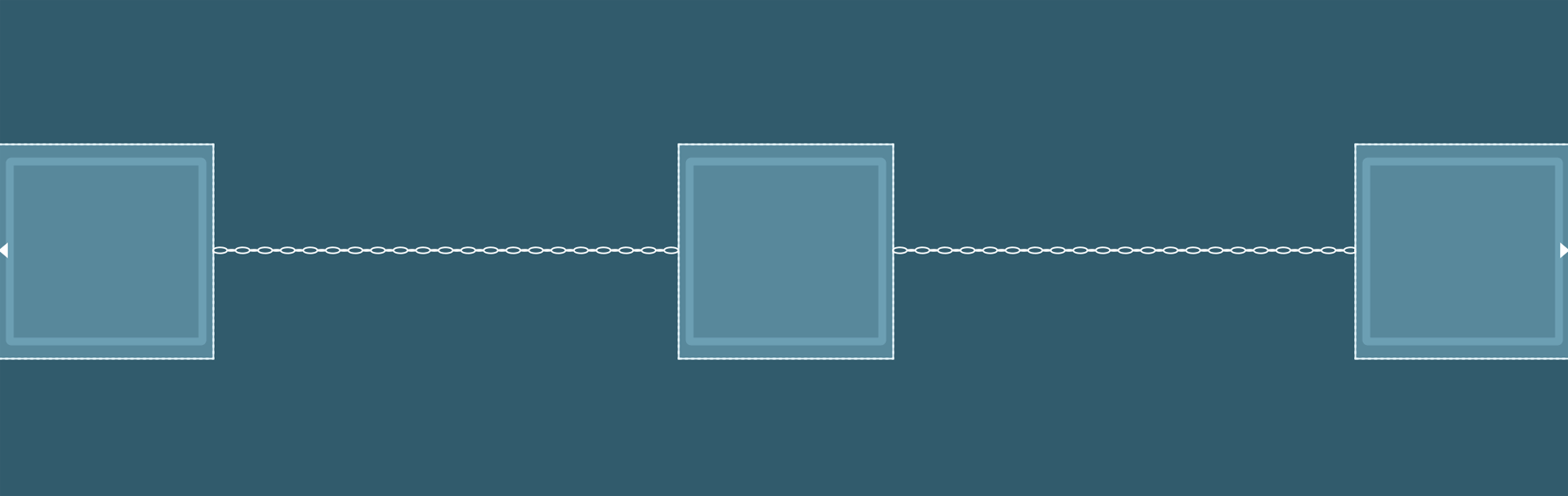
A chain is a group of views that are linked to each other with bi-directional position constraints. The views within a chain can be distributed either vertically or horizontally.
Some of the ways in which chains can be styled are shown below:
- Spread: Elements are evenly distributed along the mentioned axis. This the default style for chains.
- Spread inside: Elements are spread to use the available space with the head and tail attached to the parent.
- Weighted: Elements are resized to use all the available space according to specified weights with the head and tail glued to the parent.
- This can be achieved when the chain is set to either spread or spread inside. You can fill the remaining space by setting one or more views to
match constraint(0dp). 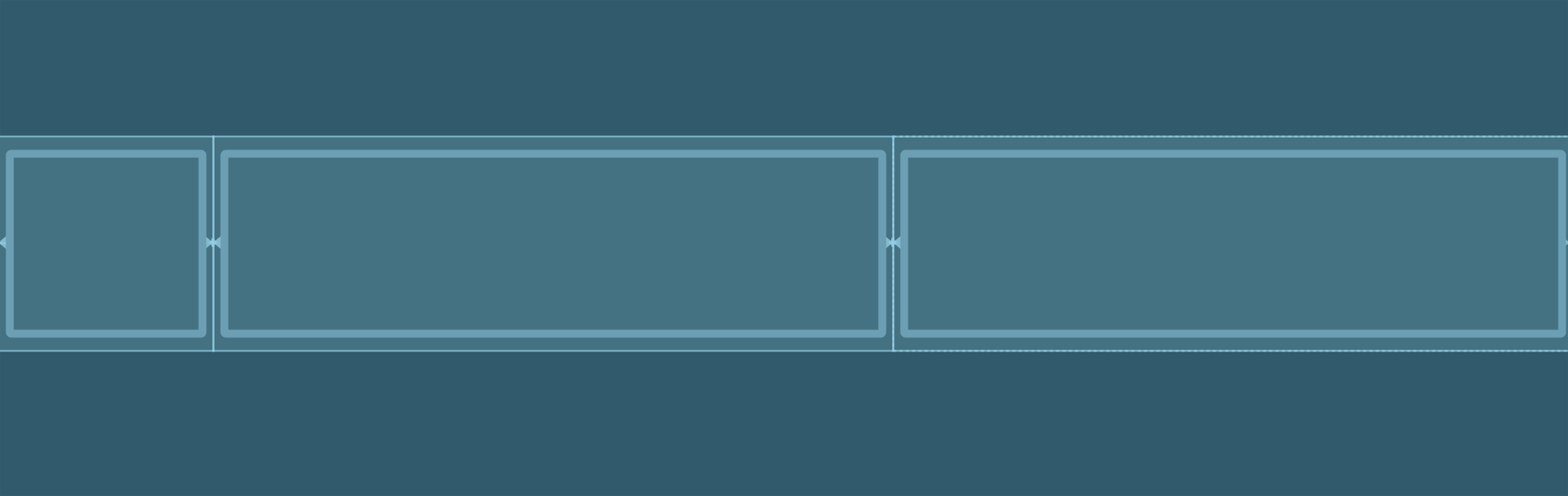
- Packed: Elements are packed to use minimum space.
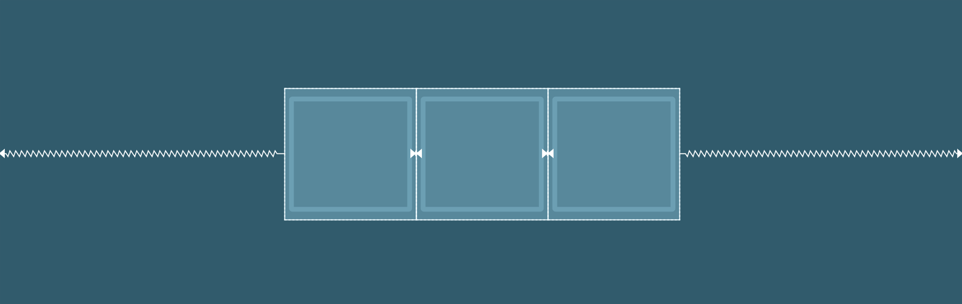
- Packed with bias: Elements are packed to use minimum space and are moved on their axis depending on bias.
The XML code with the default chain style looks like below:
<Button
    android:id="@+id/button1"
    android:layout_width="56dp"
    android:layout_height="56dp"
    app:layout_constraintBottom_toBottomOf="@+id/button2"
    app:layout_constraintEnd_toStartOf="@+id/button2"
    app:layout_constraintHorizontal_bias="0.5"
    app:layout_constraintStart_toStartOf="parent"
    app:layout_constraintTop_toTopOf="@+id/button2" />

<Button
    android:id="@+id/button2"
    android:layout_width="56dp"
    android:layout_height="56dp"
    app:layout_constraintBottom_toBottomOf="parent"
    app:layout_constraintEnd_toStartOf="@+id/button3"
    app:layout_constraintHorizontal_bias="0.5"
    app:layout_constraintStart_toEndOf="@+id/button1"
    app:layout_constraintTop_toTopOf="parent"
    app:layout_constraintVertical_bias="0.514" />

<Button
    android:id="@+id/button3"
    android:layout_width="56dp"
    android:layout_height="56dp"
    app:layout_constraintBottom_toBottomOf="@+id/button2"
    app:layout_constraintEnd_toEndOf="parent"
    app:layout_constraintHorizontal_bias="0.5"
    app:layout_constraintStart_toEndOf="@+id/button2"
    app:layout_constraintTop_toTopOf="@+id/button2" />
Bias
When a view is constrained to both sides on either axis, it is centered on that axis, and the bias value is set to 50%. You can adjust this bias by using the slider present in the Attributes panel under the Layout tab.
The XML code looks like below:
<Button
    android:id="@+id/button"
    android:layout_width="56dp"
    android:layout_height="56dp"
    app:layout_constraintBottom_toBottomOf="parent"
    app:layout_constraintEnd_toEndOf="parent"
    app:layout_constraintHorizontal_bias="0.2"
    app:layout_constraintStart_toStartOf="parent"
    app:layout_constraintTop_toTopOf="parent" />
#ui #android #constraintlayout #designing
