One of Tableau’s biggest advantages is how it lets you swim around in your data. You don’t always need a fine-tuned dashboard to find meaningful insights, so even someone with quite a basic understanding of Tableau can make a significant impact.
For this article, we’ll play into that theme of not needing to know everything about a tool in order to build useful things with it. In our previous article, we touched on how you can create custom calculations and color visuals in Python to arrive at visuals that look quite similar to what we build in Tableau.
Today, let’s expand on what we’ve learned so far. Let’s see how we can take what we’ve seen up to this point and apply that to a common scenario: data exploration.
Setting the stage
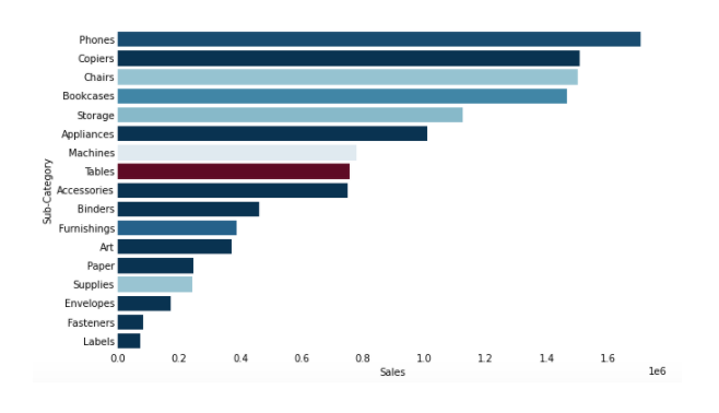
Previously, we took our ‘Sales’ and ‘Profit’ columns and created a new column named ‘Profit Ratio’. We then modified our plot from the first article, showing sales per product sub-category, and added color to the visual using our new ‘Profit Ratio’ metric:
Sales by Sub-Category, colored by Profit Ratio
Whenever I teach a newcomer to Tableau how to use the software, I always plug in this visual somewhere in the mix.
Something I view as a common mistake in data visualization is that people often think just because they can use color they always _should. _If we throw color randomly at our visuals, the results are typically no better than a simple table. Some visuals that get lost in the sauce can be downright confusing.
In our use case, color is appropriate because it helps to quickly focus in on the desired “a-ha” revelation: higher volumes of sales do not necessarily lead to higher volumes of profits.
#tableau #data-science #data-analysis #data-visualization #python