This is a three-part series where I present what I believe is a great way to consume and maintain design tokens. Examples are written in React and styled-components but the ideas in this article could be adapted to any frameworks.
Introduction
In Part 1 of this series, we came up with a set of desired interfaces for consuming design tokens. In this article, we implement the tokens to fit those interfaces. In Part 3, we will look at how to make the tokens more maintainable.
The Process
There will not be a lot of reading/reasoning in this article. I will follow through each iteration, as defined in the last article, and show you what the design tokens might look like at each stage. To see the reasoning behind each iteration please see Part 1.
We start by assuming that our tokens are initially defined like so:
const tokens = {
  orange: "#ff9b00",
  purple: "#5f259f",
  blue: "#0096e6",
  red: "#ff0000",
  white: "#ffffff",
  lighter: "#e8e8e8",
  lightest: "#b2b2b2",
  dark: "#999999",
  darker: "#666666",
  darkest: "#333333",
  black: "#000000",
};
Iteration 1
In this iteration, we want to group the tokens together by type; whether they are text color or background colors or icon color.
Desired interface:
const MyBanner = styled.div`
  color: ${tokens.text.darkGray}; //color: #333333
  background-color: ${tokens.background.purple};
`;
New token definition:
const tokens = {
  text: {
    orange: "#ff9b00",
    purple: "#5f259f",
    blue: "#0096e6",
    red: "#ff0000",
    white: "#ffffff",
    grayDarkest: "#333333",
  },
  background: {
    orange: "#ff9b00",
    purple: "#5f259f",
    blue: "#0096e6",
    white: "#ffffff",
    grayLightest: "#b2b2b2",
    black: "#000000",
  },
  icon: {
    white: "#ffffff",
    grayDark: "#999999",
  },
};
Iteration 2
Next, we introduce other token categories such as sizes (font sizes, line heights)and layouts (media queries, z-indices).
Desired interface:
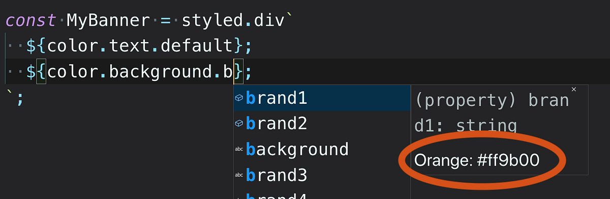
const MyBanner = styled.div`
  color: ${tokens.color.text.darkGray}; //color: #333333
  background-color: ${tokens.color.background.purple};
  font-size: ${tokens.size.font.sm1};
  line-height: ${tokens.size.lineHeight.small};
  @media (min-width: ${tokens.layout.media.tablet}) {
    font-size: ${tokens.size.font.lg1};
    z-index: ${tokens.layout.zIndex.bottomlessPit};
  }
`;
#token-design #react #javascript #styled-components #typescript-with-react