Interactive charts are key to visual storytelling.
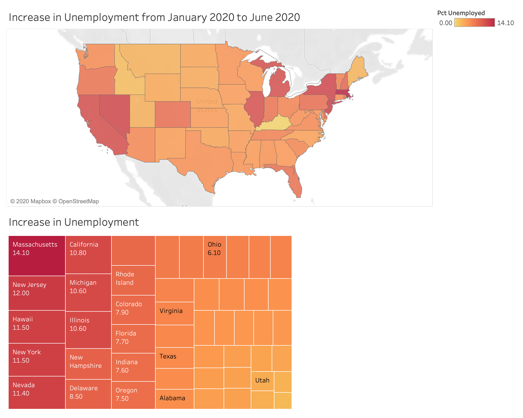
Tableau dashboard we will create in this article.
Building an infographic often starts while you are first exploring the data. **Matplotlib, Seaborn, and ggplot2 **are the classic programming charts, while Plotly has also exploded in popularity. But for me, nothing matches the clean professional aesthetic of Tableau. In this article, we will leave behind the inline Jupyter Notebook charts and learn how to create hosted interactive charts using Tableau Public.
This article is comprised of three parts:
- Research — what is your topic and how will you extract the data? In this article, we will check out the **Bureau of Labor Statistics (BLS) API. **We are able to retrieve data using an HTTP POST request with parameters including the query IDs for each BLS query. The Data we will request is Unemployment by State.
- **Data Cleaning **— Using python, we will call the BLS API and clean the data using Pandas into a tidy vertical format. This can be done with a Jupyter Notebook or Python Script. Data will be saved to a CSV file and SQLite database.
- Tableau — Create a choropleth (geographic) map and a tree map, and publish the charts to Tableau Public. We will be able to share the chart with an embedded link.
You can follow along with the querying and cleaning data section from my GitHub repo! This is a companion article to an analysis on unemployment from the COVID-19 pandemic.
#pandas #economics #python #tableau #dashboard

2.75 GEEK