This article was originally published at https://www.blog.duomly.com/how-to-use-fluent-ui-building-a-fintech-dashboard-tutorial/
A few days ago while checking tech news I found a UI framework I’ve never heard about, Fluent UI by Microsoft. Driven by curiosity I decided to take a quick look at the new discovery and check out how it looks like and how it works.
On the Microsoft website, I found out that with Fluent UI I can create React.js web apps, apps for Windows, iOS, and Android. As a front-end developer, I decided to turn my full interest in web apps and that led me to the point where I saw how many beautiful, clean, components does it offer.
Then the idea came to my mind, what if I’d try to build a simple UI and try out Fluent UI? And if I’m going to do it, why wouldn’t I share this on the blog and Youtube, because maybe you haven’t heard about it yet? I’ve already written an article about CSS frameworks here, but I didn’t know about the one from Microsoft then. So, it’s time to update you with this one!
I decided to create a simple tutorial where you can build a fintech dashboard with me using Fluent UI and React.js.
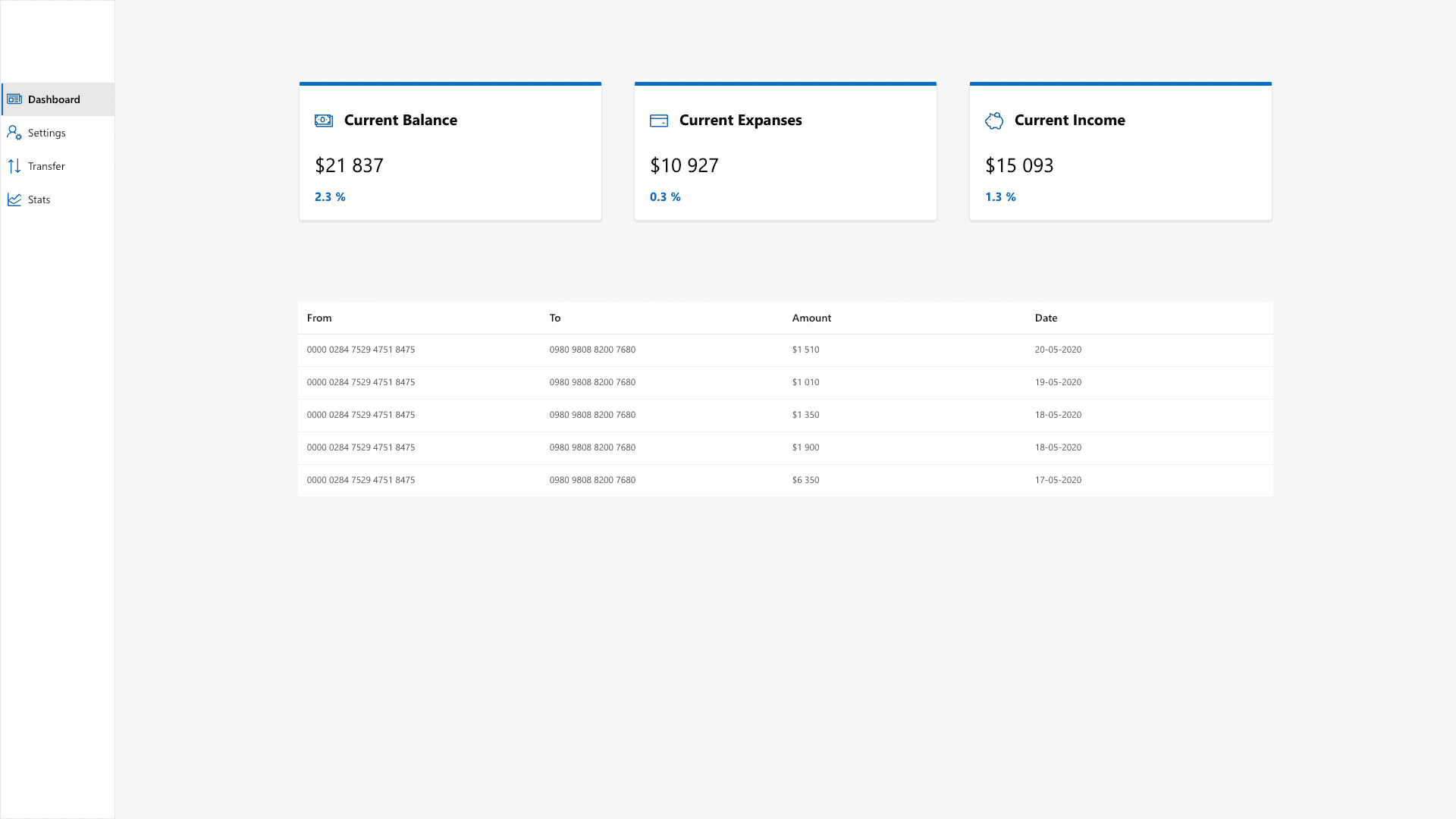
Here’s the result you should get after finishing this tutorial.
[caption id=“attachment_2502” align=“aligncenter” width=“1920”]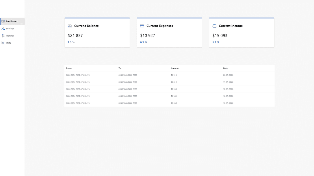 Duomly - Programming Online Courses - Fluent UI tutorial[/caption]
P.S. As always, if you’d like to watch instead of writing feel free to join us on Youtube!
Let’s start!
1. Set up React.js app
As I mentioned, we are going to use React.js to build the dashboard so, we need to go through the process of setting it up. Let's usecreate-react-app and create a new, empty project.
npx create-react-app [APP_NAME]When the project is ready let's start it!
cd [APP_NAME]
yarn start
Here's how your running app should look like:

2. Install Fluent UI
As our app is ready and running, it's time to install our UI framework which we are going to use. We are going to do it with a simple yarn command:yarn add @fluentui/reactAlso, let's install the Cards, and because it's an experimental element we need to install it as an additional package.
yarn add @uifabric/react-cardsWhen it's done, we can take a look at the documentation and start building our new dashboard. First of all, let's set up a layout grid.
3. Create a Navigation component
So, let's start by cleaning our main App.js component and creating a new one, which will be our side navigation. Let's call it Navigation.js.import React from 'react';
import { Nav, initializeIcons } from '@fluentui/react';
const navigationStyles = {
root: {
height: ‘100vh’,
boxSizing: ‘border-box’,
border: ‘1px solid #eee’,
overflowY: ‘auto’,
paddingTop: ‘10vh’,
},
};
const links = [
{
links: [
{
name: ‘Dashboard’,
key:‘key1’,
url: ‘/’,
iconProps: {
iconName: ‘News’,
styles: {
root: {
fontSize: 20,
color: ‘#106ebe’,
},
}
}
},
{
name: ‘Settings’,
key: ‘key2’,
url: ‘/’,
iconProps: {
iconName: ‘PlayerSettings’,
styles: {
root: {
fontSize: 20,
color: ‘#106ebe’,
},
}
}
},
{
name: ‘Transfer’,
key: ‘key3’,
url: ‘/’,
iconProps: {
iconName: ‘SwitcherStartEnd’,
styles: {
root: {
fontSize: 20,
color: ‘#106ebe’,
},
}
}
},
{
name: ‘Stats’,
key: ‘key4’,
url: ‘/’,
iconProps: {
iconName: ‘StackedLineChart’,
styles: {
root: {
fontSize: 20,
color: ‘#106ebe’,
},
}
}
},
],
},
];
const Navigation = () => {
initializeIcons();
return (
<Nav
groups={links}
selectedKey=‘key1’
styles={navigationStyles}
/>
);
};
export default Navigation;
Great, we have a navigation component ready. Let’s add it to our main component to be able to see it! Also, let’s add some classes to create a grid. Your App.js file should look like the one below.
import React from 'react';
import 'office-ui-fabric-react/dist/css/fabric.css';
import './App.css';

import Navigation from './Navigation';

function App() {
  return (
    <div className="ms-Grid" dir="ltr">
      <div className="ms-Grid-row">
        <div className="ms-Grid-col ms-sm1 ms-xl1">
          <Navigation />
        </div>
        <div className="main-element ms-Grid-col ms-sm11 ms-xl11">
          <div className="ms-Grid-row">

          </div>
          <div className="ms-Grid-row">

          </div>
        </div>
      </div>
    </div>
  );
}

export default App;
As you can see, I’ve also added some styling in the App.css file.
#root {
   background-color: rgba(225, 223, 221, 0.2);
}

.ms-Nav {
  background-color: white;
}

.ms-Grid-col {
  padding-left: 0;
  margin-left: 0;
}
Here is the result you should be able to see right now!

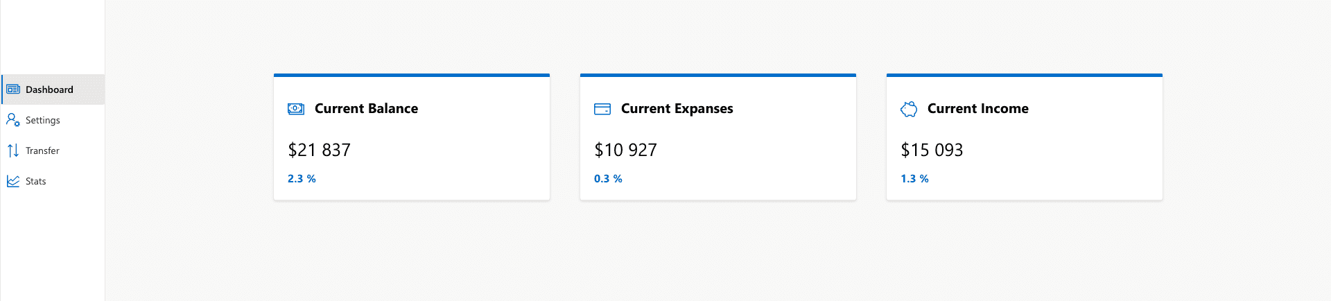
4. Create cards section
Now we can continue and create elements in our main section. Let's createCardsSection.js file and inside the file, we are going to create three cards using the experimental <Card/> component.
import React from 'react';
import { Text, initializeIcons } from '@fluentui/react';
import { Card } from '@uifabric/react-cards';
import 'office-ui-fabric-react/dist/css/fabric.css';
const container = {

display: ‘flex’,

justifyContent: ‘center’,

margin: ‘10vh 0’,

};
const icon = {

fontSize: 24,

padding: 15,

verticalAlign: ‘middle’,

paddingLeft: 0,

color: ‘#0078d4’

}
const styles = {

cardStyles: {

root: {

background: ‘white’,

padding: 20,

borderTop: ‘5px solid #0078d4’,

width: ‘90%’,

maxWidth: ‘90%’,

margin: ‘auto’,

}

},

header: {

root: {

fontSize: 20,

fontWeight: ‘bold’,

}

},

amount: {

root: {

fontSize: 26,

paddingBottom: 20,

paddingTop: 30,

}

},

percentage: {

root: {

fontSize: 16,

fontWeight: ‘bold’,

color: ‘#0078d4’,

}

}

};
const cards = [

{

title: ‘Current Balance’,

amount: ‘$21 837’,

icon: ‘Money’,

percentage: ‘2.3’,

},

{

title: ‘Current Expanses’,

amount: ‘$10 927’,

icon: ‘PaymentCard’,

percentage: ‘0.3’

},

{

title: ‘Current Income’,

amount: ‘$15 093’,

icon: ‘Savings’,

percentage: ‘1.3’

}

]
const CardsSection = () => {

initializeIcons();

return (

<div style={container}>

{cards.map((card) => (

<div className=“s-Grid-col ms-sm3 ms-xl3”>

<Card styles={styles.cardStyles}>

<Card.Section>

<Card.Item>

<i style={icon} className={ms-Icon ms-Icon--${card.icon}} aria-hidden=“true”></i>

<Text styles={styles.header}>{card.title}</Text>

</Card.Item>

<Card.Item>

<Text styles={styles.amount}>{card.amount}</Text>

</Card.Item>

<Card.Item>

<Text styles={styles.percentage}>

{card.percentage} %

</Text>

</Card.Item>

</Card.Section>

</Card>

</div>

))}

</div>

);

};
export default CardsSection;
Also, don’t forget to add the newly created component into the
App.js file.
import Navigation from './Navigation';
import CardsSection from './CardsSection';

function App() {
  return (
    <div className="ms-Grid" dir="ltr">
      <div className="ms-Grid-row">
        <div className="ms-Grid-col ms-sm1 ms-xl1">
          <Navigation />
        </div>
        <div className="main-element ms-Grid-col ms-sm11 ms-xl11">
          <div className="ms-Grid-row">
            <CardsSection />
          </div>
          <div className="ms-Grid-row">

          </div>
        </div>
      </div>
    </div>
  );
}

export default App;
Here’s how the dashboard should look like right now!
5. Create a table section
The last section we would like to add to our fintech dashboard is a table, with previous operations data.So, we are going to create another component called OperationsTable.js, and to create this table, we will use <DetailsList /> component.
Here’s the code:
import React from 'react';
import { DetailsList } from '@fluentui/react';
import { mergeStyleSets } from 'office-ui-fabric-react/lib/Styling';
import 'office-ui-fabric-react/dist/css/fabric.css';


const classNames = mergeStyleSets({
  table: {
    margin: 'auto',
  }
});

const operations = [
  {
    from: '0000 0284 7529 4751 8475',
    to: '0980 9808 8200 7680',
    amount: '$1 510',
    date: '20-05-2020',
  },
  {
    from: '0000 0284 7529 4751 8475',
    to: '0980 9808 8200 7680',
    amount: '$1 010',
    date: '19-05-2020',
  },
  {
    from: '0000 0284 7529 4751 8475',
    to: '0980 9808 8200 7680',
    amount: '$1 350',
    date: '18-05-2020',
  },
  {
    from: '0000 0284 7529 4751 8475',
    to: '0980 9808 8200 7680',
    amount: '$1 900',
    date: '18-05-2020',
  },
  {
    from: '0000 0284 7529 4751 8475',
    to: '0980 9808 8200 7680',
    amount: '$6 350',
    date: '17-05-2020',
  }
]

const columns = [
  { key: 'column1', name: 'From', fieldName: 'from', minWidth: 100, maxWidth: 300, isResizable: true },
  { key: 'column2', name: 'To', fieldName: 'to', minWidth: 100, maxWidth: 300, isResizable: true },
  { key: 'column3', name: 'Amount', fieldName: 'amount', minWidth: 100, maxWidth: 300, isResizable: true },
  { key: 'column4', name: 'Date', fieldName: 'date', minWidth: 100, maxWidth: 300, isResizable: true },
]

const OperationsTable = () => {
  return (
    <div data-is-scrollable={true}>
      <div className={`s-Grid-col ms-sm9 ms-xl9 ${classNames.table}`}>
        <DetailsList
          items={operations}
          columns={columns}
          selectionMode={0}
        />
      </div>
    </div>
  );
};

export default OperationsTable;
Let’s add a few lines of CSS in App.css file:
.ms-Viewport {
  margin: 0 1.5%;
}
.ms-FocusZone {

padding: 0;

}
And add our new component to App.js file:
import React from 'react';
import 'office-ui-fabric-react/dist/css/fabric.css';
import './App.css';
import Navigation from ‘./Navigation’;

import CardsSection from ‘./CardsSection’;

import OperationsTable from ‘./OperationsTable’;
function App() {

return (

<div className=“ms-Grid” dir=“ltr”>

<div className=“ms-Grid-row”>

<div className=“ms-Grid-col ms-sm1 ms-xl1”>

<Navigation />

</div>

<div className=“main-element ms-Grid-col ms-sm11 ms-xl11”>

<div className=“ms-Grid-row”>

<CardsSection />

</div>

<div className=“ms-Grid-row”>

<OperationsTable />

</div>

</div>

</div>

</div>

);

}
export default App;
Conclusion
In this article, we’ve created a simple dashboard using Fluent UI and React.js. I personally find the Fluent UI frameworks elements pretty clear and user friendly. Also, Microsoft provides us a lot of ready building blocks for UI. If you like Microsoft design or you are working on the project which is related to any of Microsoft products, I think it’s a great solution to use it, but for beginners in front-end, there are a few easier UI kits. Let me know in the comments what’s your opinion about Fluent UI if you tried it.
Thank you for reading, Anna from Duomly#css #html #javascript #reactjs #web-development