This is primarily a note to self; and, is something that has been covered several times on StackOverflow; but, I can never seem to remember the answer and end-up re-learning it each time. As such, I wanted to write it down! This post looks at how to get CSS padding and widths to work consistently inside an overflow: auto (or [overflow: scroll](https://www.bennadel.com/blog/3642-use-css-overflow-auto-not-overflow-scroll-when-clipping-most-fixed-size-containers.htm) if you feel that’s necessary) container by using an inner-wrapper with display: inline-block.
Run this demo in my JavaScript Demos project on GitHub.
View this code in my JavaScript Demos project on GitHub.
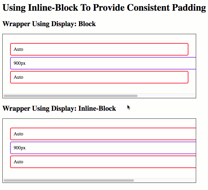
Most of the time, when we create an overflow container, we want to include some sort of inner-padding on that container such that the overflow contents don’t butt-up against the scrollbars or the viewport border. To accomplish this, I usually just put in a “wrapper” div with a padding. And, as long as there is no horizontal scrolling, this works perfectly well.
However, the moment there is horizontal scrolling inside the overflow container, we see two unpleasant effects:
-
Some of the direct descendants of the “wrapper” element are “stuck” at 100% of the overflow container width and do not extend to match the width of the elements that are causing the horizontal scrolling.
-
The right padding of the “wrapper” element does not seem to get applied, allowing the overflow content to butt-up against the right-border of the overflow container.
#html / css #html