An annotated example of how to create a nice Pyplot table

Sometimes, I need to create an image for a document that contains a few rows and columns of data. Like most people, I’ll just use a screen capture to create the image, but this approach doesn’t lend well to automated tasks and requires hand-tweaking to get it ready to present. It’s absurd that I’m working in my Jupyter notebook with Pandas and Matplotlib, and I’m snapping screenshots to capture tables for slide decks and written reports. Matplotlib renders nice graphs. Why not nice, little tables?
One alternative is to generate the report using LaTeX, which has powerful table capabilities. Adopting LaTeX for reporting just to render a little table is overkill and often a yak shave. I’d really like to just use Matplotlib to generate my little grids with nicely centered titles; no extraneous text; a nice, clean border; and maybe a little footer with the date.
Pandas can output decent-looking dataframes within Jupyter notebooks, thanks to Jupyter’s output cell rendering. It can even style these Pandas dataframes using the pandas.Dataframe.style library. The challenge to using these tools to build styled tables is they render the output in HTML. Getting a file into an image format requires workflows that call other external tools, such as [wkhtmltoimage](https://wkhtmltopdf.org/), to translate the HTML to images.
Matplotlib can save charts as images. If you search the Matplotlib documentation, you will find it has a matplotlib.pyplot.table package, which looks promising. It is useful. I used it for this article, in fact. The challenge is that matplotlib.pyplot.table creates tables that often hang beneath stacked bar charts to provide readers insight into the data above. You want to show just the chart and you want the chart to look nice.
The first thing that you’ll probably notice when attempting to use matplotlib.pyplot.table is that the tables are rather ugly and don’t manage vertical cell padding well. Second, if you try to hide the graph to just show the table grid, alignment issues rear their ugly heads and keep you from ever getting the nicely styled little table you aimed for. It takes some work to get the table to look nice, and I will share with you what I learned from doing this work myself.
The Matplotlib Table Example
The Matplotlib pyplot.table example code creates a table, but does not show how to present data with just a simple table. It generates a table used as an extension to a stacked bar chart. If you follow your intuition and only hide the chart, you will have a poorly formatted image, unsuitable for your article or slide presentation.
In this article, I take you step-by-step through the conversion of the example provided by the Matplotlib example writer to some simple table code for your projects. I provide explanation of the changes I made along the way, which should help you make enhancements. I provide the full code at the end of the article.
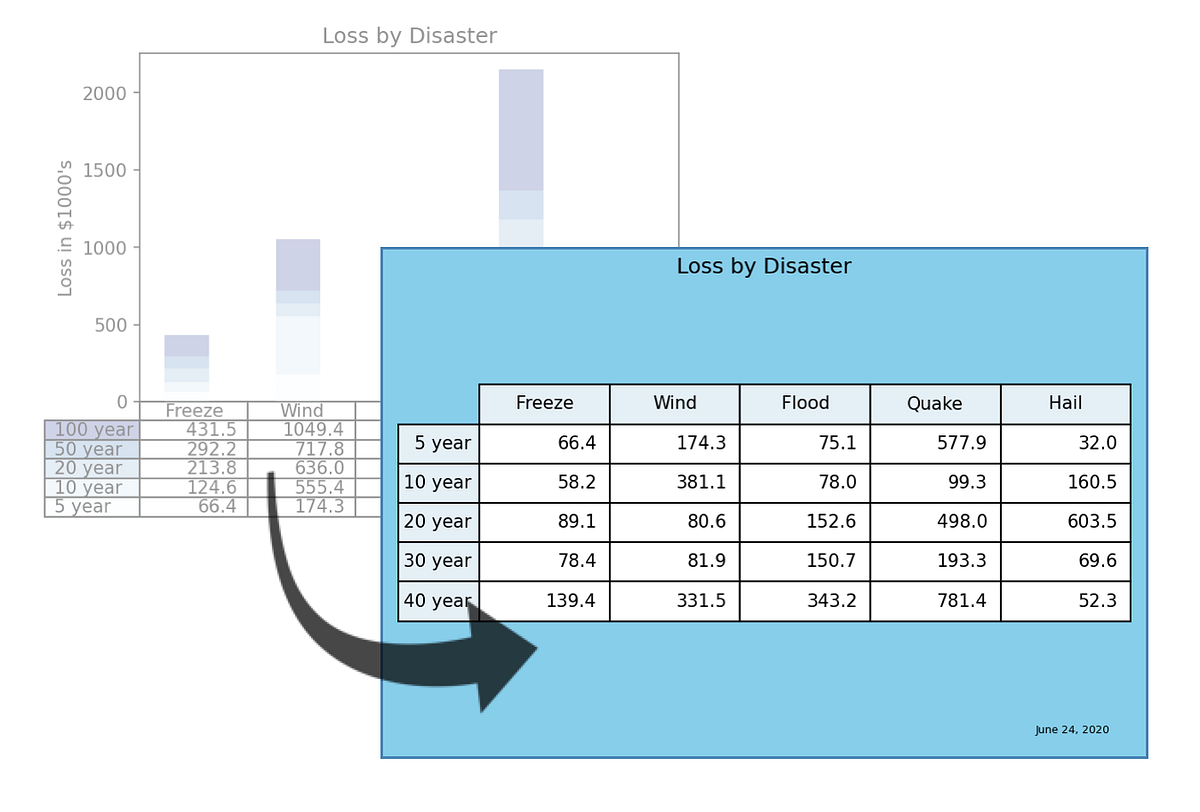
From the example, you can see the table feature is used to display data related to an associated stacked bar graph.
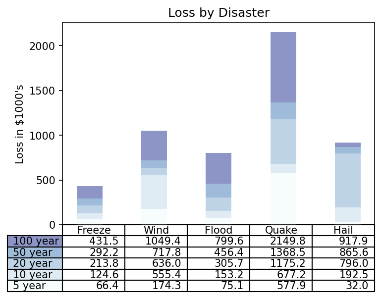
Matplotlib table demo example (Image by author)
Source code for the example (from the Matplotlib Table Demo):
import numpy as np
import matplotlib.pyplot as plt

data = [[ 66386, 174296,  75131, 577908,  32015],
        [ 58230, 381139,  78045,  99308, 160454],
        [ 89135,  80552, 152558, 497981, 603535],
        [ 78415,  81858, 150656, 193263,  69638],
        [139361, 331509, 343164, 781380,  52269]]
columns = ('Freeze', 'Wind', 'Flood', 'Quake', 'Hail')
rows = ['%d year' % x for x in (100, 50, 20, 10, 5)]
values = np.arange(0, 2500, 500)
value_increment = 1000
# Get some pastel shades for the colors
colors = plt.cm.BuPu(np.linspace(0, 0.5, len(rows)))
n_rows = len(data)
index = np.arange(len(columns)) + 0.3
bar_width = 0.4
# Initialize the vertical-offset for the stacked bar chart.
y_offset = np.zeros(len(columns))
# Plot bars and create text labels for the table
cell_text = []
for row in range(n_rows):
    plt.bar(index, data[row], bar_width, bottom=y_offset, color=colors[row])
    y_offset = y_offset + data[row]
    cell_text.append(['%1.1f' % (x / 1000.0) for x in y_offset])
# Reverse colors and text labels to display the last value at the top.
colors = colors[::-1]
cell_text.reverse()
# Add a table at the bottom of the axes
the_table = plt.table(cellText=cell_text,
                      rowLabels=rows,
                      rowColours=colors,
                      colLabels=columns,
                      loc='bottom')
# Adjust layout to make room for the table:
plt.subplots_adjust(left=0.2, bottom=0.2)
plt.ylabel("Loss in ${0}'s".format(value_increment))
plt.yticks(values * value_increment, ['%d' % val for val in values])
plt.xticks([])
plt.title('Loss by Disaster')
# plt.show()
# Create image. plt.savefig ignores figure edge and face colors, so map them.
fig = plt.gcf()
plt.savefig('pyplot-table-original.png',
            bbox_inches='tight',
            dpi=150
            )
#publishing #visualization #python #matplotlib #data-science