When Apple unveiled iOS 14 at WWDC, its yearly developer conference, the company showed off some big features coming to the iPhone later this year — like widgets that allow users to bring content from inside their apps to the home screen, and picture-in-picture video. Android fans were quick to point out something obvious: Many of the features announced at WWDC have been available for years on their devices, and Apple is playing catch-up.
They aren’t wrong. Widgets have been a part of Android since its inception, allowing users to put weather, clocks, and whatever else they like on their home screens, rather than a sea of app icons. Similarly, picture-in-picture video debuted as a part of Android 8, released in 2017.
While it’s true that many of iOS’ features debut on Android in some form first, those same critics are missing a key point: Apple may be late to the game, but they’ll likely do a much better job of integrating these features into their products than the competition. I switched to Android a few years ago when Google released the Pixel because I was tired of waiting for some of these features, but after this year’s event, I find myself envious of the level of polish in Apple’s latest update.
Google often releases features years ahead of the competition, but the company commonly fails to encourage developers to use it, or worse, doesn’t create a set of rules or expectations around how it should be used by developers. Take widgets, for instance. Android has had widgets since its inception, but they’re a chaotic mess: There’s no enforcement of any design aesthetic or simple rules, making for an inconsistent experience. Even different widgets made by different Google product teams don’t match up in size or layout, or use a consistent style.
While Google has made leaps and bounds in making its visual design more consistent since the debut of the material design language, its hands-off approach hasn’t translated to any improvements for widgets. Widgets on Android might be functional, and provide flexibility to surface information, but they’re sloppy.
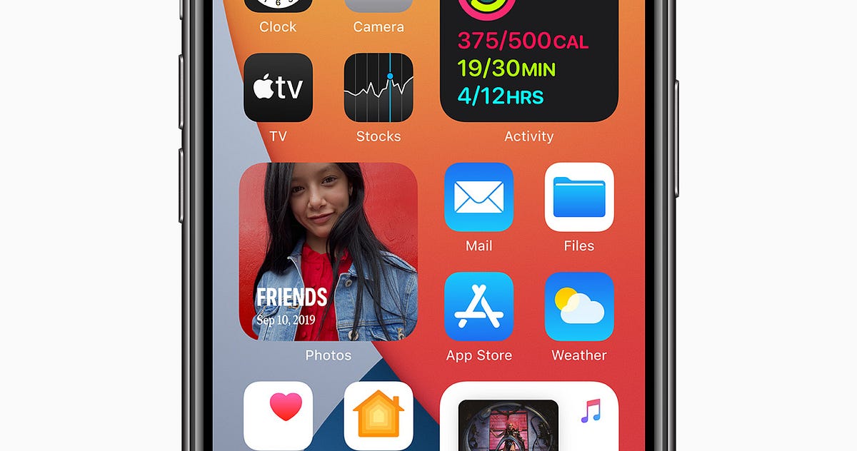
Widgets on iOS 14, by contrast, are predictable and consistent, complementing the grid of app icons rather than allowing a freeform place for developers to dump information into. Apple provides a set of only three sizing options (small, medium, or large) and suggests developers build dynamic, “delightful” widgets that do more than just open an app. Providing these limitations means that the experience will be consistent, regardless of who develops them.
#apple #widget #debugger #ios-14 #design