Giving your users a way to customise the interface to their preference is a huge win for user experience. Here we are going to provide the user with a simple switch to toggle between dark mode and light mode and we will also try to remember their preference for future visits.
Let’s begin!
If you don’t have a website of your own to which you wish to add this functionality, use this demo website to follow along.
Adding the CSS
We will be adding CSS custom properties also known as CSS variables, which we can reference and modify throughout the document. If you wish to read more about custom properties you can read on MDN.
Here’s the tldr; version -
Custom properties (sometimes referred to as CSS variables or cascading variables) are entities defined by CSS authors that contain specific values to be reused throughout a document. They are set using custom property notation (e.g., --main-color: black;) and are accessed using the var() function (e.g., color: var(–main-color);)
First, we’ll add our light or default mode css variables to the :root pseudo class. It matches with the root element in your document tree, generally the <html> tag. We will use :root because we want to avail the variables globally.
:root {
    --primary-color: #302AE6;
    --secondary-color: #536390;
    --font-color: #424242;
    --bg-color: #fff;
    --heading-color: #292922;
}
Second, we’ll add our dark mode css variables.
[data-theme=“dark”] {

–primary-color: #9A97F3;

–secondary-color: #818cab;

–font-color: #e1e1ff;

–bg-color: #161625;

–heading-color: #818cab;

}
What is [data-theme=“dark”]? This means we are referencing a data attribute called data-theme with a value “dark”. We will find the use of it in a while.
Then, we can reference these variables in our stylesheets like so-
body {

background-color: var(–bg-color);

color: var(–font-color);
/*other styles*/
.....

}
h1 {

color: var(–secondary-color);
/*other styles*/
.....

}
a {

color: var(–primary-color);
/*other styles*/
.....

}
Adding the HTML “toggle switch markup”
This is essentially just a checkbox, however we will add some additional markup to style like a toggle switch. I referenced the styles from this codepen.
<div class=“theme-switch-wrapper”>
<label class=“theme-switch” for=“checkbox”>
<input type=“checkbox” id=“checkbox” />
<div class=“slider round”></div>
</label>
<em>Enable Dark Mode!</em>
</div>/Simple css to style it like a toggle switch/
.theme-switch-wrapper {
display: flex;
align-items: center;em {
margin-left: 10px;
font-size: 1rem;
}
}
.theme-switch {
display: inline-block;
height: 34px;
position: relative;
width: 60px;
}.theme-switch input {
display:none;
}.slider {
background-color: #ccc;
bottom: 0;
cursor: pointer;
left: 0;
position: absolute;
right: 0;
top: 0;
transition: .4s;
}.slider:before {
background-color: #fff;
bottom: 4px;
content: “”;
height: 26px;
left: 4px;
position: absolute;
transition: .4s;
width: 26px;
}input:checked + .slider {
background-color: #66bb6a;
}input:checked + .slider:before {
transform: translateX(26px);
}.slider.round {
border-radius: 34px;
}.slider.round:before {
border-radius: 50%;
}
Adding the JavaScript
The final part is to add the bit of JavaScript to tie it all together.
We have 3 tasks in hand-
- Add event handlers to handle accordingly the check/uncheck event of toggle-switch
- Store the user preference for future visits
- Check for saved user preference, if any, on load of the website
Adding the event handlers
const toggleSwitch = document.querySelector(‘.theme-switch input[type=“checkbox”]’);function switchTheme(e) {
if (e.target.checked) {
document.documentElement.setAttribute(‘data-theme’, ‘dark’);
}
else {
document.documentElement.setAttribute(‘data-theme’, ‘light’);
}
}toggleSwitch.addEventListener(‘change’, switchTheme, false);
Remember, the data-theme attribute we referenced in CSS above, this is where it’s getting added to our root element.
Store the user preference for future visits
We will use browser’s localStorage to store the user preference.
Let’s modify our switchTheme function -
function switchTheme(e) {

if (e.target.checked) {

document.documentElement.setAttribute(‘data-theme’, ‘dark’);

localStorage.setItem(‘theme’, ‘dark’); //add this

}

else {

document.documentElement.setAttribute(‘data-theme’, ‘light’);

localStorage.setItem(‘theme’, ‘light’); //add this

}

}
Check for saved user preference, if any, on load of the website
We will check if the theme preference is saved, if yes then we will, accordingly-
- set our
data-themeattribute - check/uncheck our toggle-switch checkbox
const currentTheme = localStorage.getItem(‘theme’) ? localStorage.getItem(‘theme’) : null;if (currentTheme) {
document.documentElement.setAttribute(‘data-theme’, currentTheme);if (currentTheme === 'dark') { toggleSwitch.checked = true; }}
That’s it! Check out the full demo below.
I recently added this to [my website](https://ananyaneogi.com), so check that out as well, maybe!Pro-Tip: How to decide on the color scheme?
My suggestion is to stay in the same spectrum of your primary or brand color and generate a palette out of it. Use the darkest shade from the palette as the background color and the lighter shades as font colors when in dark mode. I used this color shades generator for generating my color palette.
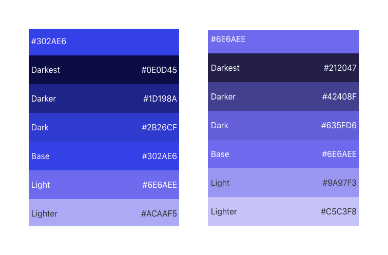
Even if you don’t end up using the exact colors generated, it is still a good place to start. Even I ended up fine tuning the colors I ultimately used.
Originally published by Ananya Neogi at https://dev.to/ananyaneogi/create-a-dark-light-mode-switch-with-css-variables-34l8
Follow great articles on Twitter
Learn More
☞ Build Responsive Real World Websites with HTML5 and CSS3
☞ Web Design for Beginners: Real World Coding in HTML & CSS
☞ Beginner Full Stack Web Development: HTML, CSS, React & Node
☞ The Complete HTML & CSS Course - From Novice To Professional
☞ CSS - The Complete Guide (incl. Flexbox, Grid & Sass)
☞ The Complete Sass & SCSS Course: From Beginner to Advanced
#css #html