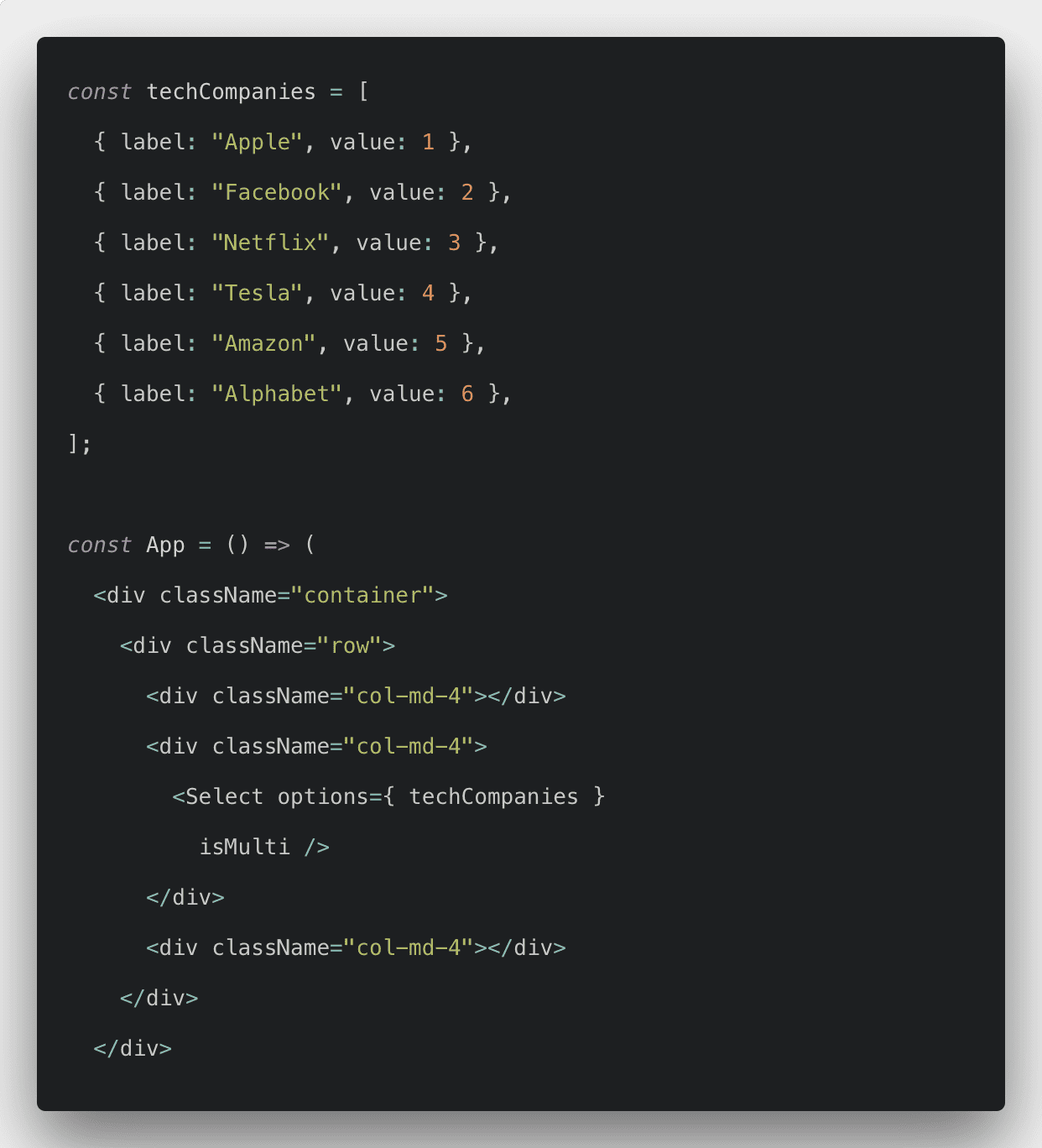
You can use the third-party library like react-select or Building a custom dropdown menu component in React. A dropdown menu consists of four essential components:
- **header **wrapping
- header title
- **list **wrapping
- list items
What is Dropdown
Dropdowns are toggleable, contextual overlays for displaying lists of links, and more. Like overlays, Dropdowns are built using a third-party library Popper.js, which provides dynamic positioning and viewport detection.
The** drop-down menu** is a menu that offers a list of options. The title of the menu, or the currently-selected item in the list, is always displayed. When the visible item is clicked, other items from the list “drop-down” into view and the user can choose from those options.
The basic HTML for Bootstrap Dropdown is the following.
<div class="dropdown show">
  <a class="btn btn-secondary dropdown-toggle" href="#" role="button" id="dropdownMenuLink" data-toggle="dropdown" aria-haspopup="true" aria-expanded="false">
    Dropdown link
  </a>

  <div class="dropdown-menu" aria-labelledby="dropdownMenuLink">
    <a class="dropdown-item" href="#">Action</a>
    <a class="dropdown-item" href="#">Another action</a>
    <a class="dropdown-item" href="#">Something else here</a>
  </div>
</div>
#react
3.05 GEEK