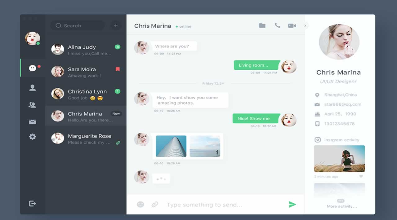
In this article we are going to focus on building a basic sidebar, and the main chat window inside our chat shell. See below.

Chat shell with a fixed width sidebar and expanded chat window
This is the second article in this series. You can check out the previous articlefor setting up the shell OR you can just** **check out the **chat-shell **branch from the following repository.
https://github.com/lyraddigital/flexbox-chat-app.git
Open up the chat.html file. You should have the following HTML.
<!DOCTYPE html>
<html>
<head>
    <meta charset="utf-8" />
    <title>Chat App</title>
    <link rel="stylesheet" type="text/css" media="screen" href="css/chat.css" />
</head>
<body>
    <div id="chat-container">
    </div>
</body>
</html>
Now inside of the **chat-container div **add the following HTML.
<div id="side-bar">
</div>
<div id="chat-window">
</div>
Now let’s also add the following CSS under the #chat-container selector in the chat.css file.
#side-bar {
    background: #0048AA;
    border-radius: 10px 0 0 10px;
}
#chat-window {
    background: #999;
    border-radius: 0 10px 10px 0;
}
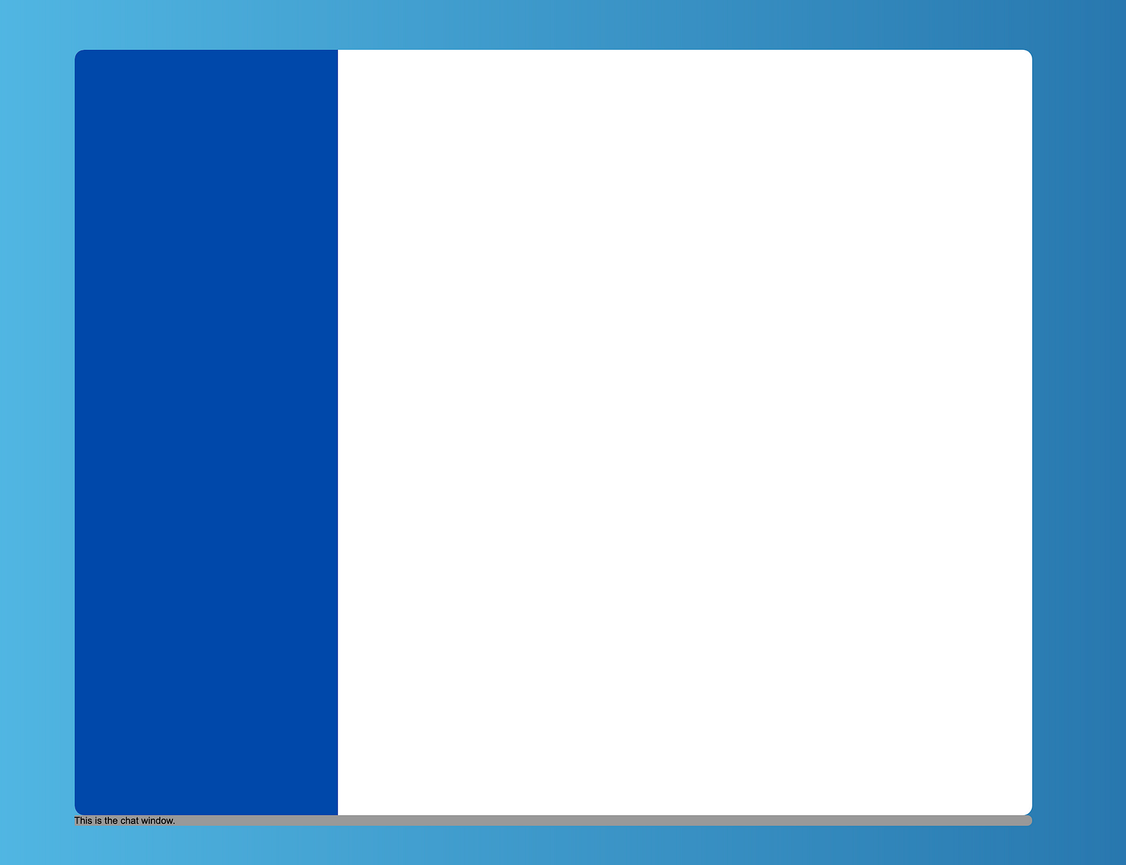
Now reload the page. You should see the following:-

Chat shell with sidebar and chat window before sizing
So what happened? Where is our sidebar and where is our chat window? I expected to see a blue side bar and a grey chat window, but it’s no where to be found. Well it’s all good. This is because we have no content inside of either element, so it can be 0 pixels wide.
Sizing Flex Items
So now that we know that our items are 0 pixels wide, let’s attempt to size them. We’ll attempt to try this first using explicit widths.
Add the following width property to the #side-bar rule, then reload the page.
width: 275px;
Hmm. Same result. It’s still a blank shell. Oh wait I have to make sure the height is 100% too. So we better do that too. Once again add the following property to the #side-bar rule, then reload the page.
height: 100%;

Side bar with explicit width and height set
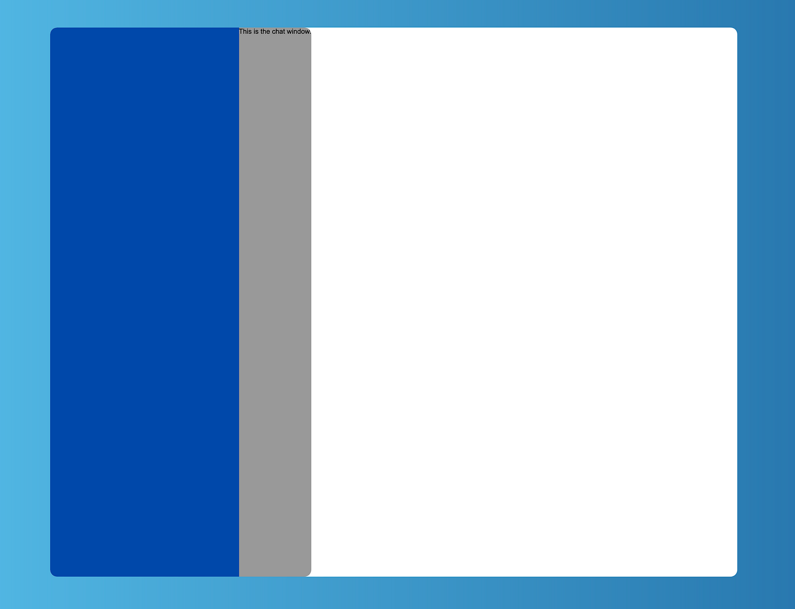
So now we have our sidebar that has grown to be exactly 275 pixels wide, and is 100% high. So that’s it. We’re done right? Wrong. Let me ask you a question. How big is the chat window? Let’s test that by adding some text to it. Try this yourself just add some text. You should see something similar to this.
Chat window is not where we expect it to be.
So as you can see the chat window is only as big as the text that’s inside of it, and it is not next to the side bar. And this makes sense because up until now the chat shell is not a flex container, and just a regular block level element.
So let’s make our chat shell a flex container. Set the following display property for the **#chat-window selector. **Then reload the page.
display: flex;
Chat window is in the right place, but wrong size
So as you can see by the above illustration, we can see it’s now next to the side bar, and not below it. But as you can see currently it’s only as wide as the text that’s inside of it.
But we want it to take up the remaining space of the chat shell. Well we know how to do this, as we did it in the previous article. Set the **flex-grow property to 1 **on the #chat-window selector. Basically copy and paste the property below and reload the page.
flex-grow: 1;

Chat shell with chat window that has grown
So now we have the chat window taking up the remaining space of the chat shell. Next, let’s remove the background property, and also remove all text inside the chat-window div if any still exists. You should now see the result below.
Final output — With explicit width and height for the side bar
But are we done? Technically yes, but before we move on, let’s improve things a little bit.
Understanding the default alignment
If you remember, before we had defined our chat shell to be a flex container, we had to make sure we set the height of the side bar to be 100%. Otherwise it was 0 pixels high, and as a result nothing was displayed. With that said, try removing the height property from the #side-bar selector and see what happens when you reload the page. Yes that’s right, it still works. The height of the sidebar is still 100% high.
So what happened here? Why do we no longer have to worry about setting the height to 100%? Well this is one of the cool things Flexbox gives you for free. By default every flex item will **stretch **vertically to fill in the entire height of the flex container. We can in fact change this behaviour, and we will see how this is done in a future article.
Setting the size of the side bar properly
So another feature of Flexbox is being able to set the size of a flex item by using the flex-basis property. The flex-basis property allows you to specify an initial size of a flex item, before any growing or shrinking takes place. We’ll understand more about this in an upcoming article.
For now I just want you to understand one important thing. And that is using width to specify the size of the sidebar is not a good idea. Let’s see why.
Say that potentially, if the screen is mobile we want the side bar to now appear across the top of the chat shell, acting like a top bar instead. We can do this by changing the direction flex items can flex inside a flex container. For example, add the following CSS to the #chat-container selector. Then reload the page.
flex-direction: column;
Sidebar gone — It’s 0 pixels high when using column direction
So as you can see we are back to a blank shell. So firstly let’s understand what we actually did here. By setting the flex-direction property to column, we changed the direction of how the flex items flex. By default flex items will flex from left to right. However when we set flex-direction to column, it changes this behaviour forcing flex items to flex from top to bottom instead. On top of this, when the direction of flex changes, the sizing and alignment of flex items changes as well.
When flexing from left to right, we get a height of 100% for free as already mentioned, and then we made sure the side bar was set to be 275 pixels wide, by setting the width property.
However now that we a flexing from top to bottom, the width of the flex item by default would be 100% wide, and you would need to specify the height instead. So try this. Add the following property to the #side-bar selector to set the height of the side bar. Then reload the page.
height: 275px;

Sidebar with a fixed width and height
Now we are seeing the side bar again, as we gave it a fixed height too. But we still have that fixed width. That’s not what we wanted. We want the side bar (ie our new top bar) here to now be 100% wide. Comment out the width for a moment and reload the page again.

Sidebar rotated to now be on top
So now we were able to move our side bar so it appears on top instead, acting like a top bar. Which as previously mentioned might be suited for mobile device widths. But to do this we had to swap the value of width to be the value of height. Wouldn’t it be great if this size was preserved regardless of which direction our items are flexing.
Try this, remove all widths and height properties from the #side-bar selectorand write the following instead. Then reload the page.
flex-basis: 275px;
As you can see we get the same result. Now remove the **flex-direction property from the #chat-container selector. **Then once again reload the page.

Final output using flex-basis property
Once again we are back to our final output. But now we also have the flexibility to easily change the side bar to be a top bar if we need to, by just changing the direction items can flow. Regardless of the direction of flex, the size of our side bar / top bar is preserved.
Conclusion
Ok so once again we didn’t build much, but we did cover a lot of concepts about Flexbox around sizing. We will cover more concepts in the next article where we layout out the elements in our side bar.
#web-development #user-experience