In this article, I’ll present another machine learning walk-through in Python and also leave you with a challenge: try to develop a better solution (some helpful tips are included)!
Don’t just read about machine learning — practice it!
After spending considerable time and money on courses, books, and videos, I’ve arrived at one conclusion: the most effective way to learn data science is by doing data science projects. Reading, listening, and taking notes is valuable, but it’s not until you work through a problem that concepts solidify from abstractions into tools you feel confident using.
In this article, I’ll present another machine learning walk-through in Python and also leave you with a challenge: try to develop a better solution (some helpful tips are included)! The complete Jupyter Notebook for this project can be run on Kaggle — no download required — or accessed on GitHub.
Problem Statement
The New York City Taxi Fare prediction challenge, currently running on Kaggle, is a *supervised regression *machine learning task. Given pickup and dropoff locations, the pickup timestamp, and the passenger count, the objective is to predict the fare of the taxi ride. Like most Kaggle competitions, this problem isn’t 100% reflective of those in industry, but it does present a realistic dataset and task on which we can hone our machine learning skills.
To solve this problem, we’ll follow a standard data science pipeline plan of attack:
- Understand the problem and data
- Data exploration / data cleaning
- Feature engineering / feature selection
- Model evaluation and selection
- Model optimization
- Interpretation of results and predictions
This outline may seem to present a linear path from start to finish, but data science is a highly non-linear process where steps are repeated or completed out of order. As we gain familiarity with the data, we often want to go back and revisit our past decisions or take a new approach.
While the final Jupyter Notebook may present a cohesive story, the development process is very messy, involving rewriting code and changing earlier decisions.
Throughout the article, I’ll point out a number of areas in which I think an enterprising data scientist — you — could improve on my solution. I have labeled these *potential improvements *because as a largely empirical field, there are no guarantees in machine learning.
New York City Taxi Fare Prediction Challenge (Link)
Getting Started
The Taxi Fare dataset is relatively large at 55 million training rows, but simple to understand, with only 6 features. The fare_amount is the target, the continuous value we’ll train a model to predict:
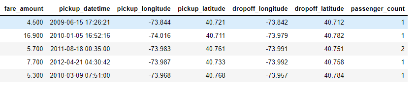
Training Data
Throughout the notebook, I used only a sample of 5,000,000 rows to make the calculations quicker. My first recommendation thus is:
- Potential improvement 1: use more data for training the model
It’s not assured that larger quantities of data will help, but empirical studies have found that generally, as the amount of data used for training a model increases, performance increases. A model trained on more data can better learn the actual signals, especially in a high-dimensional problem with a large number of features (this is not a high-dimensional dataset so there could be limited returns to using more data).
While the sheer size of the dataset may be intimidating, frameworks such as Dask allow you to handle even massive datasets on a personal laptop. Moreover, learning how to set-up and use cloud computing, such as Amazon ECS, is a vital skill once the data exceeds the capability of your machine.
Fortunately, it doesn’t take much research to understand this data: most of us have taken taxi rides before and we know that taxis charge based on miles driven. Therefore for feature engineering, we’ll want to find a way to represent the distance traveled based on the information we are given. We can also read notebooks from other data scientists or read through the competition discussion for ideas about how to solve the problem.
Data Exploration and Cleaning
Although Kaggle data is usually cleaner than real-world data, this dataset still has a few problems, namely anomalies in several of the features. I like to carry out data cleaning as part of the exploration process, correcting anomalies or data errors as I find them. For this problem, we can spot outliers by looking at statistics of the data using df.describe().
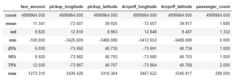
Statistical description of training data
The anomalies in passenger_count, the coordinates, and the fare_amount were addressed through a combination of domain knowledge and looking at the distribution of the data. For example, reading about taxi fares in NYC, we see that the minimum fare amount is $2.50 which means we should exclude some of the rides based on the fare. For the coordinates, we can look at the distribution and exclude values that fall well outside the norm. Once we’ve identified outliers, we can remove them using code like the following:
# Remove latitude and longtiude outliers
data = data.loc[data['pickup_latitude'].between(40, 42)]
data = data.loc[data['pickup_longitude'].between(-75, -72)]
data = data.loc[data['dropoff_latitude'].between(40, 42)]
data = data.loc[data['dropoff_longitude'].between(-75, -72)]
Once we clean the data, we can get to the fun part: visualization. Below is a plot of the pickup and dropoff locations on top of NYC colored by the binned fare (binning is a way of turning a continuous variable into a discrete one).
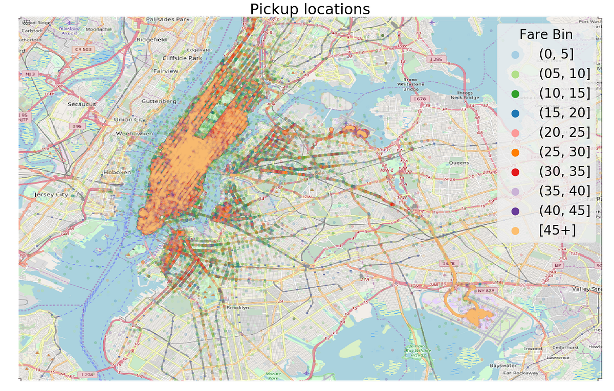
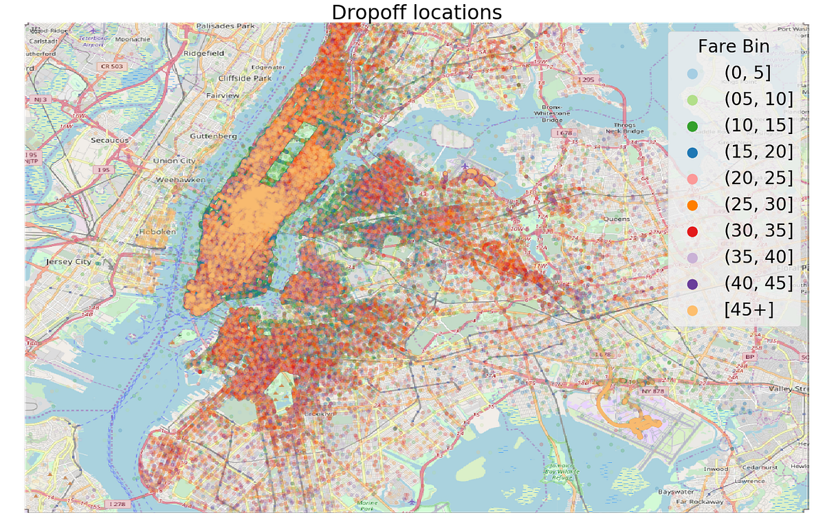
Pickups and Dropoffs plotted on New York City
We also want to take a look at the target variable. Following is an Empirical Cumulative Distribution Function (ECDF) plot of the Target variable, the fare amount. The ECDF can be a better visualization choice than a histogram for one variable because it doesn’t have artifacts from binning.
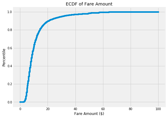
ECDF of Target
Besides being interesting to look at, plots can help us identify anomalies, relationships, or ideas for new features. In the maps, the color represents the fare, and we can see that the fares starting or ending at the airport (bottom right) tend to be among the most expensive. Going back to the domain knowledge, we read the standard fare for rides to JFK airport is $45, so if we could find a way to identify airport rides, then we’d know the fare accurately.
While I didn’t go that far in this notebook, using domain knowledge for data cleaning and feature engineering is extremely valuable. My second recommendation for improvement is:
- Potential improvement 1: use more data for training the model
This can be done with domain knowledge (such as a map), or statistical methods (such as z-scores). One interesting approach to this problem is in this notebook, where the author removed rides that began or ended in the water.
The inclusion / exclusion of outliers can have a significant effect on model performance. However, like most problems in machine learning, there’s no standard approach (here’s one statistical method in Python you could try).
Feature Engineering
Feature engineering is the process of creating new features — predictor variables — out of an existing dataset. Because a machine learning model can only learn from the features it is given, this is the most important step of the machine learning pipeline.
For datasets with multiple tables and relationships between the tables, we’ll probably want to use automated feature engineering, but because this problem has a relatively small number of columns and only one table, we can hand-build a few high-value features.
For example, since we know that the cost of a taxi ride is proportional to the distance, we’ll want to use the start and stop points to try and find the distance traveled. One rough approximation of distance is the absolute value of the difference between the start and end latitudes and longitudes.
# Absolute difference in latitude and longitude
data['abs_lat_diff'] = (data['dropoff_latitude'] - data['pickup_latitude']).abs()
data['abs_lon_diff'] = (data['dropoff_longitude'] - data['pickup_longitude']).abs()
Features don’t have to be complex to be useful! Below is a plot of these new features colored by the binned fare.
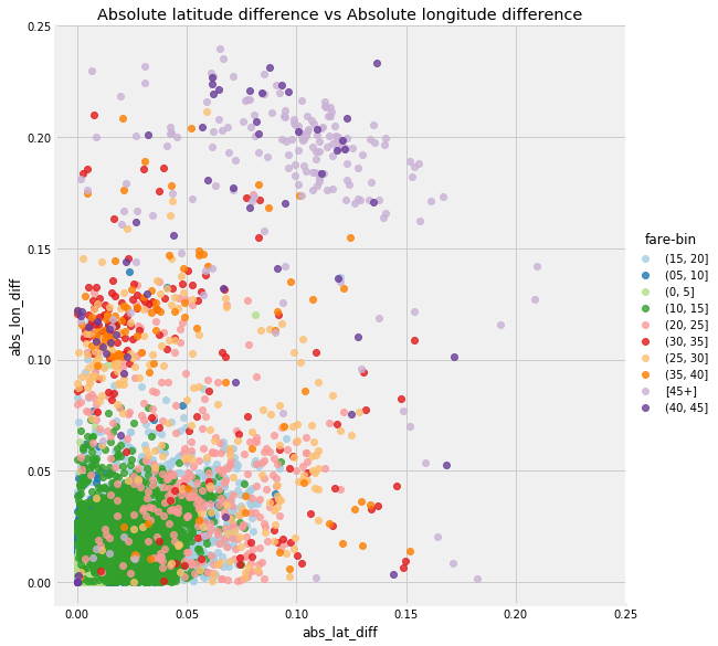
Absolute Longitude vs Absolute Latitude
What these features give us is a *relative *measure of distance because they are calculated in terms of latitude and longitude and not an actual metric. These features are useful for comparison, but if we want a measurement in kilometers, we can apply the Haversine formula between the start and end of the trip, which calculates the Great Circle distance. This is still an approximation because it gives distance along a line drawn on the spherical surface of the Earth (I’m told the Earth is a sphere) connecting the two points, and clearly, taxis do not travel along straight lines. (See notebook for details).
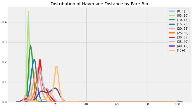
Haversine distance by Fare (binned)
The other major source of features for this problem are time based. Given a date and time, there are numerous new variables we can extract. Constructing time features is a common task, and in the notebook I’ve included a useful function that builds a dozen features from a single timestamp.
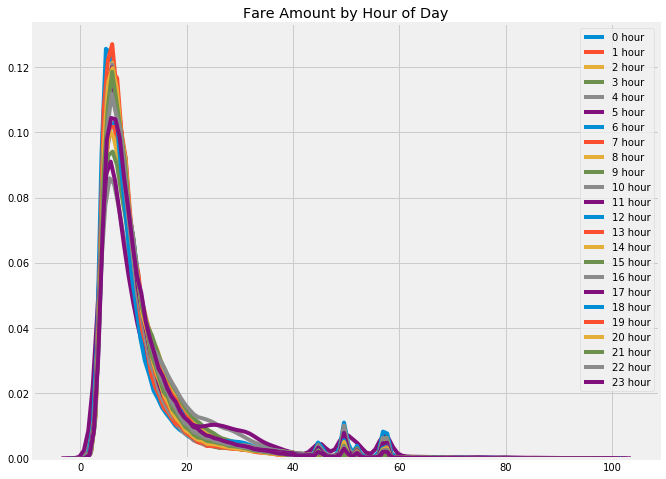
Fare amount colored by time of day
Although I built almost 20 features in this project, there are still more to be found. The tough part about feature engineering is you never know when you have fully exhausted all the options. My next recommendation is:
- Potential improvement 1: use more data for training the model
Feature engineering also involves problem expertise or applying algorithms that automatically build features for you. After building features, you’ll often have to apply feature selection to find the most relevant ones.
Once you have clean data and a set of features, you start testing models. Even though feature engineering comes before modeling on the outline, I often return to this step again and again over the course of a project.
Model Evaluation and Selection
A good first choice of model for establishing a baseline on a regression task is a simple linear regression. Moreover, if we look at the Pearson correlation of the features with the fare amount for this problem, we find several very strong linear relationships as shown below.
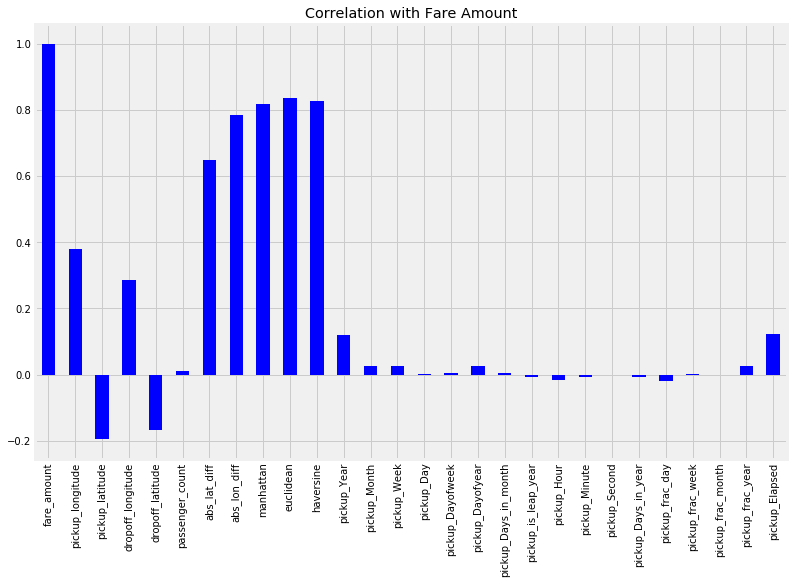
Pearson Correlations of Features with Target
Based on the strength of the linear relationships between some of the features and the target, we can expect a linear model to do reasonably well. While ensemble models and deep neural networks get all the attention, there’s no reason to use an overly complex model if a simple, interpretable model can achieve nearly the same performance. Nonetheless, it still makes sense to try different models, especially because they are easy to build with Scikit-Learn.
The starting model, a linear regression trained on only three features (the abs location differences and the passenger_count) achieved a validation root mean squared error (RMSE) of $5.32 and a mean absolute percentage error of 28.6%. The benefit to a simple linear regression is that we can inspect the coefficients and find for example that an increase in one passenger raises the fare by $0.02 according to the model.
# Linear Regression learned parameters
Intercept 5.0819
abs_lat_diff coef:  113.6661
abs_lon_diff coef: 163.8758
passenger_count coef: 0.0204
For Kaggle competitions, we can evaluate a model using both a validation set — here I used 1,000,000 examples — and by submitting test predictions to the competition. This allows us to compare our model to other data scientists — the linear regression places about 600/800. Ideally, we want to use the test set only once to get an estimate of how well our model will do on new data and perform any optimization using a validation set (or cross validation). The problem with Kaggle is that the leaderboard can encourage competitors to build complex models over-optimized to the testing data.
We also want to compare our model to a naive baseline that uses no machine learning, which in the case of regression can be guessing the mean value of the target on the training set. This results in an RMSE of $9.35 which gives us confidence machine learning is applicable to the problem.
Even training the linear regression on additional features does not result in a great leaderboard score and the next step is to try a more complex model. My next choice is usually the random forest, which is where I turned in this problem. The random forest is a more flexible model than the linear regression which means it has a reduced bias — it can fit the training data better. The random forest also generally has low variance meaning it can generalize to new data. For this problem, the random forest outperforms the linear regression, achieving a $4.20 validation RMSE on the same feature set.
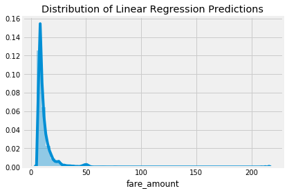
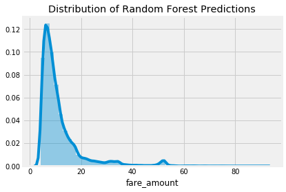
Test Set Prediction Distributions
The reason a random forest typically outperforms a linear regression is because it has more flexibility — lower bias — and it has reduced variance because it combines together the predictions of many decision trees. A linear regression is a simple method and as such has a high bias — it assumes the data is linear. A linear regression can also be highly influenced by outliers because it solves for the fit with the lowest sum of squared errors.
The choice of model (and hyperparameters) represents the bias-variance tradeoff in machine learning: a model with high bias cannot learn even the training data accurately while a model with high variance essentially memorizes the training data and cannot generalize to new examples. Because the goal of machine learning is to generalize to new data, we want a model with both low bias and low variance.
The best model on one problem won’t necessarily be the best model on all problems, so it’s important to investigate several models spanning the range of complexity. Every model should be evaluated using the validation data and the best performing model can then be optimized in model tuning. I selected the random forest because of the validation results, and I’d encourage you to try out a few other models (or even combine models in an ensemble).
Model Optimization
In a machine learning problem, we have a few approaches for improving performance:
- Understand the problem and data
- Data exploration / data cleaning
- Feature engineering / feature selection
- Model evaluation and selection
- Model optimization
- Interpretation of results and predictions
There are still gains to be made from 1. and 2. (that’s part of the challenge), but I also wanted to provide a framework for optimizing the selected model.
Model optimization is the process of finding the best hyperparameters for a model on a given dataset. Because the best values of the hyperparameters depend on the data, this has to be done again for each new problem.
While the final Jupyter Notebook may present a cohesive story, the development process is very messy, involving rewriting code and changing earlier decisions.
There are a number of methods for optimization, ranging from manual tuning to automated hyperparameter tuning, but in practice, random search works well and is simple to implement. In the notebook, I provide code for running random search for model optimization. To make the computation times reasonable, I again sampled the data and only ran 50 iterations. Even this takes a considerable amount of time because the hyperparameters are evaluated using 3-fold cross validation. This means on each iteration, the model is trained with a selected combination of hyperparameters 3 times!
The best parameters were
{'n_estimators': 41, 'min_samples_split': 2, 'max_leaf_nodes': 49, 'max_features': 0.5, 'max_depth': 22, 'bootstrap': True}
with a negative mae of -2.0216735083205952
I also tried out a number of different features and found the best model used only 12 of the 27 features. This makes sense because many of the features are highly correlated and hence are not necessary.
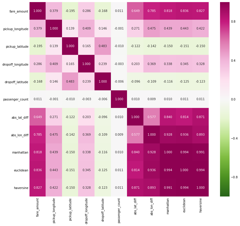
Heatmap of Correlation of Subset of Features
After running the random search and choosing the features, the final random forest model achieved an RMSE of 3.38 which represents a percentage error of 19.0%. This is a 66% reduction in the error from the naive baseline, and a 30% reduction in error from the first linear model. This performance illustrates a critical point in machine learning:
While the final Jupyter Notebook may present a cohesive story, the development process is very messy, involving rewriting code and changing earlier decisions.
Although I ran 50 iterations of random search, the hyperparameter values have probably not been fully optimized. My next recommendation is:
- Potential improvement 1: use more data for training the model
The returns from this will probably be less than from feature engineering, but it’s possible there are still performance gains to be found. If you are feeling up to the task, you can also try out automated model tuning using a tool such as Hyperopt (I’ve written a guide which can be found here.)
Interpret Model and Make Predictions
While the random forest is more complex than the linear regression, it’s not a complete black box. A random forest is made up of an ensemble of decision trees which by themselves are very intuitive flow-chart-like models. We can even inspect individual trees in the forest to get a sense of how they make decisions. Another method for peering into the black box of the random forest is by examining the feature importances. The technical details aren’t that important at the moment, but we can use the relative values to determine which features are considered relevant to the model.
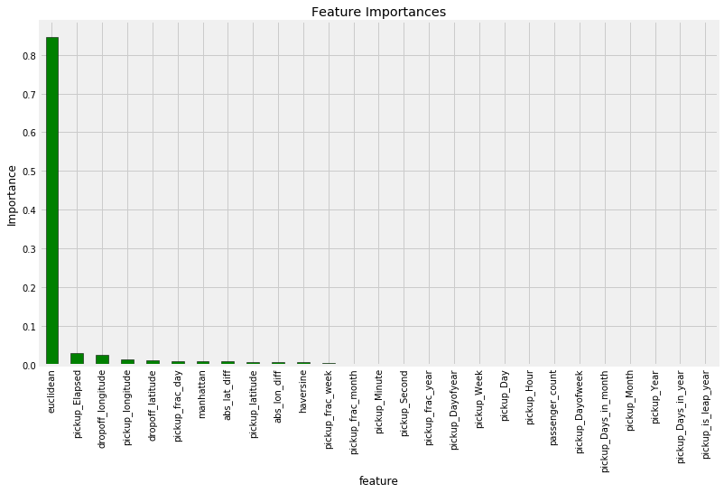
Feature Importances from training on all features
The most important feature by far is the Euclidean distance of the taxi ride, followed by the pickup_Elapsed , one of the time variables. Given that we made both of these features, we should be confident that our feature engineering went to good use! We could also feature importances for feature engineering or selection since we do not need to keep all of the variables.
Finally, we can take a look at the model predictions both on the validation data and on the test data. Because we have the validation answers, we can compute the error of the predictions, and we can examine the testing predictions for extreme values (there were several in the linear regression). Below is a plot of the validation predictions for the final model.
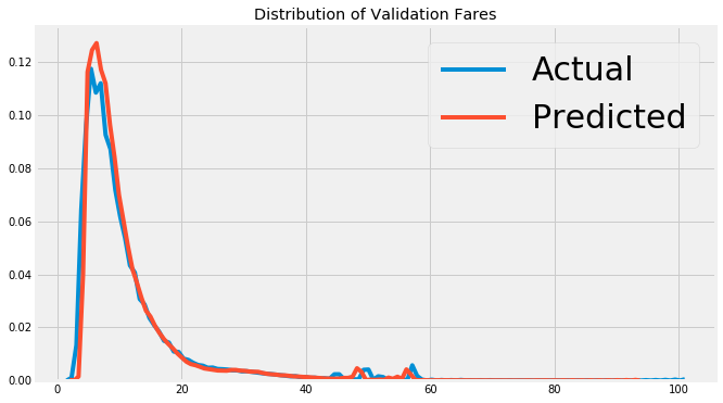
Random Forest validation predictions and true values.
Model interpretation is still a relatively new field, but there are some promising methods for examining a model. While the primary goal of machine learning is making accurate predictions on new data, it’s also equally important to know *why *the model is accurate and if it can teach us anything about the problem.
Conclusions
In this article and accompanying Jupyter Notebook, I presented a complete machine learning walk-through on a realistic dataset. We implemented the solution in Python code, and touched on many key concepts in machine learning. Machine learning is not a magical art, but rather a craft that can be honed through repetition. There is nothing stopping anyone from learning how to solve real-world problems using machine learning, and the most effective method for becoming adept is to work through projects.
In the spirit of learn by doing, my challenge to you is to improve upon my best model in the notebook and I’ve left you with a few recommendations that I believe will improve performance. There’s no one right answer in data science, and I look forward to seeing what everyone can come up with! If you take on the challenge, please leave a link to your notebook in the comments. Hopefully this article and notebook have given you the start necessary to get out there and solve this problem or others. And, when you do need help, don’t hesitate to ask because the data science community is always supportive.
#machine-learning #data-science #python