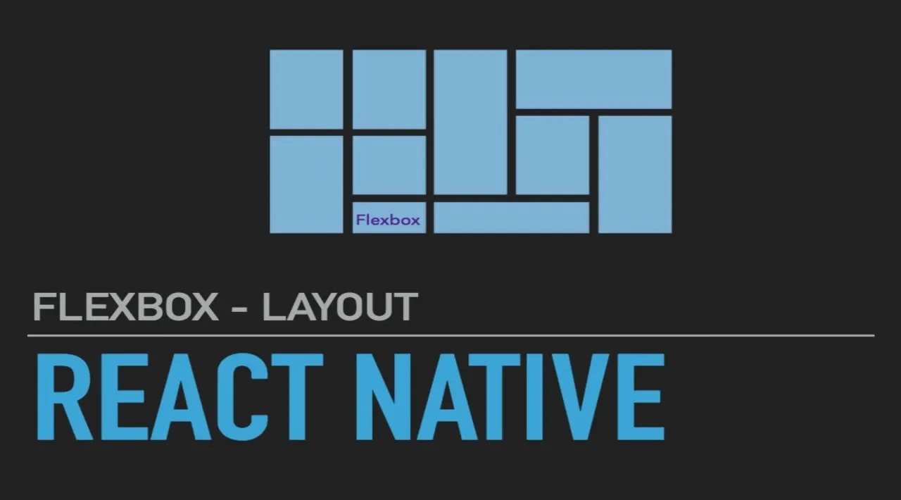
Developing a mobile app in React Native? Use Flexbox, a CSS tool that enables you to build layouts to fit multiple screen sizes.
If you have a web design and/or development background, you may be familiar with Flexbox. It’s an opt-in CSS tool that enables you to build layouts based on columns and rows.
In React Native, this is the default way to build layouts. It works wonderfully for mobile development because it allows us to build layouts that fit multiple screen sizes, thanks to responsive design.
#react-native #css
7.20 GEEK