In this tutorial, I would like to introduce a very cool Python hand-painted style visualization package: cutecharts.
Different from the common charts such as Matplotlib and seaborn, this package can be used to generate the following kinds of charts that look like hand drawn, and the effect may be better in some scenarios. Cute charts are also interactive and dynamic. Whenever the mouse is hovering on the chart, the numbers show up.
To create this chart, you just need a few lines of Python codes.
For now, this library supports five kinds of charts — Bar, Line, Pie, Radar and Scatter. It also supports combination of charts. Let us explore them one by one.
Before we start to draw cute charts, we need to install the cutechart library.
$ pip install cutecharts
Let us use dataset of Toronto temperature to draw bar and line charts.
#import library and data

import cutecharts.charts as ctc
df=pd.DataFrame({
 ‘x’:[‘Sun.’,’Mon.’,’Tue.’,’Wed.’,’Thu.’,’Fri.’,’Sat.’],
 ‘y’:[14,15,17,20,22.3,23.7,24.8],
 ‘z’:[16,16.4,23.6,24.5,19.9,13.6,13.4]})
- Bar Chart
chart = ctc.Bar(‘Toronto Temperature’,width=’500px’,height=’400px’)
chart.set_options(
 labels=list(df[‘x’]),
 x_label='Days',
 y_label='Temperature (Celsius)' ,
 colors=[‘#1EAFAE’ for i in range(len(df))]
 )
chart.add_series('This week',list(df[‘y’]))
chart.render_notebook()
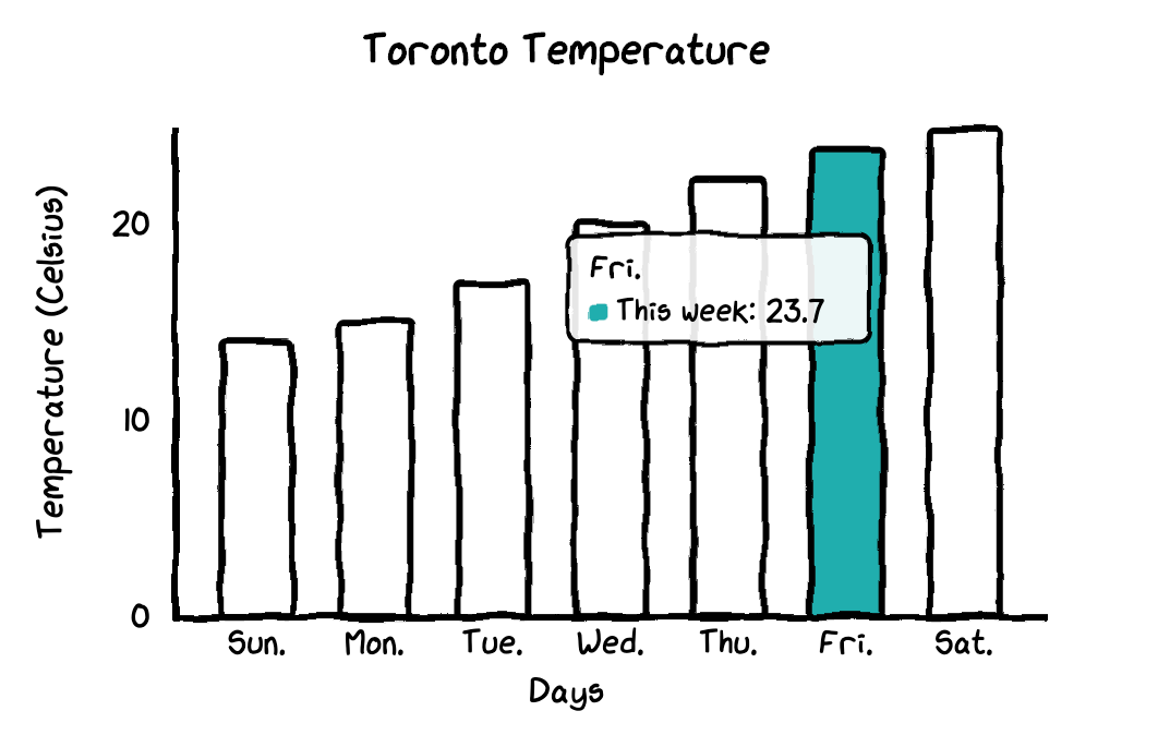
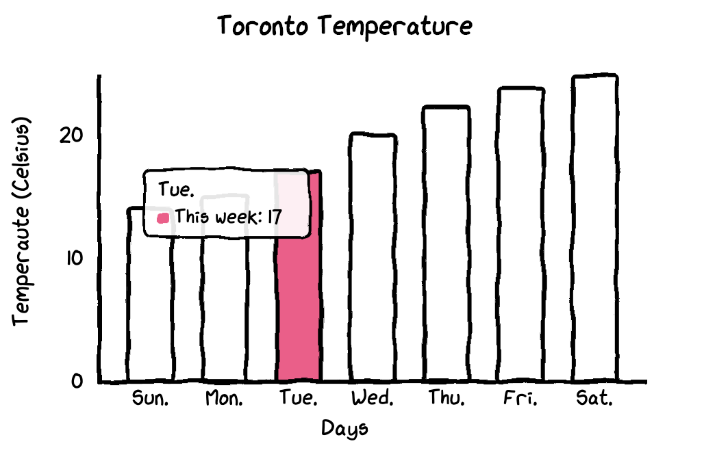
In this bar chart, all bars have the same color. If you would like to customize the colors for each bar, you just need to change one line in the codes.
chart = ctc.Bar(‘title’,width=’500px’,height=’400px’)
chart.set_options(
 labels=list(df[‘x’]),
 x_label=”Days”,
 y_label=”Temperature (Celsius)” ,
 colors=[‘#FFF1C9’,’#F7B7A3',’#EA5F89',’#9B3192',’#57167E’,’#47B39C’,’#00529B’]
 )
chart.add_series(“This week”,list(df[‘y’]))
chart.render_notebook()
2. Line Chart
It makes more sense to draw the line chart for our dataset so that we can see the differences between temperatures of last week and this week.
chart = ctc.Line(“Toronto Temperature”,width=’500px’,height=’400px’)
chart.set_options(
 labels=list(df[‘x’]),
 x_label=”Days”,
 y_label=”Temperature (Celsius)” )
chart.add_series(“This Week”, list(df[‘y’]))
chart.add_series(“Last Week”, list(df[‘z’]))
chart.render_notebook()
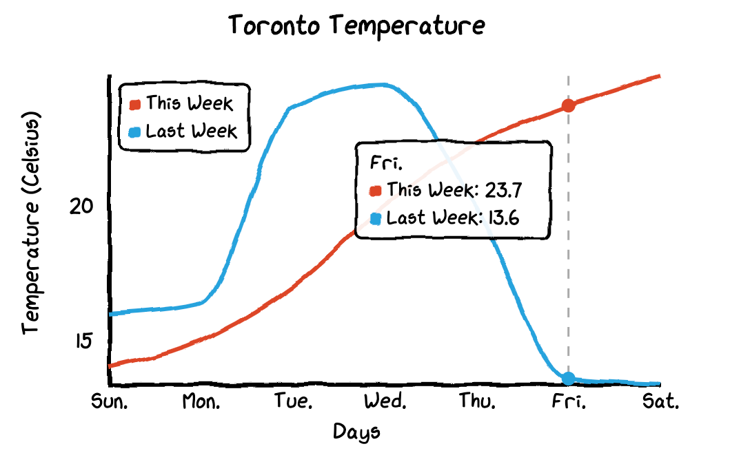
When you hover the mouse on the chart, the chart will automatically show labels with numbers and it also draws a dashed line so that the differences of temperatures between this week and last week become more visualized.
#python #python programming #data #charts