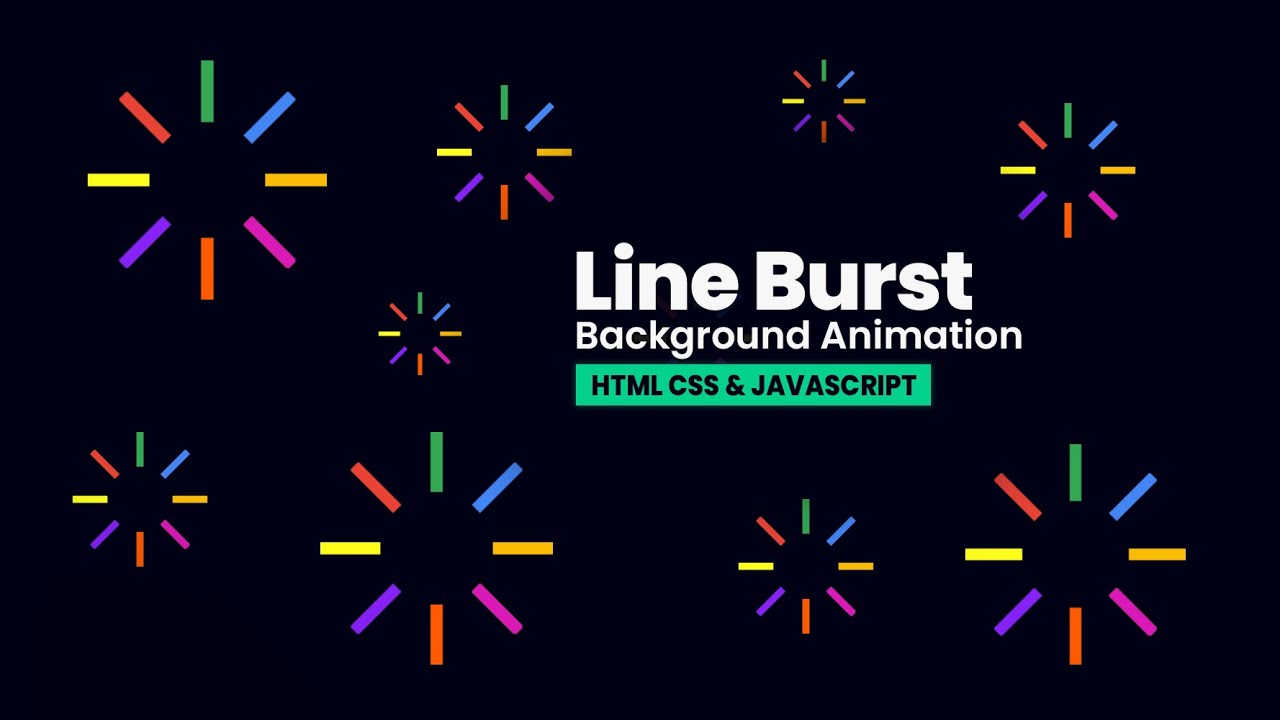
In this video, you will learn how to create an awesome colorful line burst background animation using HTML, CSS and how to clone the line burst animation multiple times with random color lines using Vanilla Javascript.
Subscribe: https://www.youtube.com/channel/UCNDmzGYwwT3rdY3xQuW8QOA
Source code
index.html
<!DOCTYPE html>
<html lang="en" dir="ltr">
	<head>
		<meta charset="utf-8">
		<title>Line Burst Background Animation - Using HTML, CSS & Javascript</title>
		<link rel="stylesheet" href="style.css">
	</head>
	<body>

		<div class="animation-container">
			<div class="burst">
				<div class="line"></div>
				<div class="line"></div>
				<div class="line"></div>
				<div class="line"></div>
				<div class="line"></div>
				<div class="line"></div>
				<div class="line"></div>
				<div class="line"></div>
			</div>
		</div>

		<script type="text/javascript">
		function createBurst(){
			let animContainer = document.querySelector(".animation-container");
			let burst = document.querySelector(".burst");
			let lines = document.querySelectorAll(".line");

			burst.style.top = Math.random() * innerHeight + "px";
			burst.style.left = Math.random() * innerWidth + "px";

			lines.forEach((line) => {
				const colors = ["#ea4335", "#34a853", "#4285f4", "#fbbc05",
												"#dc18b9", "#ff5a00", "#8621f8", "#ffff1b"];
				const randomColor = colors[Math.floor(Math.random() * colors.length)];
				line.style.background = randomColor;
			});

			let burstClone = burst.cloneNode(true);
			animContainer.appendChild(burstClone);

			setTimeout(() => {
				burstClone.remove();
			}, 8000);
		}
		setInterval(createBurst, 200);
		</script>

	</body>
</html>
style.css
 *{
	margin: 0;
	padding: 0;
}

body{
	height: 100vh;
	background: #000115;
	overflow: hidden;
}

.animation-container{
	z-index: 999;
	position: absolute;
	width: 100%;
	height: 100vh;
	display: flex;
	justify-content: center;
	align-items: center;
}

.burst{
	position: absolute;
}

.burst .line{
	position: absolute;
	background: #fff;
	width: 10px;
	height: 50px;
}

.burst .line:nth-child(1){
	animation: move01 1.5s linear infinite;
}

@keyframes move01{
	0%{
		transform: translate(0, 0);
		opacity: 0;
	}
	50%{
		transform: translate(0, -50px);
		opacity: 0.5;
	}
	100%{
		transform: translate(0, -100px);
		opacity: 0;
	}
}

.burst .line:nth-child(2){
	animation: move02 1.5s linear infinite;
}

@keyframes move02{
	0%{
		transform: rotate(45deg) translate(0, 0);
		opacity: 0;
	}
	50%{
		transform: rotate(45deg) translate(0, -50px);
		opacity: 1;
	}
	100%{
		transform: rotate(45deg) translate(0, -100px);
		opacity: 0;
	}
}

.burst .line:nth-child(3){
	animation: move03 1.5s linear infinite;
}

@keyframes move03{
	0%{
		transform: rotate(90deg) translate(0, 0);
		opacity: 0;
	}
	50%{
		transform: rotate(90deg) translate(0, -50px);
		opacity: 1;
	}
	100%{
		transform: rotate(90deg) translate(0, -100px);
		opacity: 0;
	}
}

.burst .line:nth-child(4){
	animation: move04 1.5s linear infinite;
}

@keyframes move04{
	0%{
		transform: rotate(135deg) translate(0, 0);
		opacity: 0;
	}
	50%{
		transform: rotate(135deg) translate(0, -50px);
		opacity: 1;
	}
	100%{
		transform: rotate(135deg) translate(0, -100px);
		opacity: 0;
	}
}

.burst .line:nth-child(5){
	animation: move05 1.5s linear infinite;
}

@keyframes move05{
	0%{
		transform: rotate(180deg) translate(0, 0);
		opacity: 0;
	}
	50%{
		transform: rotate(180deg) translate(0, -50px);
		opacity: 1;
	}
	100%{
		transform: rotate(180deg) translate(0, -100px);
		opacity: 0;
	}
}

.burst .line:nth-child(6){
	animation: move06 1.5s linear infinite;
}

@keyframes move06{
	0%{
		transform: rotate(225deg) translate(0, 0);
		opacity: 0;
	}
	50%{
		transform: rotate(225deg) translate(0, -50px);
		opacity: 1;
	}
	100%{
		transform: rotate(225deg) translate(0, -100px);
		opacity: 0;
	}
}

.burst .line:nth-child(7){
	animation: move07 1.5s linear infinite;
}

@keyframes move07{
	0%{
		transform: rotate(270deg) translate(0, 0);
		opacity: 0;
	}
	50%{
		transform: rotate(270deg) translate(0, -50px);
		opacity: 1;
	}
	100%{
		transform: rotate(270deg) translate(0, -100px);
		opacity: 0;
	}
}

.burst .line:nth-child(8){
	animation: move08 1.5s linear infinite;
}

@keyframes move08{
	0%{
		transform: rotate(315deg) translate(0, 0);
		opacity: 0;
	}
	50%{
		transform: rotate(315deg) translate(0, -50px);
		opacity: 1;
	}
	100%{
		transform: rotate(315deg) translate(0, -100px);
		opacity: 0;
	}
}
#html #css #javascript
10.30 GEEK