Learn how to combine standard Flutter widgets to create even more customizable and performant apps in this step-by-step card widget tutorial.
Introduction
In this article, you will learn all about widgets and the card class in Flutter, while bringing both together to create a card widget. At the end of this article, you will have a reusable card widget to customize as much as you want.
Widgets in Flutter
Building fully functional apps with Flutter can be exciting, because it involves bringing together various components and combining them one at a time to build a complete app. No matter how complex or large a Flutter app is, they all use the basic building blocks referred to as “widgets”.
Widgets form the basis of views and screens in a Flutter app, and appropriately combining the diverse widgets available will give you a beautifully designed screen.
There are two types of Flutter widgets:
- Stateless widgets are widgets that are immutable, meaning they do not change. Whatever information they carry remains constant throughout the lifetime of the widget
- Stateful widgets are widgets whose information and properties can change during the run time of the widget. Its properties can be updated, changed, or deleted while it is still in runtime
Examples of widgets are the center widget (aligns its child or item to the center), row widget (aligns its children in a horizontal format), and column widget (aligns its children vertically). Combining these ready-made widgets makes development easier and faster.
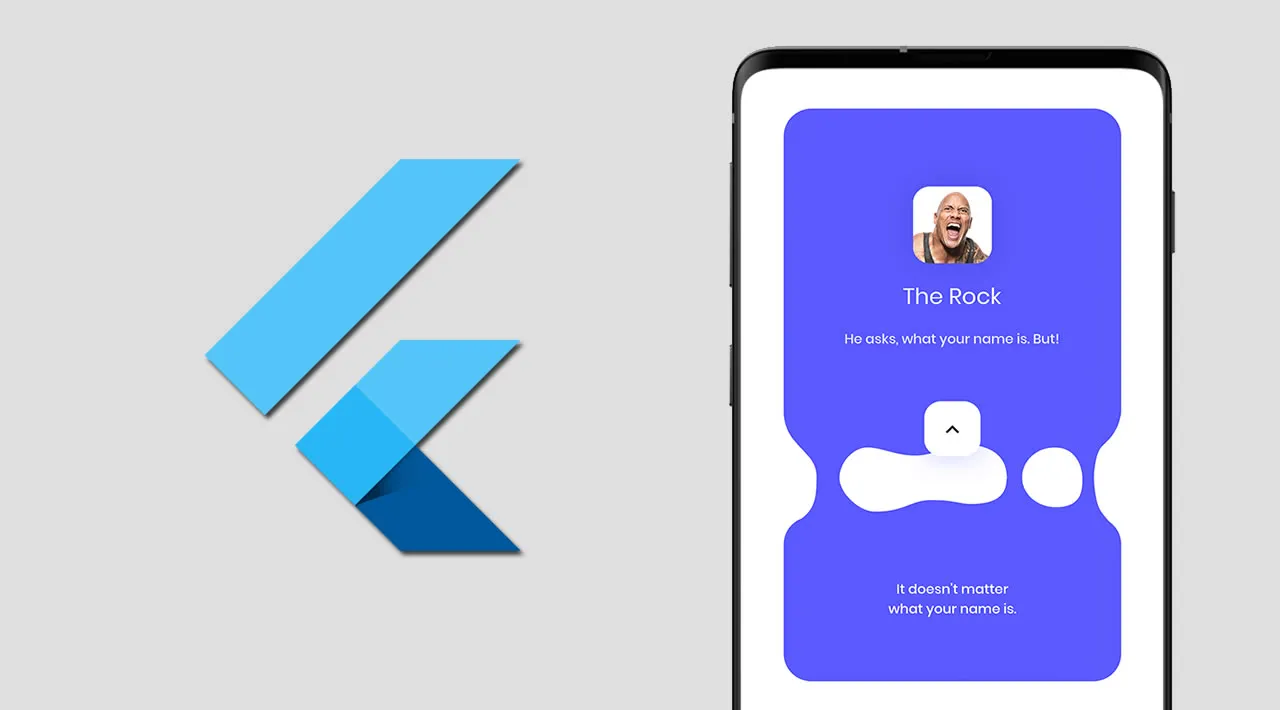
However, there are times when some built-in Widgets do not satisfy an immediate need in an app, and you need to combine one or two. For example, the built-in card widget in Flutter does not fully handle our needs, so we have to join it with other widgets to build our own reusable and fully customizable card widget.
#flutter