Visualization often plays a minimal role in the data science and model-building process, yet Tukey, the creator of Exploratory Data Analysis, specifically advocated for the heavy use of visualization to address the limitations of numerical indicators.
Everyone’s heard — and understands — a picture equals a thousand words, and following this logic, a visualization of the data is worth at least as much as dozens of statistical metrics, from quartiles to means to standard deviations to mean absolute errors to kurtosis to entropy. Wherever there is an abundance of data, it is best understood when it is visualized.
Exploratory Data Analysis was created to investigate the data, emphasizing visualization because it was more informative. This short article will present one of the most useful tools in visual EDA and how to interpret it.
Seaborn’s pairplot is magical: at its most simple, it gives us a rich and informational visual representation of univariate and bivariate relationships within the data. For instance, consider two pairplots below, created with one line of code, sns.pairplot(data) (the second adding hue=’species’ as a parameter).
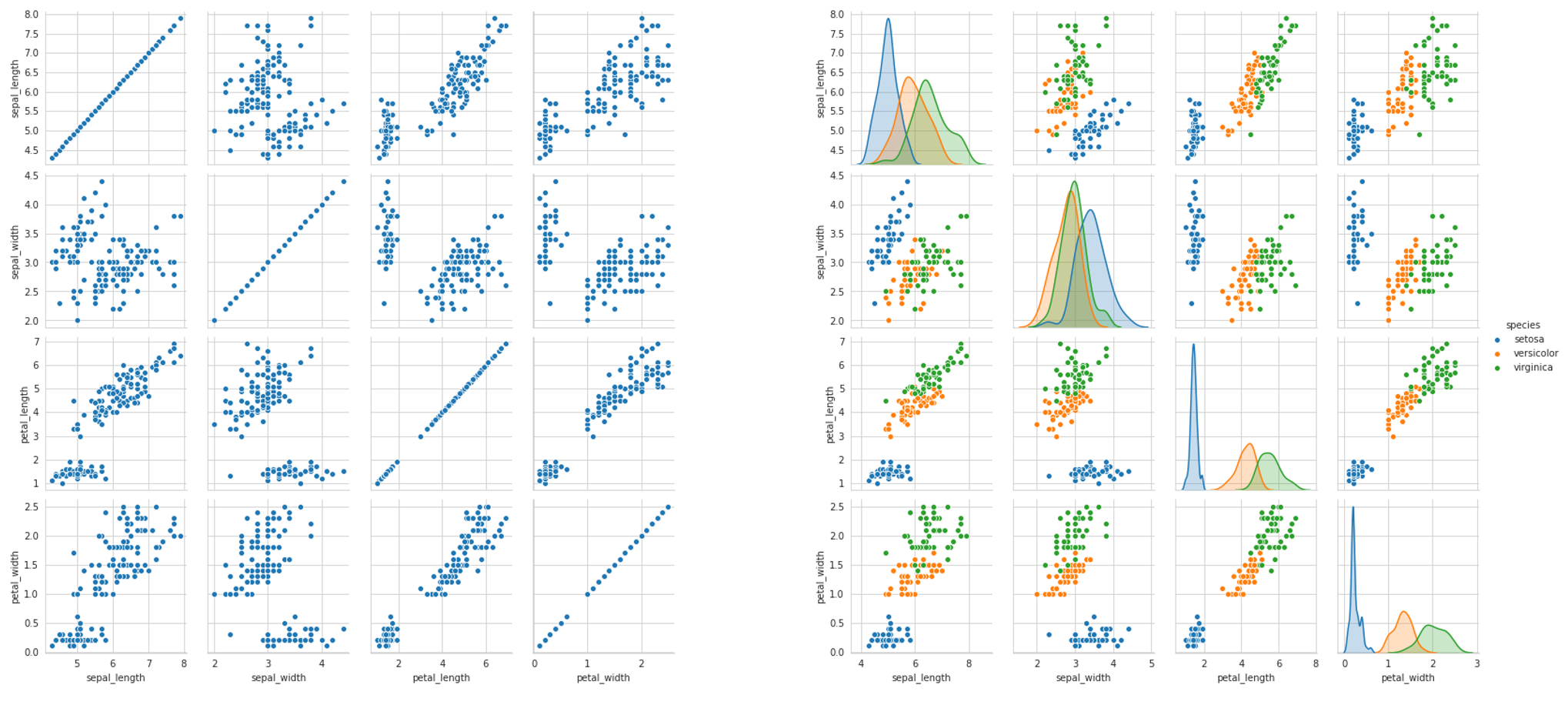
There’s so much information to be gleaned about the data, be it the success of classification (how much entropy/overlap is there between classes), potential results of a feature selection process, variance, and what the best choice of model may be, based on these observed attributes. The pairplot is like an unfolding of multidimensional space.
Usually, people stop at the one-liner pairplot, but with a few more lines or even words of code, we can reap even more information and insights.
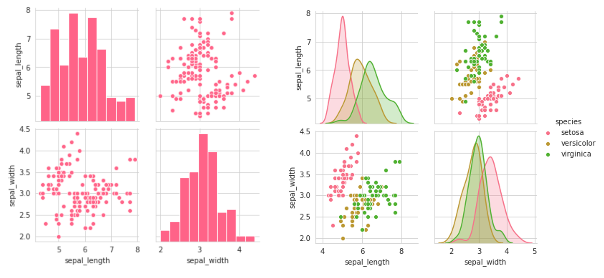
For one, pairplots can get notoriously large. To select a subset of the variables to be displayed, use the vars parameter, which can be set to a list of variable names. For instance, sns.pairplot(data,vars=[‘a’,’b’]) would only give the relationships between the two columns ‘a’ and ‘b’, being aa, ab, ba, and bb. Alternatively, one can specify x_vars and y_vars (each lists) to be the variables for each of those axes.
The result of setting the first two plots (setting the vars parameter) is a symmetrical grid of plots:
The third plot sets the y-component to only one variable — ‘sepal_length’ — and the x-component to all the columns of the data. This returns the interactions between that one column and all other columns. Note that for the first column — when it is paired against itself — and the fifth column — where it is paired against a categorical variable, the scatterplot is not an appropiate plot. We’ll explore how to deal with this later.
#programming #computer-science #python #data-science #data-analysis #"data analysis"