Data visualization is an important and sometimes undervalued tool in a data scientist’s toolkit. It allows us to gain an understanding and intuition about the data, through exploratory data analysis, which influences preprocessing, feature engineering, and the correct machine learning algorithm choice. It also helps to better evaluate models and even allows you to spot areas in the data where models could have poor performance.
Taking data visualization one step further by adding interactivity is even more advantageous. By adding interactive elements to your visualizations you create a more engaging experience. This in turn makes a user ‘explore’ visualizations instead of just reading them!
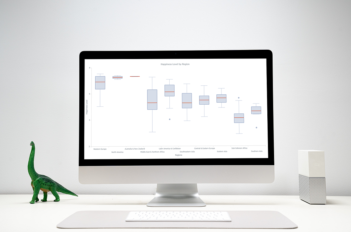
In this tutorial, I will be covering how to build an interactive data visualization, specifically a box plot as an example, using JavaScript and a charting library. I will begin by first briefly covering the basics of box plots before going through the steps of building one and then finally using the technique in a fun example to investigate the distribution of happiness between the different regions of the planet in an attempt to answer the question: ‘Where should you live to be happier?’.
What is a box plot?
A box plot, also widely called a box-and-whisker plot, is a data visualization technique used to visualize descriptive statistics of datasets. While this chart type is not as useful as a histogram at understanding a single datasets distribution, these visualizations do well at allowing a user to compare different datasets.
Box plots visualize the following summary statistics: The median, the first and third quartile (Q1 and Q3), the low and the high as well as the outliers. These are displayed as follows:
Diagram by the author
How to create a JavaScript box plot
To build an interactive data visualization there are a quite a few options. If you want to learn about JavaScript alternatives, you can have a look here. In this example I will be using a JS charting library and specifically AnyChart. I’m going with AnyChart as it supports box-and-whisker plots (among multiple other chart types), and I think both its documentation and API are really great for beginners and advanced users alike but alternatives which better suit your needs can work too and will follow similar steps.
Step 1: Set up the page
The first step is to set up a page for the box plot visualization. This includes adding the HTML elements, loading the required scripts and setting up the CSS for our chart. Which looks like:
<html>
  <head>
    <script src="https://cdn.anychart.com/releases/8.8.0/js/anychart-base.min.js"></script>
    <style type="text/css">
      html, body, #container {
        width: 100%;
        height: 100%;
        margin: 0;
        padding: 0;
      }
     </style>
  </head>
  <body>
    <div id="container"></div>
  </body>
  <script>
    anychart.onDocumentReady(function () {
      // code goes here.
    });
  </script>
</html>
When using a charting library you will need to import the correct script in order to use that library and in some cases different modules for different chart types. For access to AnyChart’s box-and-whisker chart, for example, I will need to use the base module.
#data-visualization #tutorial #box-plot #javascript #web-development