Build Scatter Chart in Power BI
Power BI is a powerful and versatile platform for business intelligence (BI) developed by Microsoft. It's essentially a one-stop shop for all your data analysis, visualization, and reporting needs.
A scatter plot is a very useful chart to visualize the relationship between two numerical variables. It is used in inferential statistics to visually examine correlation between two variables. In this we will learn how to build a scatter plot, format it, and add dimensions to the chart with the analytics pane of Power BI Desktop.
Data
In this guide, you will work with a fictitious data set of bank loan disbursal across years. The data contains 3,000 observations and 17 variables. You can download the dataset here. The major variables are described below:
- Date: Loan disbursal date.
- Loan_disbursed: Loan amount (in US dollars) disbursed by the bank.
- Age: The applicant’s age in years.
- Gender: Whether the applicant is female (F) or male (M).
- Purpose: Purpose for which loan was taken.
- Weeknum: Week number of the year.
Loading Data
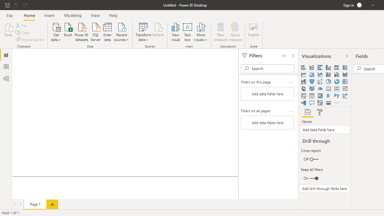
Once you open your Power BI Desktop, the following output is displayed.
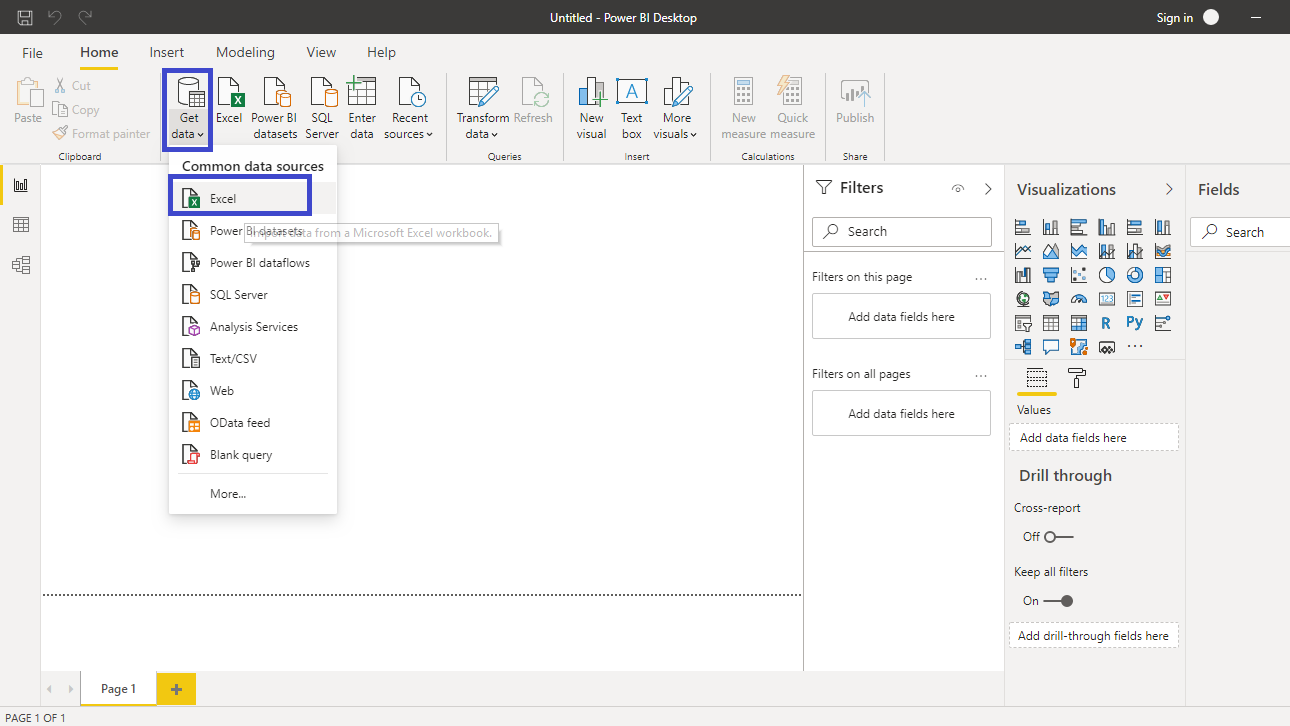
Click on Get data option and select Excel from the options.
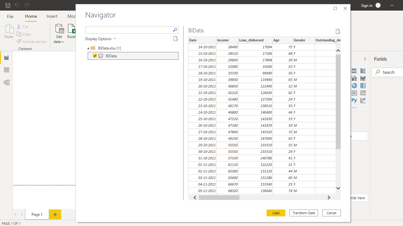
Browse to the location of the file and select it. The name of the file is BIdata.xlsx, and the sheet you will load is BIData sheet. The preview of the data is shown, and once you are satisfied that you are loading the right file, click Load.
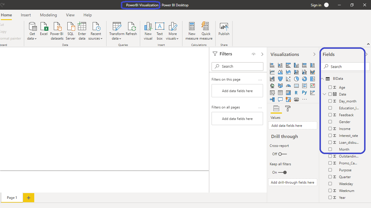
You have loaded the file, and you can save the dashboard. It is named PowerBI Visualization. The Fields pane contains the variables of the data.
Creating Scatter Plot
To begin, click on the Scatter chart option located in the Visualizations pane. This creates a chart box in the canvas. Nothing is displayed because you are yet to add the required visualization arguments.

You can resize the chart on the canvas. The next step is to fill the visualization arguments under the Fields option as shown below. Drag the variable Age into the X Axis field, and Loan_disbursed in the Y Axis field. Next, fill the Details field with the Weeknum variable.

The output above shows the scatterplot of Age and Loan_disbursed by Weeknum. But there is a mistake in the chart. The variables Age and Loan_disbursed are getting added, instead of being an average. To make this correction, click on X Axis field and select Average.

Repeat the same for Loan_disbursed variable placed in the Y Axis.

This will create the scatterplot. There are options to format the plot under the Format tab.

If you want to change the title formatting, you can go to the Format tab, and change the Alignment. You can also set the Text size to 16.

You have the desired scatter plot where each point represents the average age of the applicant, and the average loan disbursed, for a week number.

Adding Analytics to the Scatter Plot
Power BI also provides the option to add analytics to the scatter chart with the Analytics pane.

To begin, you can add Trend line to the chart. Click on Add.

Select the Color, Transparency level, and Style options as shown in the chart below, or as per your preference. This will create the following output.

If you look at the scatter plot, you can examine that most of the applicants are of the average age between 44 and 53 years. If you want to add a fixed line around X axis, you can select the X Axis Constant Line option.

Click on Add and set Value to 44. Also, keep the Color and Transparency options as shown below.

You can repeat the above process to add the X Axis Constant Line 2 and set the Value to 53.

The output above shows the scatter plot enriched with the analytics of a trend line and two fixed X axis lines.
Thanks for reading !!!
Originally published by Deepika Singh at Pluralsight
#powerbi