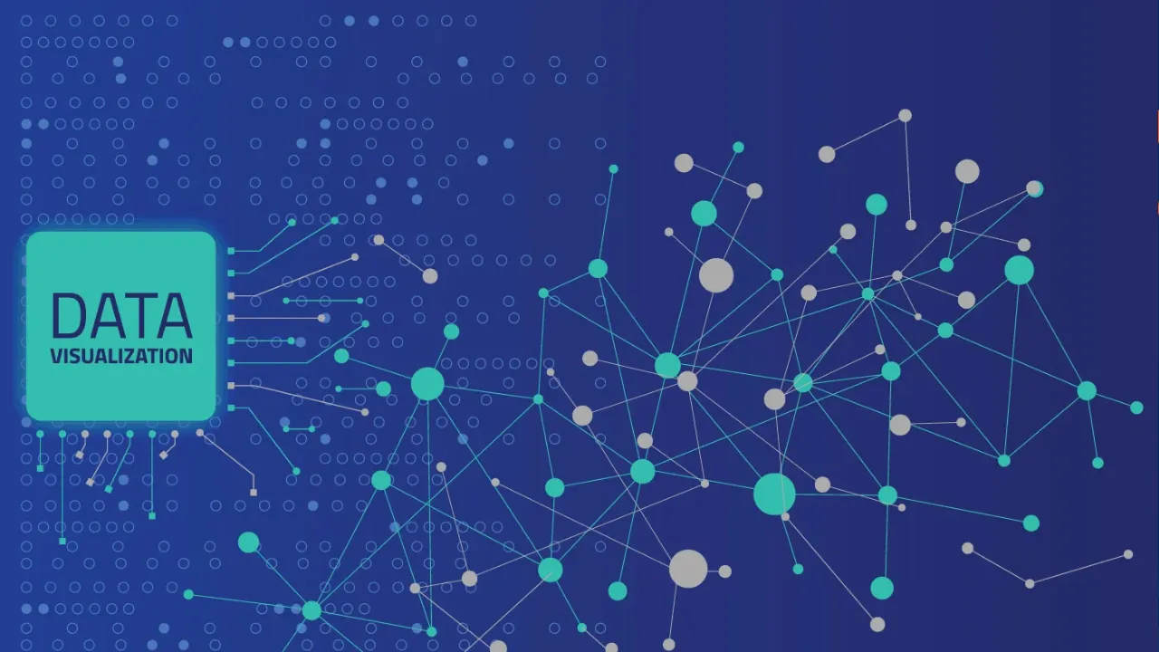
The only way to industrialize the power of analytics is to pair it with equally effective visualization. It helps the users understand the intuition behind the analytics and focus on the areas that need attention.
Excellent analysis, if not presented well, becomes practically unusable. The only way to industrialize the power of analytics is to pair it with equally effective visualization. Effective data visualization brings explainability to the analytics findings. It helps the users understand the intuition and the thought processes that went into deriving the findings.
If designed carefully, visualization can ease the task of inferring a complex analysis. In this document, we present three case studies to demonstrate the power of visual analytics. We have chosen these case studies to highlight how large, complex data can be rendered through effective metaphors and how insights can be derived with ease.
#analytics #big data #big data analysis tools #decision automation #data visualization