I. Introduction
One of the most joyful activities in analytics is working with beautiful visualization. With the Variable Factor Map, you can explain Principal Component **Analysis **with ease. A picture worth a thousand words
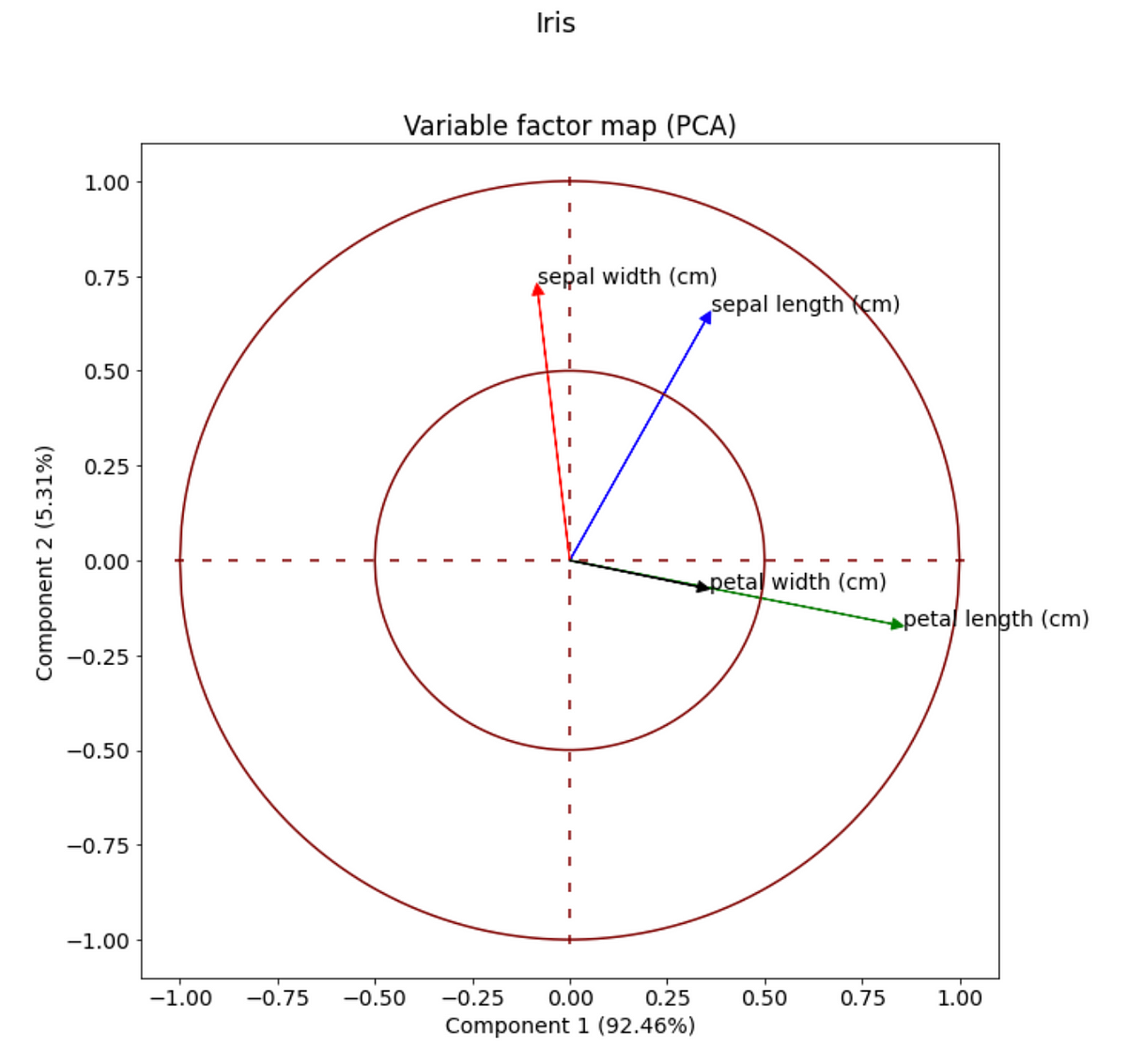
Principle Component Analysis (PCA), is a dimensionality-reduction method that is used to reduce the dimensionality of large data sets. It transforms multiple features into a much less number of new features while maintaining most of the information and variability of the original data.
If the number of features is 2, we can put them in a 2D plot and visualize how different features factor in each new component. In the picture above, four features (sepal width, sepal length, petal width, petal length) from the **iris data set **are compressed into two. They are component 1 (y-axis) and component 2 (x-axis), which maintain 97.77% of the information of the original dataset. The four vectors represent how these 2 components explain the four original features.
II. Coding
The code is created using minimal knowledge of Python and matplotlib. I believe simplicity is the keynote of all true elegance. There are three important steps to create this plot
- Data preparation
- PCA Decomposition
- Plot
#python #apc #matplotlib #analytics