Rumor has it that COVID-19 is a great opportunity to show your data-science / analytics skills, and you don’t have to be an epidemiologist in order to share your 2 cents with the world. Well… here is my attempt.
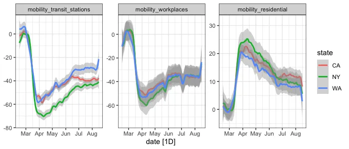
Google has shared a public data set about daily mobility across the world, before, during, and after COVID-19 first wave, starting February 15, 2020. The version I have has 6 types of mobility measures:
Mobility retail and recreation
mobility grocery and pharmacy
mobility parks
mobility transit stations
mobility workplaces
mobility residential
In this post I focused on overall state level analysis, for each of 51 US states. However, data source also has information for several regions within states, and for other countries.
Analysis goal: Measure and rank states recovery between first drop in mobility trends, till back-to-normal phase (at time of analysis).
Disclaimer: The purpose of the following analysis is to demonstrate data visualization techniques, analytic reasoning, and mostly satisfy my own curiosity. Some ad-hoc quick heuristics (assumptions) may have been adopted for the purpose of focus on high level insight. There are of course multiple possible biases that might better explain the data, which will be discussed at the end.
Data: I don’t really know how Google measures mobility, nonetheless, I don’t know their sample size, experimental unit, data collection procedures and aggregation, and validation. However, looking at trends of the time series for mobility data at state level, seem to be well corresponding with clear signals trends.
#visualization #r #covid19 #inferential-statistics #data-science