A heatmap is a graphical method of representing numerical data originally contained in a matrix format. Rather than using numbers — something we observe in a matrix — a heatmap depicts the value of a numerical variable using different colors.
In this article, we will learn how to create a heatmap in R using the ggplot2 package.
Dataset and Data Visualization Plan
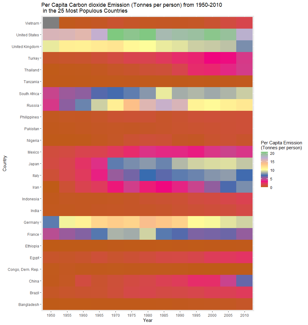
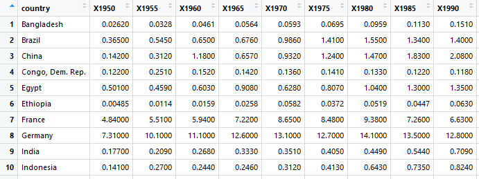
We will use a subset of a dataset (from gapminder)which has data on the per capita CO2 emissions in 192 countries over the period of 1800–2010 (with many empty cells though).
For simplicity, we are interested in visualizing the changes in per capita CO2 emissions in the twenty five most populous countries over the period of 1950–2010. Also, rather than looking at every single year, we will consider per capita CO2 emissions in each of these countries during specific years (1950, 1955, 1960,……, 2010).
Let’s start coding! :)
Step 1: Load the packages and the dataset in RStudio
library(dplyr)
library(ggplot2)
library(reshape)

#the dataset (.csv file) should be located in the same folder where your R code (.R file) is located. Also at the beginning, click: Session -> Set Working Directory -> To Source File Location
g<-read.csv(“heatmap_co2.csv”)
Step 2: Select rows and columns using select and filter functions from the dplyr pakage
#Select certain columns (specific years)
g1<- g%>%select(country,X1950,X1955,X1960,X1965,X1970,X1975,X1980, X1985, X1990,X1995,X2000,X2005,X2010)

#Select certain rows (specific countries)
g2<- g1%>%filter(country==”China”|country==”India”|country==”United States”|country==”Indonesia”|country==”Pakistan”|country==”Brazil”|
country==”Nigeria”|country==”Bangladesh”|country==”Russia”|country==”Mexico”|country==”Japan”|country==”Ethiopia”|country==”Philippines”|country==”Egypt”|country==”Vietnam”|country==”Congo, Dem. Rep.”| country==”Turkey”|country==”Iran”|country==”Germany”|country==”Thailand”|country==”United Kingdom”|country==”France”|country==”Italy”| country==”Tanzania”| country==”South Africa”)
Let’s have a quick look at the g2 dataframe.
We want to remove the Xs from the beginning of the column names.
#rstats #ggplot2 #data-visualization #heatmap #data-science #data analysis