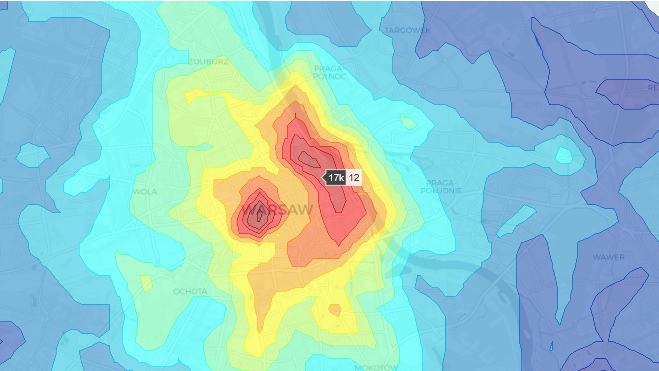
Have you ever worked with spatial data and faced the challenge of having to choose between overcrowded scatter plots or choropleth maps limited to administrative boundaries such as districts?
Working as a data scientist in the real estate industry, I often deal with spatial data, however, I was struggling to find the optimal way of visualizing spatial data in a way that would make it easy to grasp key spatial features from large data sets.
The basic features provided by Plotly or Folium felt limiting so I decided to do a bit of research on how to create custom heatmaps on top of a map, which I want to share with you in this article. I will be working on a data set of >10k Real Estate offers in Warsaw from May 2020, which you can download from my GitHub in the link below.
1. Introduction
The data used can be downloaded from GitHub
df = pd.read_excel(r"https://raw.githubusercontent.com/Jan-Majewski/Project_Portfolio/master/03_Real_Estate_pricing_in_Warsaw/Warsaw_RE_data.xlsx")
As the data has many more features than needed for this project let’s select just key 8 columns.
key_columns=['Id', 'Area', 'Price', 'latitude', 'longitude',
      'City','district']

df=df[key_columns]
df.head(10)

First, let’s explore the most common ways of visualizing spatial data with basic Plotly features.
1.1.Basic Scattermapbox

Scatter plots on a map are probably the most common and easiest ways of visualizing spatial data. You take the coordinates, set one feature as colour and there is your map. It even looks quite effective at first glance, but if you are dealing with a larger data set it gets overcrowded and you actually lose sight of the map below.
1.2 Grid Scattermapbox

We can simplify the scatter by creating a grid by rounding coordinates and calculating the mean for each tile. It looks easier to read but we also lose a lot of detail.
Grid plot is based on data summarized by clipping lat and on and creating lat_mod and lon_mod features and grouping data to create df_map.
#plotly #real-estate #geojson #spatial-analysis #data-vizualization #data analysis
