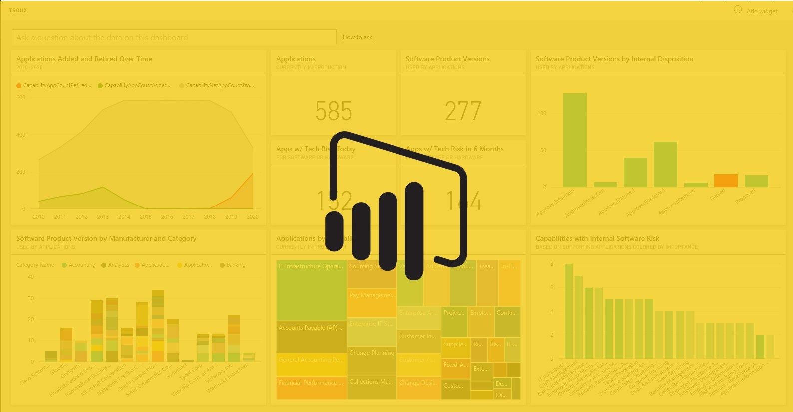
PowerBi is a powerful tool. But, as many complex products, it has some limitations. For almost all of them, there are some workarounds you can do to make your development and the life of a typical user easier. Let’s talk about them.
- Styleguide
Colours. Meh. Boring. But at the same time you don’t want your report to look like a piece of sh*t, do you? You don’t want your report developed in 2020 to look as created in the times of Windows 95. Why? Because nowadays everyone is used to good looking interfaces, good looking devices and good looking tools and websites which are a) functional, b) user-friendly and c) simply beautiful.
#data #data-visualization #power-bi-tutorials #power-bi #design

1.25 GEEK