Even though Star Wars: The Last Jedi is a divisive movie (which is not the point of this article, I promise), it inspired me to develop the most useless thing of all: the franchise’s famous opening crawl using solely HTML, CSS and a little bit of Javascript (but for a cool reason).
The crawl contains 5 essential elements:
- The background
- The intro phrase
- The logo
- The text
- The music
I’ll simply go through the necessary steps, from building each element to some final touches such as adding John Williams’ famous track.
Step 1: Creating the background
Let’s do something a bit more original than adding a picture of space. Let’s generate stars randomly !
JS:
// Sets the number of stars we wish to display
const numStars = 100;

// For every star we want to display
for (let i = 0; i < numStars; i++) {
  let star = document.createElement("div");
  star.className = "star";
  var xy = getRandomPosition();
  star.style.top = xy[0] + 'px';
  star.style.left = xy[1] + 'px';
  document.body.append(star);
}

// Gets random x, y values based on the size of the container
function getRandomPosition() {
  var y = window.innerWidth;
  var x = window.innerHeight;
  var randomX = Math.floor(Math.random()x);
  var randomY = Math.floor(Math.random()y);
  return [randomX,randomY];
}
CSS:
body {
  margin: 0;
  background-color: black;
}
.star {
  position: absolute;
  width: 1px;
  height: 1px;
  background-color: white;
}
Tada ! We now have a beautiful background to display the crawl on.
It looks like this (note that the stars on this picture are very hard to see as they are one pixel wide, but they’ll look good once you actually implement them, you have my word):
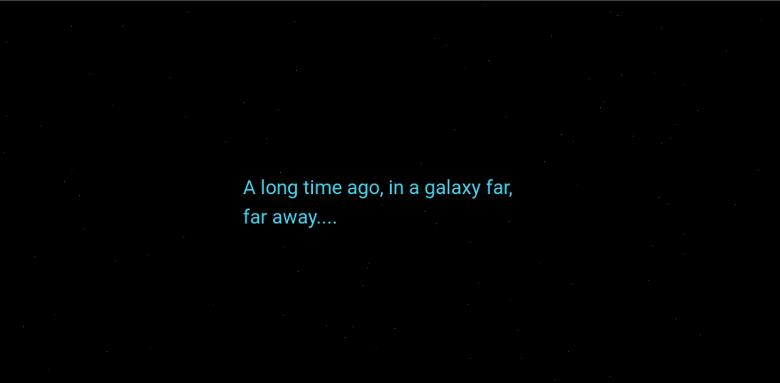
Step 2: Adding the famous intro phrase
A long time ago in a galaxy far, far away…
Everyone has already heard, seen or whispered this phrase in their lifetime, so let’s add it (with the necessary effects).
HTML:
...
<section class="intro">
  A long time ago, in a galaxy far,<br> far away....
</section>
CSS:
...
/* Center it, set the color, size and hide the text */
.intro {
    position: absolute;
    top: 45%;
    left: 50%;
    z-index: 1;
    animation: intro 6s ease-out 1s;
    color: rgb(75, 213, 238);
    font-weight: 400;
    font-size: 300%;
    opacity: 0;
}

@keyframes intro {
    0% {
        opacity: 0;
    }
    20% {
        opacity: 1;
    }
    90% {
        opacity: 1;
    }
    100% {
        opacity: 0;
    }
}
Result:
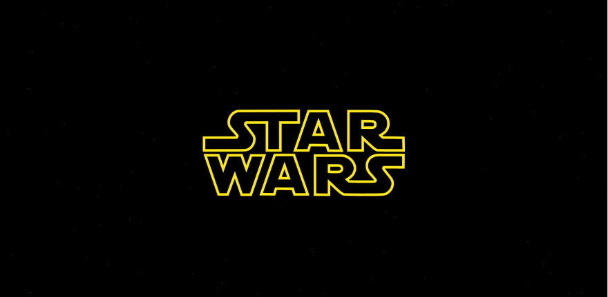
Step 3: Displaying the logo
The logo is vital to this opening sequence, here’s how I added it.
HTML:
...
<section class="logo">
    <!-- SVG GOES HERE -->
</section>
The SVG being a very long file, I have uploaded it here for you to copy and paste.
CSS:
...
/* Set the animation & hide the logo */
.logo {
    position: absolute;
    top: 20%;
    left: 45%;
    z-index: 1;
    margin: auto;
    animation: logo 9s ease-out 9s;
    opacity: 0;
}

.logo svg {
    width: inherit;
}

/* Scale the logo down and maintain it centered */
@keyframes logo {
    0% {
        width: 18em;
        transform: scale(2.75);
        opacity: 1;
    }
    50% {
        opacity: 1;
        width: 18em;
    }
    100% {
        opacity: 0;
        transform: scale(0.1);
        width: 18em;
    }
}
And there we go, our beautifully animated logo:
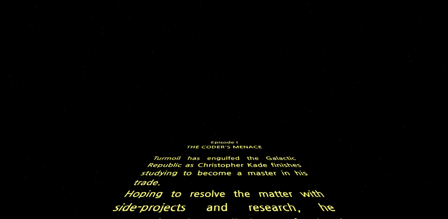
Step 4: Adding the scrolling text
It’s probably the most essential part of the crawl but it’s rather easy to implement.
HTML:
...
<!-- Change the text to your liking -->
<div id="board">
  <div id="content">
    <p id="title">Episode I</p>
    <p id="subtitle">THE CODER'S MENACE</p>
    <br>
    <p>Turmoil has engulfed the Galactic Republic as Christopher Kade finishes studying to become a master in his trade.</p>
    <!-- Add as many paragraphs as you want -->
    <!-- And make it cheesy ! -->
  </div>
</div>
CSS:
...
p {
  color: #FFFF82;
}

/* Set the font, lean the board, position it */
#board {
  font-family: Century Gothic, CenturyGothic, AppleGothic, sans-serif;
  transform: perspective(300px) rotateX(25deg);
  transform-origin: 50% 100%;
  text-align: justify;
  position: absolute;
  margin-left: -9em;
  font-weight: bold;
  overflow: hidden;
  font-size: 350%;
  height: 50em;
  width: 18em;
  bottom: 0;
  left: 50%;
}

#board:after {
  position: absolute;
  content: ' ';
  bottom: 60%;
  left: 0;
  right: 0;
  top: 0;
}

/* Set the scrolling animation and position it */
#content {
  animation: scroll 100s linear 16s;
  position: absolute;
  top: 100%;
}

#title, #subtitle {
  text-align: center;
}

@keyframes scroll {
    0% {
        top: 100%;
    }
    100% {
        top: -170%;
    }
}
And there we go !
Final touch: the music
What would Star Wars be without its music?
Since we have timed our animations in advance, it should be a piece of cake !
First, download the following .mp3 file and add it to your project’s assets.
Then, in our HTML file, add:
<audio preload="auto" autoplay>
  <source src="@/assets/audio/Star_Wars_original_opening_crawl_1977.mp3" type="audio/mpeg">
</audio>
Which preloads the music as the page is loaded and plays it automatically.
And voilà, everything should work as expected.
Final thoughts
You can find the finished product on this codepen (without the music).
It’s always fun to work on something random to explore the possibilities of vanilla web technologies. I hope this was a call to action for some of you and would love to hear all about it in the comments.
Thanks for reading,
#html #html5 #css #css3