To Do List by ReactJS, styled-components
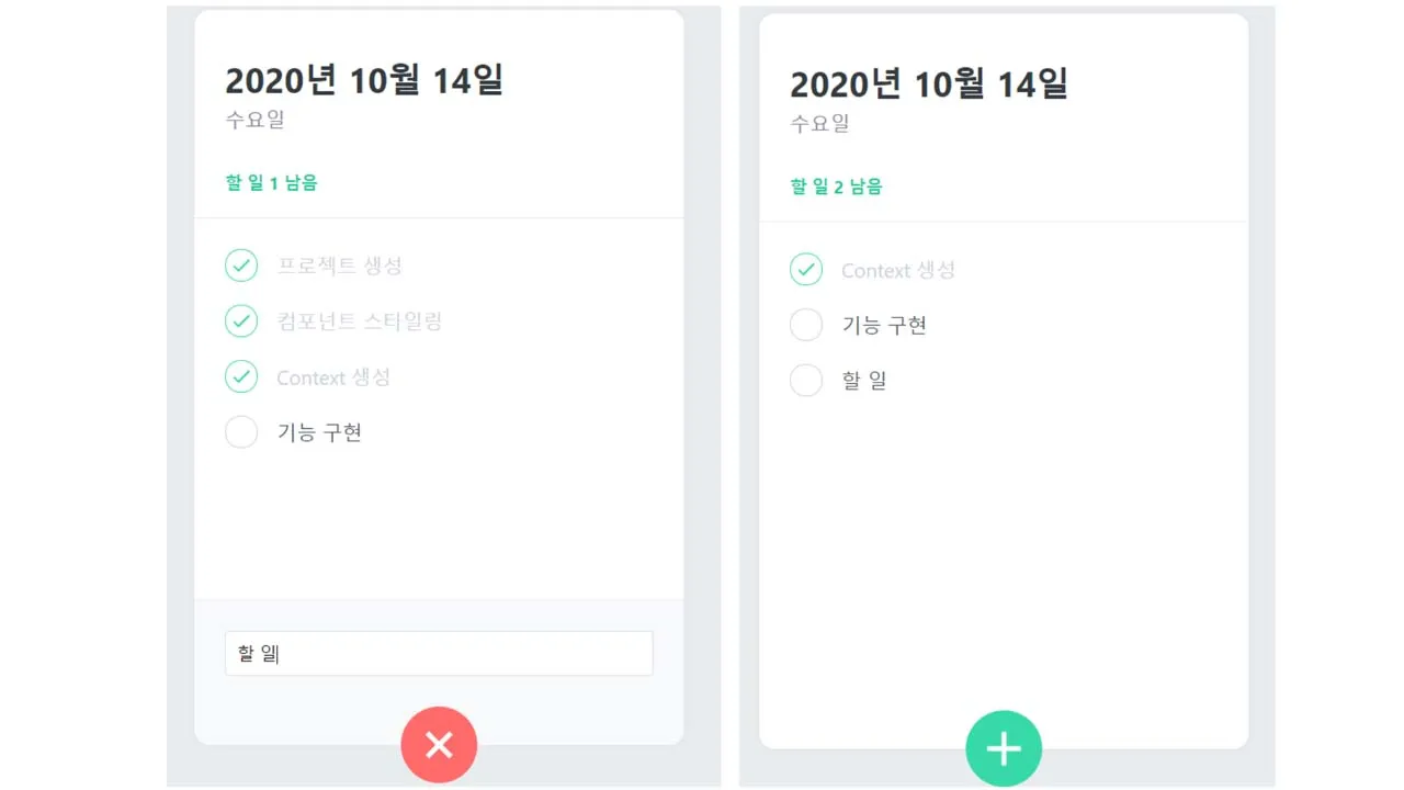
To Do List App
GlobalStyle setting
- First, let’s change the entire page to a gray background.
- Let’s see how to put the global style into the body using styled-components.
// App.js

import React from 'react';
import { createGlobalStyle } from 'styled-components';
//

const GlobalStyle = createGlobalStyle`
  body{
    background : #e9ecef;
  }
`;

function App() {
  return (
    <>
      <GlobalStyle />
      < div >Hello!!</ div >
     < / >
  );
}

export default App;
It is not necessary to create GlobalStyle unconditionally, but let’s just note that there are other ways to create and write CSS files.
Next, let’s create a template, head, and list.
// App.js

import React from 'react';
import { createGlobalStyle } from 'styled-components';
import ToDoTemplate from './components/ToDoTemplate';
import ToDoHead from './components/ToDoHead';
import ToDoList from './components/ToDoList';

const GlobalStyle = createGlobalStyle`
  body{
    background : #e9ecef;
  }
`;

function App() {
  return (
    <>
      <GlobalStyle />
      < ToDoTemplate >
        <ToDoHead />
        <ToDoList />
      </ToDoTemplate>
    </>
  );
}

export default App;
// ToDoTemplate.js

import React from 'react';
import styled from 'styled-components';

const ToDoTemplateBlock = styled.div`
  width: 512px;
  height: 768px;

  position : relative ;
/* This attribute needs to be rendered with the green plus button at the bottom of the todo template afterwards */ /* , which is necessary at that time. */ background : white ; border-radius : 16 px ; box-shadow : 0 0 8 px rgba ( 0, 0, 0, 0.04 );

  margin : 0  auto ;
/* Set page center */ margin-top : 96 px ; margin-bottom : 32 px ;

  display: flex;
  flex-direction: column;
`;

function ToDoTemplate({ children }) {
  return <ToDoTemplateBlock>{children}</ToDoTemplateBlock>;
}

export  default  ToDoTemplate ;
// ToDoHead.js

import React from 'react';
import styled from 'styled-components';

const  ToDoHeadBlock  =  styled . div , `
  /* The current date, weekday, and item list are inside. */
/* const DateText = styeld.h1 Instead of writing this way, use nested CSS syntax as shown below. */ padding-top : 48 px ; padding-left : 32 px ; padding-right : 32 px ; padding-bottom : 24 px ; border-bottom : 1 px solid #e9ecef ;

  h1 {
    margin: 0;
    font-size: 36px;
    color: #343a40;
  }

  .day {
    margin-top: 4px;
    color: #868396;
    font-size: 21px;
  }

  .tasks-left {
    color: #20c997;
    font-size: 18px;
    margin-top: 40px;
    font-weight: bold;
  }
`;

function ToDoHead() {
  return (
    <ToDoHeadBlock>
      < h1 >October 12, 2020</ h1 >
      <div className="day">일요일</div>
      <div className="tasks-left">할 일 2개 남음</div>
    </ToDoHeadBlock>
  );
}

export default ToDoHead;
// ToDoList.js

import React from 'react';
import styled from 'styled-components';

const ToDoListBlock = styled.div`
  flex : 1 ;
/* Since you set display: flex and flex-direction: column in ToDoTemplate , */ /* fleX:1 will take up all the space it can occupy. */ padding : 20 px 32 px ; padding-bottom : 48 px ; overflow-y : auto ; /* Will show scrollbars as yield increases */ background : gray ;

`;

function ToDoList() {
  return <ToDoListBlock>ToDoList</ToDoListBlock>;
}

export default ToDoList;

// ToDoList.js

import React from 'react';
import styled from 'styled-components';
import ToDoItem from './ToDoItem';

const ToDoListBlock = styled.div`
  flex : 1 ;
/* Since you set display: flex and flex-direction: column in ToDoTemplate , */ /* fleX:1 will take up all the space it can occupy. */ padding : 20 px 32 px ; padding-bottom : 48 px ; overflow-y : auto ; /* Show scrollbar when there are more items */

`;

function ToDoList() {
  return (
    <ToDoListBlock>
      < ToDoItem  text = " Create project "  done = { true } />
      < ToDoItem  text = " Styling the component "  done = { true } />
      <ToDoItem text="Context 만들기" done={false} />
      < ToDoItem  text = " Implement the function "  done = { false } />
    </ToDoListBlock>
  );
}

export default ToDoList;
// ToDoCreate.js

import React from 'react';
import styled, { css } from 'styled-components';
import { MdAdd } from 'react-icons/md';

const CircleButton = styled.button`
  background: #38d9a9;
  &:hover {
    background: #63e6be;
  }
  &:active {
    background: #20c997;
  }

  z-index : 5 ;
/* set to hide other content */ cursor : pointer ; width : 80 px ; height : 80 px ; display : flex; align-items : center ; justify- content : center ;

  position : absolute ;
left : 50 % ; bottom : 0 px ; transform : translate( -50 % , 50 % ); /* If you don't use the code above, it won't go to the center. Because of the size of the button. */ /* By using the code above, it moves to the left/bottom by 50% of the size of the button and aligns it to the center. */

  font-size: 60px;
  color: white;
  border-radius: 40px;

  border: none;
  outline: none;
`;

function ToDoCreate() {
  return (
    <CircleButton>
      <MdAdd />
    </CircleButton>
  );
}

export default ToDoCreate;
// ToDoItem.js

import React from 'react';
import styled, { css } from 'styled-components';
import { MdDone, MdDelete } from 'react-icons/md';

const Remove = styled.div`
  opacity : 0 ;
/* Make it visible only when the cursor is placed on the ToDoItemBlock. */ display : flex; align-items : center ; justify- content : center ; color : #dee2e6 ; font-size : 24 px ; cursor : pointer ;   &: hover { color : #ff6b6b ;   }

`;
const CheckCircle = styled.div`
  width: 32px;
  height: 32px;
  border-radius: 16px;
  border: 1px solid #ced4da;
  font-size: 24px;
  display: flex;
  align-items: center;
  justify-content: center;
  margin-right: 20px;
  cursor: pointer;

  /* If done exists, it will change the color, so we need a multiline style. */
/* Let's load css from the top. */   ${( props ) => props . done && css ` border :1pxsolid#38d9a9;
      color :#38d9a9;
      /* If there is a done value, change the border and color values. */ `}`;
constText=styled. div`

  flex: 1;
  font-size: 21px;
  color: #495057;
  ${(props) =>
    props.done &&
    css`
      color: #ced4da;
    `}
`;
const ToDoItemBlock = styled.div`
  display : flex;
align-items : center ; padding-top : 12 px ; padding-bottom : 12 px ;   &: hover {    ${R emove } { /* In this way, you can select a component and give it properties. */ opacity : 1 ;     }  }

`;

function ToDoItem({ id, done, text }) {
  //
  return (
    <ToDoItemBlock>
      <CheckCircle done={done}>{done && <MdDone />}</CheckCircle>
      <Text done={done}>{text}</Text>
      <Remove>
        <MdDelete />
      </Remove>
    </ToDoItemBlock>
  );
}

export default ToDoItem;
- I created several components, and Remove is an icon component in the shape of a trash can that will appear on the right.
- CheckCircle is a check component that shows the check status shown on the left,
- Text is a component that displays text,
- The above three contents are shown inside ToDoItemBlock.

ToDoCreate should be able to open and close. Let’s add state management.
// ToDoCreate.js

import React, { useState } from 'react';
import styled, { css } from 'styled-components';
import { MdAdd } from 'react-icons/md';

const CircleButton = styled.button`
  background: #38d9a9;
  &:hover {
    background: #63e6be;
  }
  &:active {
    background: #20c997;
  }

  z-index : 5 ;
/* set to hide other content */ cursor : pointer ; width : 80 px ; height : 80 px ; display : flex; align-items : center ; justify- content : center ;

  position : absolute ;
left : 50 % ; bottom : 0 px ; transform : translate( -50 % , 50 % ); /* If you don't use the code above, it won't go to the center. Because of the size of the button. */ /* By using the code above, it moves to the left/bottom by 50% of the size of the button and aligns it to the center. */

  font-size: 60px;
  color: white;
  border-radius: 40px;

  border: none;
  outline: none;

  /* You need to add a transition to give an animation effect. */
transition : 0.125 s all ease-in;   ${( props ) => props . open && css ` background :#ff6b6b;
      &:hover{
         background :#ff8787;

      }
      &:active {
        background: #fa5252;
      }
      transform: translate(-50%, 50%) rotate(45deg); ;
    `};
`;

const InsertFormPositioner = styled.div`
  width: 100%;
  bottom: 0;
  left: 0;
  position: absolute;
`;

const InsertForm = styled.div`
  background: #f8f9fa;
  padding: 32px;
  padding-bottom: 72px;
  border-bottom-left-radius: 16px;
  border-bottom-right-radius: 16px;
  border-top: 1px solid #e9ecef;
`;

const Input = styled.input`
  padding : 12 px ;
border-radius : 4 px ; border : 1 px solid #dee2e6 ; width : 100 % ; outline : none ; font-size : 18 px ; box-sizing : border-box; /* If the box sizing border box is not set, padding is ignored and applied. */

`;

function ToDoCreate() {
  const [open, setOpen] = useState(false);
  const onToggle = () => setOpen(!open);

  return (
    <>
      {open && (
        <InsertFormPositioner>
          <InsertForm>
            < Input
              placeholder = " After entering the
              task , press Enter " autoFocus
            />
          </InsertForm>
        </InsertFormPositioner>
      )}
      <CircleButton onClick={onToggle} open={open}>
        <MdAdd />
      </CircleButton>
    </>
  );
}

export default ToDoCreate;

- It is activated when the + button is pressed.
- Now all UI work is done. Let’s start implementing the function.
Before we start implementing the functionality, let’s change the structure using the context API.
It is not a good idea to use the context API unconditionally, but it is very useful when the project size grows later.
The first thing we need to do is create a ToDoContext file and create a reducer in it.
// ToDoContext.js

import  React , { useReducer , createContext , useContext , useRef } from  ' react ' ;
// useRef is a value that can be changed immediately, not id value management or state management

const  initialAll  = [
  { id :  1 , text :  ' create project ' , done :  true },
  { id :  1 , text :  ' Component styling ' , done :  true },
  { id: 1, text: 'Context 생성', done: false },
  { id :  1 , text :  ' function implementation ' , done :  false },
];

// Let's create three actions.
// Create
// Toggle
// Remove
function  todoReducer ( state , action ) {
   switch ( action . Type ) {
     case  ' CREATE ' :
       return  state . concat ( action . todo );
    Case  ' TOGGLE ' :
       return  State . map (
         // will do the conversion for all todos.
        ( All ) => ( everything . Id  ===  action . Id  ? { ... everything , done :  ! All . Done } :  all )
      );
    case 'REMOVE':
      return state.filter((todo) => todo.id !== action.id);

    default:
      throw new Error(`Unhandled action type: ${action.type}`);
  }
}

const ToDoStateContext = createContext();
const ToDoDispatchContext = createContext();
const ToDoNextIdContext = createContext();

export function ToDoProvider({ children }) {
  const [state, dispatch] = useReducer(todoReducer, initialTodos);
  const nextId = useRef(5);

  return (
    <ToDoStateContext.Provider value={state}>
      <ToDoDispatchContext.Provider value={dispatch}>
        <ToDoNextIdContext.Provider value={nextId}>
          {children}
        </ToDoNextIdContext.Provider>
      </ToDoDispatchContext.Provider>
    </ToDoStateContext.Provider>
  );
}

// const state = useContext(ToDoStateContext);
// You can call and use ToDoContext itself like this, but
// Let's call useContext from the top and create a custom hook.

export function useToDoState() {
  return useContext(ToDoStateContext);
}

export  function  useToDoDispatch () {
   return  useContext ( ToDoDispatchContext );
}

export function useToDoNextId() {
  return useContext(ToDoNextIdContext);
}
// ToDoList.js

import React from 'react';
import styled from 'styled-components';
import ToDoItem from './ToDoItem';
import { useToDoState } from './ToDoContext';

const ToDoListBlock = styled.div`
  flex : 1 ;
/* Since you set display: flex and flex-direction: column in ToDoTemplate , */ /* fleX:1 will take up all the space it can occupy. */ padding : 20 px 32 px ; padding-bottom : 48 px ; overflow-y : auto ; /* Show scrollbar when there are more items */

`;

function  ToDoList () {
   const  state  =  useToDoState ();
  // You can simply use a custom hook made in ToDoContext like this.
  return (
    <ToDoListBlock>
      < ToDoItem  text = " Create project "  done = { true } />
      < ToDoItem  text = " Styling the component "  done = { true } />
      <ToDoItem text="Context 만들기" done={false} />
      < ToDoItem  text = " Implement the function "  done = { false } />
    </ToDoListBlock>
  );
}

export default ToDoList;
- After the hook and context creation work is over, there is a good work to do. That is, error handling is performed when there is no context. To use context, you need to wrap the app component in ToDoProvider. If you want to use it in an unwrapped state, you need to make it an error. It’s not necessary, but it’s a good way to make it a habit. This is because you can quickly find out when you make a mistake.
// App.js

import React from 'react';
import { createGlobalStyle } from 'styled-components';
import ToDoTemplate from './components/ToDoTemplate';
import ToDoHead from './components/ToDoHead';
import ToDoList from './components/ToDoList';
import ToDoCreate from './components/ToDoCreate';
import { ToDoProvider } from './components/ToDoContext';

const GlobalStyle = createGlobalStyle`
  body{
    background : #e9ecef;
  }
`;

function App() {
  return (
    <ToDoProvider>
      <GlobalStyle />
      < ToDoTemplate >
        <ToDoHead />
        <ToDoList />
        <ToDoCreate />
      </ ToDoTemplate >
    </ToDoProvider>
  );
}

export default App;
// ToDoContext.js

import React, { useReducer, createContext, useContext, useRef } from 'react';

const  initialAll  = [
  { id :  1 , text :  ' create project ' , done :  true },
  { id :  2 , text :  ' Component styling ' , done :  true },
  { id: 3, text: 'Context 생성', done: false },
  { id :  4 , text :  ' function implementation ' , done :  false },
];

function  todoReducer ( state , action ) {
   switch ( action . type ) {
     case  ' CREATE ' :
       return  state . concat ( action . todo );
    Case  ' TOGGLE ' :
       return  State . map (
         // will convert all todos
        ( todo ) => ( todo . id  === action . id  ? { ... everything , done :  ! everything . done } :  all )
      );
    case 'REMOVE':
      return state.filter((todo) => todo.id !== action.id);

    default:
      throw new Error(`Unhandled action type: ${action.type}`);
  }
}

const ToDoStateContext = createContext();
const ToDoDispatchContext = createContext();
const ToDoNextIdContext = createContext();

export function ToDoProvider({ children }) {
  const [state, dispatch] = useReducer(todoReducer, initialTodos);
  const nextId = useRef(5);

  return (
    <ToDoStateContext.Provider value={state}>
      <ToDoDispatchContext.Provider value={dispatch}>
        <ToDoNextIdContext.Provider value={nextId}>
          {children}
        </ToDoNextIdContext.Provider>
      </ToDoDispatchContext.Provider>
    </ToDoStateContext.Provider>
  );
}

export function useToDoState() {
  const context = useContext(ToDoStateContext);
  if (!context) {
    throw new Error('Cannot find ToDoProvider');
  }
  return context;
}

export function useToDoDispatch() {
  const context = useContext(ToDoDispatchContext);
  if (!context) {
    throw new Error('Cannot find ToDoProvider');
  }
  return context;
}

export function useToDoNextId() {
  const context = useContext(ToDoNextIdContext);
  if (!context) {
    throw new Error('Cannot find ToDoProvider');
  }
  return context;
}
// ToDoList.js

import React from 'react';
import styled from 'styled-components';
import ToDoItem from './ToDoItem';
import { useToDoState } from './ToDoContext';

const ToDoListBlock = styled.div`
  flex : 1 ;
/* Since you set display: flex and flex-direction: column in ToDoTemplate , */ /* fleX:1 will take up all the space it can occupy. */ padding : 20 px 32 px ; padding-bottom : 48 px ; overflow-y : auto ; /* Show scrollbar when there are more items */

`;

function  ToDoList () {
   const  state  =  useToDoState ();
  // You can simply use a custom hook made in ToDoContext like this.

  return (
    <ToDoListBlock>
      < ToDoItem  text = " Create project "  done = { true } />
      < ToDoItem  text = " Styling the component "  done = { true } />
      <ToDoItem text="Context 만들기" done={false} />
      < ToDoItem  text = " Implement the function "  done = { false } />
    </ToDoListBlock>
  );
}

export default ToDoList;
Let’s start implementing the function
// ToDoHead.js

import React from 'react';
import styled from 'styled-components';
import { useToDoState } from './ToDoContext';

const  ToDoHeadBlock  =  styled . div , `
  /* The current date, weekday, and item list are inside. */
/* const DateText = styeld.h1 Instead of writing this way, use nested CSS syntax as shown below. */ padding-top : 48 px ; padding-left : 32 px ; padding-right : 32 px ; padding-bottom : 24 px ; border-bottom : 1 px solid #e9ecef ;

  h1 {
    margin: 0;
    font-size: 36px;
    color: #343a40;
  }

  .day {
    margin-top: 4px;
    color: #868396;
    font-size: 21px;
  }

  .tasks-left {
    color: #20c997;
    font-size: 18px;
    margin-top: 40px;
    font-weight: bold;
  }
`;

function  ToDoHead () {
   const  all  =  useToDoState ();
  const  undoneTasks  =  all . filter (( all ) =>  ! everything . done );

  const today = new Date();
  const dateString = today.toLocaleDateString('ko-KR', {
    year: 'numeric',
    month: 'long',
    day: 'numeric',
  });
  const dayName = today.toLocaleDateString('ko-KR', {
    weekday: 'long',
  });

  return (
    <ToDoHeadBlock>
      <h1>{dateString}</h1>
      <div className="day">{dayName}</div>
      <div className="tasks-left">할 일 {undoneTasks.length} 남음</div>
    </ToDoHeadBlock>
  );
}

export default ToDoHead;
// ToDoCreate.js

import React, { useState } from 'react';
import styled, { css } from 'styled-components';
import { MdAdd } from 'react-icons/md';
import { useToDoNextId, useToDoDispatch } from './ToDoContext';

const CircleButton = styled.button`
  background: #38d9a9;
  &:hover {
    background: #63e6be;
  }
  &:active {
    background: #20c997;
  }

  z-index : 5 ;
/* set to hide other content */ cursor : pointer ; width : 80 px ; height : 80 px ; display : flex; align-items : center ; justify- content : center ;

  position : absolute ;
left : 50 % ; bottom : 0 px ; transform : translate( -50 % , 50 % ); /* If you don't use the code above, it won't go to the center. Because of the size of the button. */ /* By using the code above, it moves to the left/bottom by 50% of the size of the button and aligns it to the center. */

  font-size: 60px;
  color: white;
  border-radius: 40px;

  border: none;
  outline: none;

  /* You need to add a transition to give an animation effect. */
transition : 0.125 s all ease-in;   ${( props ) => props . open && css ` background :#ff6b6b;
      &:hover{
         background :#ff8787;

      }
      &:active {
        background: #fa5252;
      }
      transform: translate(-50%, 50%) rotate(45deg); ;
    `};
`;

const InsertFormPositioner = styled.div`
  width: 100%;
  bottom: 0;
  left: 0;
  position: absolute;
`;

const InsertForm = styled.form`
  /* Let's change from div to form, then we can use onSubmit event. */
/* However, in HTML, it is basically refreshed when the onSubmit event occurs. */ /* To prevent initialization from being refreshed, you need to work separately. */ /* You can see the code in onSubmit below. */ background : #f8f9fa ; padding : 32 px ; padding-bottom : 72 px ; border-bottom - left -radius : 16 px ; border-bottom - right -radius : 16 px ;

  border-top: 1px solid #e9ecef;
`;

const Input = styled.input`
  padding : 12 px ;
border-radius : 4 px ; border : 1 px solid #dee2e6 ; width : 100 % ; outline : none ; font-size : 18 px ; box-sizing : border-box; /* If the box sizing border box is not set, padding is ignored and applied. */

`;

function ToDoCreate() {
  const [open, setOpen] = useState(false);
  const [value, setValue] = useState('');
  const dispatch = useToDoDispatch();
  const nextId = useToDoNextId();

  const  onToggle  = () =>  setOpen ( ! open );
  const  onChange  = ( e ) =>  setValue ( e . target . value );
  const  onSubmit  = ( e ) => {
     e . preventDefault ();
    // Prevent actions that should be done in the original browser. That prevents refresh.
    dispatch ({
       type :  ' CREATE ' ,
       todo : {
        id: nextId.current,
        text: value,
        done: false,
      },
    });
    setValue('');
    setOpen(false);
    nextId.current += 1;
  };

  return (
    <>
      {open && (
        <InsertFormPositioner>
          <InsertForm onSubmit={onSubmit}>
            < Input
              onChange = { onChange }
              value = { value }
              placeholder = " After entering the
              task , press Enter " autoFocus
            />
          </InsertForm>
        </InsertFormPositioner>
      )}
      <CircleButton onClick={onToggle} open={open}>
        <MdAdd />
      </CircleButton>
    </>
  );
}

export default React.memo(ToDoCreate);
// ToDoItem.js

import React from 'react';
import styled, { css } from 'styled-components';
import { MdDone, MdDelete } from 'react-icons/md';
import { useToDoDispatch } from './ToDoContext';

const Remove = styled.div`
  opacity : 0 ;
/* Make it visible only when the cursor is placed on the ToDoItemBlock. */ display : flex; align-items : center ; justify- content : center ; color : #dee2e6 ; font-size : 24 px ; cursor : pointer ;   &: hover { color : #ff6b6b ;   }

`;

const CheckCircle = styled.div`
  width: 32px;
  height: 32px;
  border-radius: 16px;
  border: 1px solid #ced4da;
  font-size: 24px;
  display: flex;
  align-items: center;
  justify-content: center;
  margin-right: 20px;
  cursor: pointer;

  /* If done exists, it will change the color, so we need a multiline style. */
/* Let's load css from the top. */   ${( props ) => props . done && css ` border :1pxsolid#38d9a9;
      color :#38d9a9;
      /* If there is a done value, change the border and color values. */ `}`;

const Text = styled.div`
  flex: 1;
  font-size: 21px;
  color: #495057;
  ${(props) =>
    props.done &&
    css`
      color: #ced4da;
    `}
`;

const ToDoItemBlock = styled.div`
  display : flex;
align-items : center ; padding-top : 12 px ; padding-bottom : 12 px ;   &: hover {    ${R emove } { /* In this way, you can select a component and give it properties. */ opacity : 1 ;     }  }

`;

function ToDoItem({ id, done, text }) {
  //
  const dispatch = useToDoDispatch();
  const onToggle = () =>
    dispatch({
      type: 'TOGGLE',
      id,
    });
  const onRemove = () => {
    dispatch({
      type: 'REMOVE',
      id,
    });
  };

  return (
    <ToDoItemBlock>
      <CheckCircle done={done} onClick={onToggle}>
        {done && <MdDone />}
      </CheckCircle>
      <Text done={done}>{text}</Text>
      <Remove onClick={onRemove}>
        <MdDelete />
      </Remove>
    </ToDoItemBlock>
  );
}

export  default  React . memo ( ToDoItem );
// Component optimization is possible in this way.
// ToDoList.js

import React from 'react';
import styled from 'styled-components';
import ToDoItem from './ToDoItem';
import { useToDoState } from './ToDoContext';

const ToDoListBlock = styled.div`
  flex : 1 ;
/* Since you set display: flex and flex-direction: column in ToDoTemplate , */ /* fleX:1 will take up all the space it can occupy. */ padding : 20 px 32 px ; padding-bottom : 48 px ; overflow-y : auto ; /* Show scrollbar when there are more items */

`;

function  ToDoList () {
   const  todos  =  useToDoState ();
  // You can simply use a custom hook made in ToDoContext like this.

  return (
    <ToDoListBlock>
      {todos.map((todo) => (
        < ToDoItem
          key = { all . id }
          id = { all . id }
          text = { all . text }
          done = { all . done }
        />
      ))}
    </ToDoListBlock>
  );
}

export default ToDoList;
Important point!!
- When you click on a list item on the screen, the rest of the list is not re-rendered. This is because the component is only getting dispatch. However, if you worked with state and dispatch in one context in useToDo, if you toggle one item, the rest will be re-rendered.
- Therefore, it is very important to create and use state type context and dispatch type context separately.
- In Context, I created a context for the state, created a context for dispatch, and created a custom hook to easily use the context. And I used it like useToDoState() and useToDoDispatch() in the components.

- It works fine!
Download Details:
Author: JungHyukJin
Source Code: https://github.com/JungHyukJin/ToDoList_App
#react #reactjs #javascript
6.60 GEEK