Bookmark this python function that makes assessing your binary classifier easy.
Functionality Overview
Logistic Regression is a valuable classifier for its interpretability. This code snippet provides a cut-and-paste function that displays the metrics that matter when logistic regression is used for binary classification problems. Everything here is provided by scikit-learn already, but can be time consuming and repetitive to manually call and visualize without this helper function.
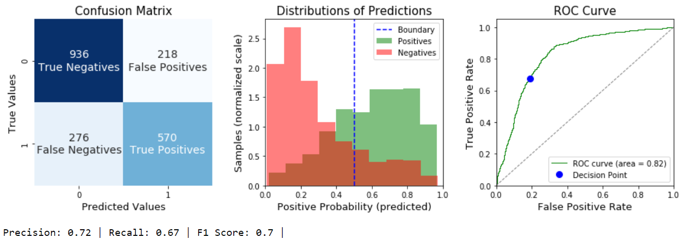
evalBinaryClassifier() takes a fitted model, test features, and test labels as input. It returns the F1 score, and also prints dense output that includes:
- Full confusion matrix labelled with quantities and text labels (ex “True Positive”)
- Distributions of the predicted probabilities of both classes
- ROC curve, AUC, as well as the decision point along the curve that the confusion matrix and distributions represent
- Precision, Recall, and F1 score
For an explanation of how to interpret these outputs, skip to after the code block.
Required Imports:
import numpy as np
	import pandas as pd
	import matplotlib.pyplot as plt
	import seaborn as sns
	from sklearn.metrics import roc_curve, confusion_matrix, auc
	from sklearn import linear_model
Example Usage:
logr = linear_model.LogisticRegressionCV()
	logr.fit(X_train,y_train)
	F1 = evalBinaryClassifier(logr,X_test,y_test)
Output:
The Code
def evalBinaryClassifier(model,x, y, labels=['Positives','Negatives']):
	    '''
	    Visualize the performance of  a Logistic Regression Binary Classifier.

	    Displays a labelled Confusion Matrix, distributions of the predicted
	    probabilities for both classes, the ROC curve, and F1 score of a fitted
	    Binary Logistic Classifier. Author: gregcondit.com/articles/logr-charts

	    Parameters
	    ----------
	    model : fitted scikit-learn model with predict_proba & predict methods
	        and classes_ attribute. Typically LogisticRegression or
	        LogisticRegressionCV

	    x : {array-like, sparse matrix}, shape (n_samples, n_features)
	        Training vector, where n_samples is the number of samples
	        in the data to be tested, and n_features is the number of features

	    y : array-like, shape (n_samples,)
	        Target vector relative to x.

	    labels: list, optional
	        list of text labels for the two classes, with the positive label first

	    Displays
	    ----------
	    3 Subplots

	    Returns
	    ----------
	    F1: float
	    '''
	    #model predicts probabilities of positive class
	    p = model.predict_proba(x)
	    if len(model.classes_)!=2:
	        raise ValueError('A binary class problem is required')
	    if model.classes_[1] == 1:
	        pos_p = p[:,1]
	    elif model.classes_[0] == 1:
	        pos_p = p[:,0]

	    #FIGURE
	    plt.figure(figsize=[15,4])

	    #1 -- Confusion matrix
	    cm = confusion_matrix(y,model.predict(x))
	    plt.subplot(131)
	    ax = sns.heatmap(cm, annot=True, cmap='Blues', cbar=False,
	                annot_kws={"size": 14}, fmt='g')
	    cmlabels = ['True Negatives', 'False Positives',
	              'False Negatives', 'True Positives']
	    for i,t in enumerate(ax.texts):
	        t.set_text(t.get_text() + "\n" + cmlabels[i])
	    plt.title('Confusion Matrix', size=15)
	    plt.xlabel('Predicted Values', size=13)
	    plt.ylabel('True Values', size=13)

	    #2 -- Distributions of Predicted Probabilities of both classes
	    df = pd.DataFrame({'probPos':pos_p, 'target': y})
	    plt.subplot(132)
	    plt.hist(df[df.target==1].probPos, density=True,
	             alpha=.5, color='green',  label=labels[0])
	    plt.hist(df[df.target==0].probPos, density=True,
	             alpha=.5, color='red', label=labels[1])
	    plt.axvline(.5, color='blue', linestyle='--', label='Boundary')
	    plt.xlim([0,1])
	    plt.title('Distributions of Predictions', size=15)
	    plt.xlabel('Positive Probability (predicted)', size=13)
	    plt.ylabel('Samples (normalized scale)', size=13)
	    plt.legend(loc="upper right")

	    #3 -- ROC curve with annotated decision point
	    fp_rates, tp_rates, _ = roc_curve(y,p[:,1])
	    roc_auc = auc(fp_rates, tp_rates)
	    plt.subplot(133)
	    plt.plot(fp_rates, tp_rates, color='green',
	             lw=1, label='ROC curve (area = %0.2f)' % roc_auc)
	    plt.plot([0, 1], [0, 1], lw=1, linestyle='--', color='grey')
	    #plot current decision point:
	    tn, fp, fn, tp = [i for i in cm.ravel()]
	    plt.plot(fp/(fp+tn), tp/(tp+fn), 'bo', markersize=8, label='Decision Point')
	    plt.xlim([0.0, 1.0])
	    plt.ylim([0.0, 1.05])
	    plt.xlabel('False Positive Rate', size=13)
	    plt.ylabel('True Positive Rate', size=13)
	    plt.title('ROC Curve', size=15)
	    plt.legend(loc="lower right")
	    plt.subplots_adjust(wspace=.3)
	    plt.show()
	    #Print and Return the F1 score
	    tn, fp, fn, tp = [i for i in cm.ravel()]
	    precision = tp / (tp + fp)
	    recall = tp / (tp + fn)
	    F1 = 2*(precision * recall) / (precision + recall)
	    printout = (
	        f'Precision: {round(precision,2)} | '
	        f'Recall: {round(recall,2)} | '
	        f'F1 Score: {round(F1,2)} | '
	    )
	    print(printout)
	    return F1
Interpretation:
Left Chart: Confusion Matrix
The Confusion Matrix describes the predictions that the model made as either True (correct) or False (wrong). It compares these to the real truth. A perfect model would have only True Positives and True Negatives. A purely random model will have all 4 categories in similar quantities.
If you have a class imbalance problem, typically you’ll see many Negatives (True and False both) and few Positives, or vice versa. (For a great example of this, see my project on Predicting Disruption.)
Center Chart: Distributions of Predictions
The Center Graph is the distribution of predicted probabilities of a Positive Outcome. For example, If your model is 100% sure a sample is positive, if will be in the far right bin. The two different colors indicate the TRUE class, not the predicted class. A perfect model would show no overlap at all between the green and red distributions. A purely random model will see them overlap each other entirely.
The decision boundary decides the model’s final predictions. In scikit-learn, the default decision boundary is .5; that is, anything above .5 is predicted as a 1 (positive) and anything below .5 is predicted as a 0 (negative). This is an important detail for understanding your model, as well as the ROC curve.
Right Chart: The ROC Curve
The Receiver Operating Characteristic curve describes *all possible *decision boundaries. The green curve represents the possibilities, and the trade off between the True Positive Rate and the False Positive Rate at different decision points. The extremes are easy to understand: your model could lazily predict 1 for ALL samples and achieve a perfect True Positive Rate but it would also have a False Positive Rate of 1. Similarly, you could reduce your False Positive rate to zero by lazily predicting everything as Negative, but your True Positive Rate would also be zero. The value in your model is its ability to increase the True Positive Rate *faster *than it increases the False Positive Rate.
A perfect model would be a vertical line up the y-axis (100% True Positives, 0% False Positives). A purely random model would right on the blue dotted line (to find more True Positives means finding an equal number of False Positives).
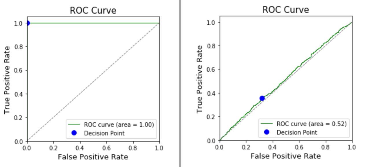
Left: a perfect model; Right: a purely random model
The Blue dot represents the .5 decision boundary that is currently determining the Confusion Matrix.
Changing this is a useful way to adjust the sensitivity of your model when one error type is worse than another. As an example, healthcare is full of these decisions: incorrectly diagnosing cancer is WAY better than incorrectly diagnosing good health. In that case, we’d want a very low decision boundary, which is to say, only predict a negative result (no cancer) if we’re VERY sure about it.
If you chose a different boundary using this same model (ex: .3 instead of .5), the blue dot would move up and to the right along the green curve. The new boundary means we’d capture more True Positives, and also more False Positives. This is also easily visualized as the blue line in the center chart moving to the left until it’s on 0.3: There would be more “green” bins to the right of the boundary, but also more “red” bins.
scikit-learn does not have a built-in way to adjust the decision boundary, but this can be done easily by calling the predict_proba() method on your data, and then manually coding a decision based on the boundary of your choice.
Did this help you understand your model? Could it be improved? Let me know, I’d love to hear from you!
#machine-learning #data-science