This article assumes the reader already knows how to plot geographic data using the Bokeh library in Python. For an excellent and thorough explanation, please see this article written by Colin Patrick Reid.
Your data is processed and you’ve successfully adapted Colin’s code to create your own beautiful visualization in Bokeh, but you want to convey more information than is possible with a static image. You’re in the right place!
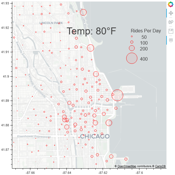
Initial Setup
We will start with this already processed data that combines bike rental data with historic daily average Chicago temperatures and the code below:
from bokeh.plotting import figure, show
	from bokeh.tile_providers import get_provider, Vendors
	import pandas as pd
	from bokeh.models import ColumnDataSource, HoverTool
	from bokeh.models import Label

	path = 'C:\\Map'
	df = pd.read_csv('https://raw.githubusercontent.com/mthomp12/Animated_Bike_Graph/master/bike_data.csv')

	df['circle_sizes'] = df['avg_trip_count'] / df['avg_trip_count'].max() * 40
	temps = df['temp'].unique().tolist()

	#only load in data for first temperature
	df = df[df['temp']==df['temp'].max()]

	source = ColumnDataSource(data=dict(
	                        x=list(df['coords_x']),
	                        y=list(df['coords_y']),
	                        ridership=list(df['avg_trip_count']),
	                        sizes=list(df['circle_sizes']),
	                        stationname=list(df['station_name'])))

	hover = HoverTool(tooltips=[
	    ("station", "@stationname"),
	    ("ridership","@ridership")

	])

	p = figure(x_range=(-9759380, -9749918), y_range=(5140778, 5150200),
	           x_axis_type="mercator", y_axis_type="mercator", tools=['pan',hover, 'wheel_zoom', 'save'])

	p.add_tile(get_provider(Vendors.CARTODBPOSITRON))

	p.circle(x = 'x',
	         y = 'y',
	         source=source,
	         size='sizes',
	        line_color="#FF0000",
	         fill_color="#FF0000",
	         fill_alpha=0.05
	        )

	#Legend
	rides = [50, 100, 200, 400]
	circles = [x / df['avg_trip_count'].max() * 40 for x in rides]
	x_coords = [-9752040] * 4
	y_coords = [5148472, 5148124, 5147752, 5147133]
	p.circle(x = x_coords, y = y_coords, size=circles, line_color="#FF0000", fill_color="#FF0000", fill_alpha=0.05)
	p.add_layout(Label(x = -9752100, y=5148672, text='Rides Per Day'))

	for x,y,text in zip(x_coords, y_coords, rides):
	    p.add_layout(Label(x = x+(500 if text!=50 else 595), y=y-200, text=str(text)))

	loc =  (-9756040, 5148472)
	mytext = Label(x=loc[0], y=loc[1], text='Temp: 80\N{DEGREE SIGN}F', text_font_size='25pt')
	p.add_layout(mytext)
	#end legend

	show(p)
#data-visualization #python #data-science #bokeh
1.70 GEEK