In this short tutorial, I’ll show you how to create a beautiful subscribe component in Gatsby, and connect it to the HubSpot CRM via their API.
If you’re not familiar with Gatsby yet, please take a few minutes to read my previous article.
To make this easier to follow, I’ll show you first the markup, then we’ll do the styling, and in the end we’ll implement the HubSpot integration.
Let’s start!
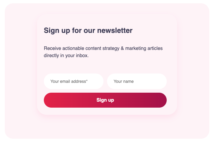
Create the React subscribe component in Gatsby
For the component above, I’ll use the following structure:
- A wrapper to serve as a container for the inner components, and to control the alignment of the subscribe form
- A title component
- A text component
- A form component for the two input fields and the button
I will therefore need separate files for each of these components. So in your project folder, create for each component a new file called “ComponentName.js.”
I’ll start with the title and text components:
// File Title.js

import React from "react";
import styled from "styled-components";
const StyledH3 = styled.h3`
  font-size: 1.5rem;
  line-height: 2rem;
  font-weight: 600;
  color: #3F3D56;
  display: block;
  margin: ${(props) =>
    props.isCentered ? `1rem auto` : `1rem 0`};
`;
export const Heading = ({ ...props }) => {
  return (
    <StyledH3 isCentered={props.isCentered}>
       {props.heading}
    </StyledH3>
   );
};
In the file Text.js, add the following code:
// File Text.js

import React from "react";
import styled from "styled-components";
const StyledTextMedium = styled.p`
  font: inherit;
  font-size: 1rem;
  line-height: 1.25rem;
  margin-bottom: 1rem;
  color: #3F3D56;
`;
export const TextMedium = ({ textMedium }) => (
  <StyledTextMedium>{textMedium}</StyledTextMedium>
);
Next, create a new file called Column.js and add the following component:
import React from "react";
import styled from "styled-components";

export const Column = styled.div`
  display: flex;
  flex-flow: column wrap;
  justify-content: ${props => (props.isCentered? `center` : `flex-start`)};
  align-items: ${props => (props.isCentered? `center` : `flex-start`)};
  align-content: stretch;
  flex-basis: 1;
  margin: 2vw;
  padding: 2vw;
  border-radius: 2rem;
${props => (props.isFloating?
    `transition: all .3s cubic-bezier(.165,.84,.44,1);

      &:hover {
        transform:  translateY(-0.5rem);
        box-shadow: 0 9px 21px 0 ${colors.colorContentLight};
      }
    ` : ` `)};
  }
`
const StyledColumn100 = styled(Column)`
  width: calc(100% - 4rem);
  flex-basis: 1;
  margin-bottom: 1.25rem;
`;

export const Column100 = ({ children, ...props }) => (
  <StyledColumn100
    isFloating={props.isFloating}
    isCentered={props.isCentered}
  >
    {children}
  </StyledColumn100>
);
Now we can define the skeleton of the Subscribe component by assembling the ones above and adding the missing parts.
In your components folder, create a new sub-folder to hold the component, and add two files: Subscribe.js for the markup, and style.js for the styling.
#gatsbyjs #react #front-end-development #forms #programming