A Simple React Modal with Hook Based API
react-simple-hook-modal
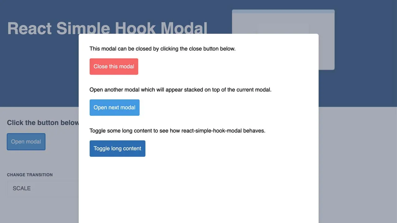
Need a simple modal that just works? react-simple-hook-modal is just that!
Installation
Simply install the package from npm and you’re good to go!
npm install react-simple-hook-modal

or

yarn add react-simple-hook-modal
Usage
React
react-simple-hook-modal has a super simple API and utilises React hooks.
- Simply wrap your app in
<ModalProvider/> - Add instances of
<Modal/>wherever you want to display a modal- This will not render anything to the DOM here
- Modals are rendered after allthe children in side
<ModalProvider/>
- Use the
useModalhook to control your modal’s state - Use the
ModalTransitionenum to optionally set the transition animation- Currently there are 3 to select from, or choose
NONEto disable the transitions
- Currently there are 3 to select from, or choose
import {
  ModalProvider,
  Modal,
  useModal,
  ModalTransition,
} from 'react-simple-hook-modal';

const MyComponent = () => {
  const { isModalOpen, openModal, closeModal } = useModal();

  return (
    <>
      <button onClick={openModal}>Open</button>
      <Modal
        id="any-unique-identifier"
        isOpen={isModalOpen}
        transition={ModalTransition.BOTTOM_UP}
      >
        <button onClick={openModal}>Open</button>
      </Modal>
    </>
  );
};

const App = () => (
  <ModalProvider>
    <MyComponent />
  </ModalProvider>
);
Styles
react-simple-hook-modal uses a subset of tailwindcss under the hood. The tailwind classes used have a prefix of rsm added to avoid potential conflicts with your own styles. You can import the default styles using:
import 'react-simple-hook-modal/dist/styles.css';
ModalProvider also takes optional props:
backdropClassNamewhich can contain one or more classes to append and override the default styles (e.g. Changing the backdrop colour can be done by adding the classbg-blue-800).
Modal also takes optional props:
modalClassNamewhich can contain one or more classes to append to the default modal div.
Example
See the example directory in the repository for a full example including multiple stacked modals.
Demo
Click here to see a live demo of react-simple-hook-modal in action!
Issues
If you have any issues, please create an issue here on GitHub.
Thanks and enjoy!
Download Details:
Author: mbrookson
Demo: https://react-simple-hook-modal.now.sh/
Source Code: http://github.com/mbrookson/react-simple-hook-modal
#react #reactjs #javascript

