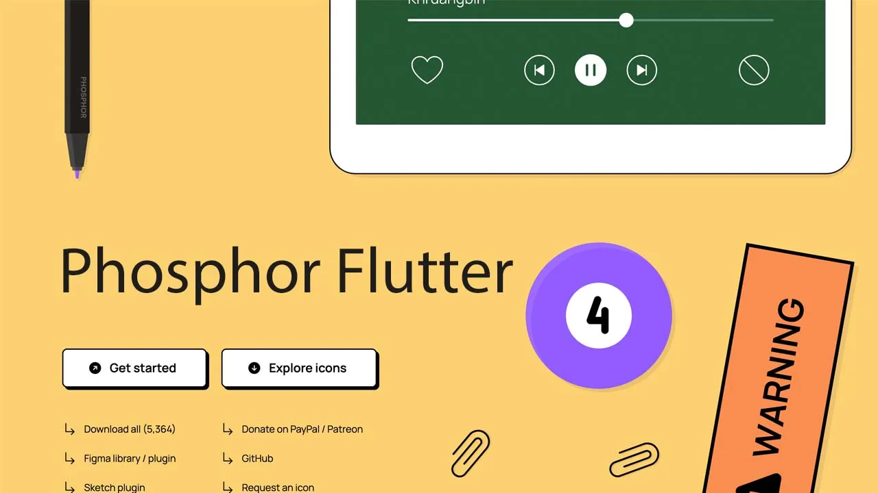
phosphor-flutter .Phosphor is a flexible icon family for interfaces, diagrams, presentations — whatever, really. Explore all our icons at phosphoricons.com.
Installation
Add this to your pubspec.yaml
dependencies:
  phosphor_flutter: ^any
Then run the pub get command
flutter pub get
Usage
Normal Icons
Just add a Icon() widget passing any Phosphor Icon value like any Material Icon
// With Material Icons
Icon(
  Icons.edit, // Pencil icon
),

// With Phosphor Icons
Icon(
  PhosphorIcons.pencil, // Pencil Icon
),
You could use any property of the Icon widget to personalize the icon.
// This will show the [Note Pencil] icon in its fill version
// with a size of 30.0, green color and a semantic label for
// screen readers.
Icon(
  PhosphorIcons.notePencilFill,
  color: Colors.green,
  size: 30.0,
  semanticLabel: 'New Note',
),
All the icons has their thin, light, regular, bold and fill versions.
[WIP] Duotone Icons
The Duotone icons are still a work in progress
Example App
You could see all the icons within the example app.
Installing
- Download the APK from releases page and install in your device
From source code
- Clone the repo
- Open directory example cd example
- Run flutter flutter run
Related Projects
- phosphor-home ▲ Phosphor homepage and general info
- phosphor-react ▲ Phosphor icon component library for React
- phosphor-vue ▲ Phosphor icon component library for Vue
- phosphor-icons ▲ Phosphor icons for Vanilla JS
- phosphor-figma ▲ Phosphor icons Figma plugin
- phosphor-sketch ▲ Phosphor icons Sketch plugin
Use this package as a library
Depend on it
Run this command:
With Flutter:
$ flutter pub add phosphor_flutterThis will add a line like this to your package's pubspec.yaml (and run an implicit dart pub get):
dependencies:
  phosphor_flutter: ^1.3.1
Alternatively, your editor might support flutter pub get. Check the docs for your editor to learn more.
Import it
Now in your Dart code, you can use:
import 'package:phosphor_flutter/phosphor_flutter.dart';import 'package:example/constants/all_icons.dart';
import 'package:flutter/material.dart';
import 'package:phosphor_flutter/phosphor_flutter.dart';
void main() {
runApp(MyApp());
}
class MyApp extends StatelessWidget {
@override
Widget build(BuildContext context) {
return MaterialApp(
title: 'Flutter Demo',
theme: ThemeData(
primarySwatch: Colors.blue,
visualDensity: VisualDensity.adaptivePlatformDensity,
),
home: IconsCatalog(),
);
}
}
class IconsCatalog extends StatefulWidget {
IconsCatalog({Key key}) : super(key: key);
@override
_IconsCatalogState createState() => _IconsCatalogState();
}
class _IconsCatalogState extends State<IconsCatalog> {
dynamic _icons;
List<String> _iconsNames;
String _title = 'Icons Catalog - Regular';
@override
void initState() {
_icons = AllIcons.regularIcons.values.toList();
_iconsNames = AllIcons.regularIcons.keys.toList();
super.initState();
}
@override
Widget build(BuildContext context) {
return Scaffold(
appBar: AppBar(
title: Text(_title),
leading: Padding(
padding: const EdgeInsets.all(8.0),
child: Container(
decoration: BoxDecoration(
image: DecorationImage(
image: AssetImage(
'assets/images/phosphor-mark-tight-yellow.png',
),
fit: BoxFit.fill,
),
),
),
),
centerTitle: true,
backgroundColor: Color(0xff35313d),
actions: [
PopupMenuButton<String>(
tooltip: 'Style',
icon: Icon(PhosphorIcons.pencilLine),
itemBuilder: (context) {
return {
'Thin',
'Light',
'Regular',
'Bold',
'Fill',
}.map((style) {
var icon;
switch (style) {
case 'Regular':
icon = PhosphorIcons.pencilLine;
break;
case 'Bold':
icon = PhosphorIcons.pencilLineBold;
break;
case 'Fill':
icon = PhosphorIcons.pencilLineFill;
break;
case 'Light':
icon = PhosphorIcons.pencilLineLight;
break;
case 'Thin':
icon = PhosphorIcons.pencilLineThin;
break;
default:
break;
}
return PopupMenuItem<String>(
child: Row(
children: [
Icon(
icon,
color: Colors.black,
),
SizedBox(
width: 8,
),
Text(style),
],
),
value: style,
);
}).toList();
},
onSelected: (value) {
var icons;
var iconsNames;
switch (value) {
case 'Bold':
icons = AllIcons.boldIcons.values.toList();
iconsNames = AllIcons.boldIcons.keys.toList();
break;
case 'Fill':
icons = AllIcons.fillIcons.values.toList();
iconsNames = AllIcons.fillIcons.keys.toList();
break;
case 'Light':
icons = AllIcons.lightIcons.values.toList();
iconsNames = AllIcons.lightIcons.keys.toList();
break;
case 'Thin':
icons = AllIcons.thinIcons.values.toList();
iconsNames = AllIcons.thinIcons.keys.toList();
break;
case 'Regular':
default:
icons = AllIcons.regularIcons.values.toList();
iconsNames = AllIcons.regularIcons.keys.toList();
break;
}
setState(() {
_icons = icons;
_iconsNames = iconsNames;
_title = 'Icons Catalog - $value';
});
},
),
],
),
body: GridView.builder(
shrinkWrap: true,
primary: true,
gridDelegate: SliverGridDelegateWithFixedCrossAxisCount(
crossAxisCount: 3,
crossAxisSpacing: 0,
mainAxisSpacing: 0,
),
itemCount: _icons.length,
itemBuilder: (context, index) {
return Padding(
padding: const EdgeInsets.all(12.0),
child: Column(
mainAxisAlignment: MainAxisAlignment.center,
children: [
if (_icons is List<PhosphorIconData>)
Icon(
_icons[index],
size: 48,
)
else
_icons[index],
Text(
_iconsNames[index],
textAlign: TextAlign.center,
),
],
),
);
},
),
);
}
}