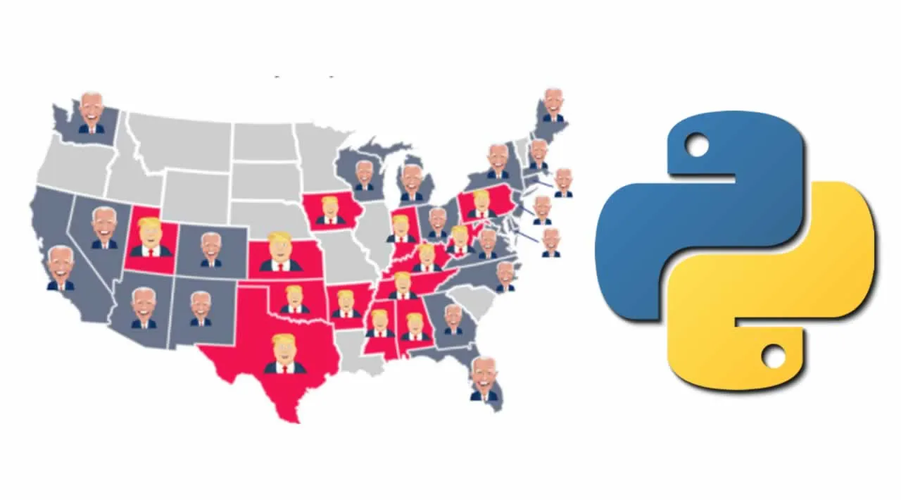
This US election has brought with it high tensions, unfounded fraud allegations and, most importantly, some great visualisations. Well, important to data scientists at least. It seems like you can’t look anywhere without seeing some novel way of presenting election results. So why not add a few more to the mix? In this tutorial, you will learn how to create some of your own visualisations using Python.

Source: Author
You will learn how to create two interactive choropleths of US presidential election results from 1976 to 2016. The first map has a time slider. As you move the slider, the map will change to show the results in each state for a given year. For the second map, every state has been turned into a button. You can click the state to see voting trends through time. We’ll go over the code and you can find the full project on GitHub. You can also download the maps here. You should be able to open and explore them in your browser.

Source: flaticon
Python packages
We will be building the maps using folium. It is a very useful package for creating simple geospatial data visualisations. Along with folium, we will be using a handful of other Python packages. You can import them all with the code below. Make sure you have installed all the packages first.
#Imports
import numpy as np
import pandas as pd
import matplotlib.pyplot as plt, mpld3
%matplotlib inline
import json
import datetime

from shapely.geometry import Polygon, mapping
import geopandas as gpd
import folium
from folium.plugins import TimeSliderChoropleth
#python #us #election #programming
