Native looking typographic styles for React Native
Pixel–perfect, native–looking typographic styles for React Native.
Why
Creating great Text Styles in React Native is not a simple task, it requires a lot of fiddling and handling edge cases.
This library provides a good set of defaults and helpers that cover the majority of the cases you’ll need, make your code much simpler and
Quick start
Add the dependency:
yarn add react-native-typography
Set a style in your component:
import { material } from 'react-native-typography'

<Text style={material.display1}>Hello Typography!</Text>
And it will look like this:

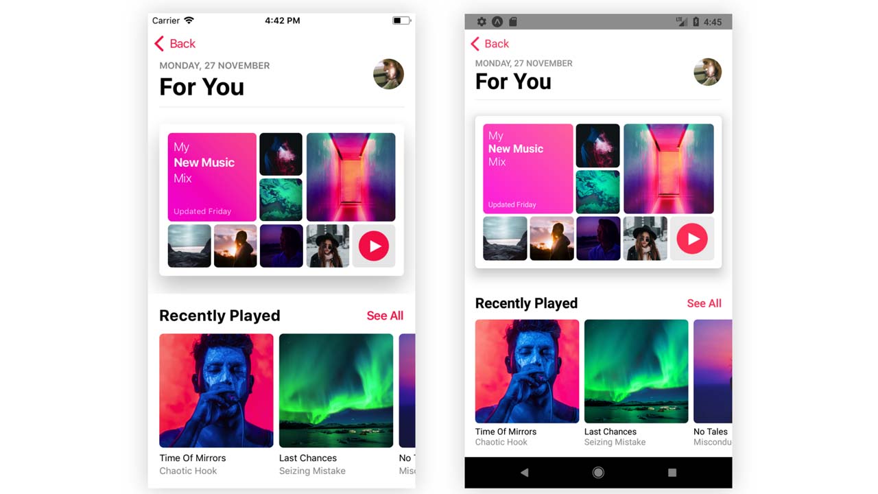
Example app
- You can run the example app via Expo or check the code, all of the screenshots are taken directly from there!
Typography collections
We provide a series of predefined collections for you to start with that match the native design systems for iOS and Android.
You can use them directly wherever you would supply a textStyle.
There’s also the option of extending them to create your own styles.
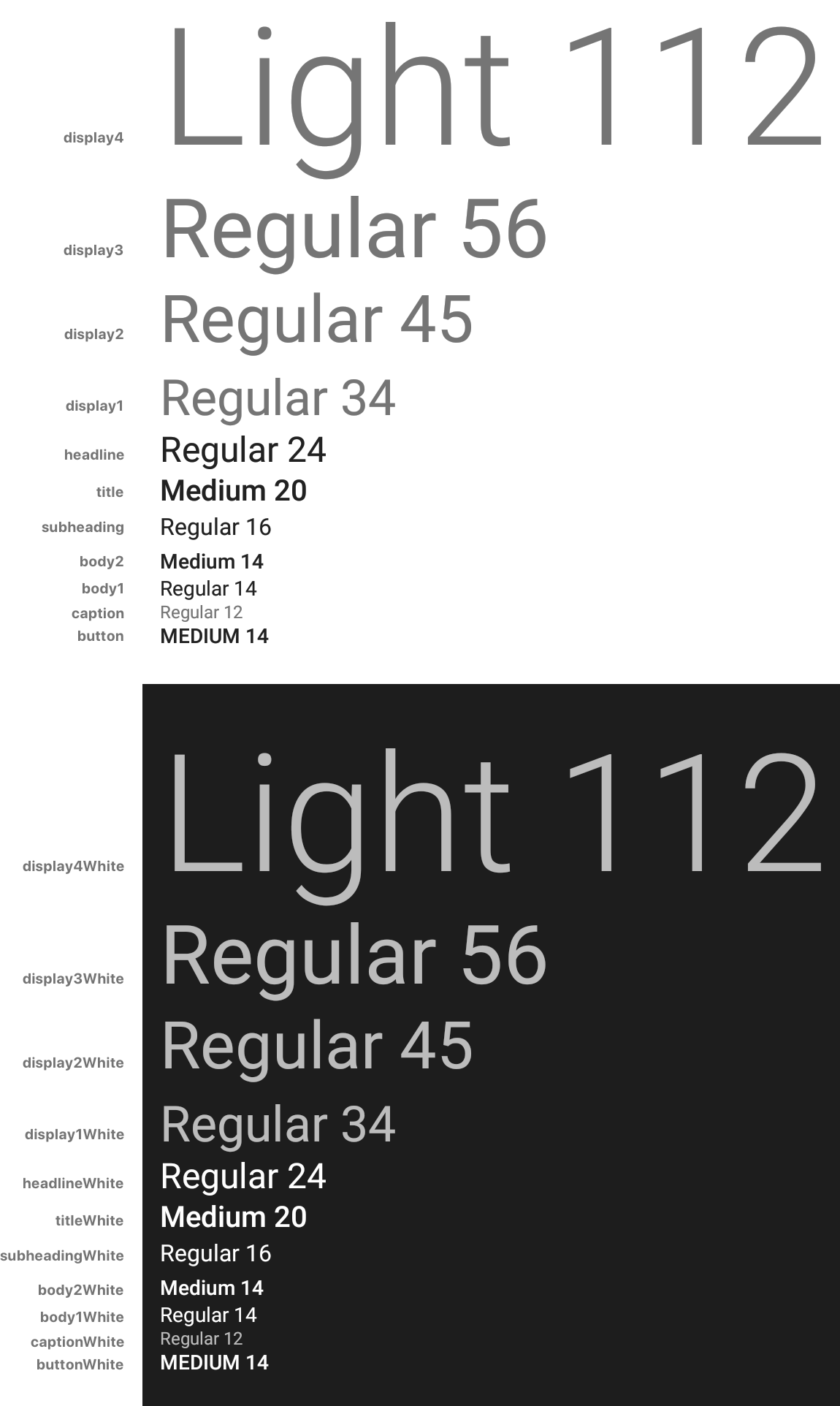
Material Design
Includes all the styles defined in the Material Design Guidelines. Defines size, weight and color.
import { material } from 'react-native-typography'

<Text style={material.display4}>Hello Material!</Text>
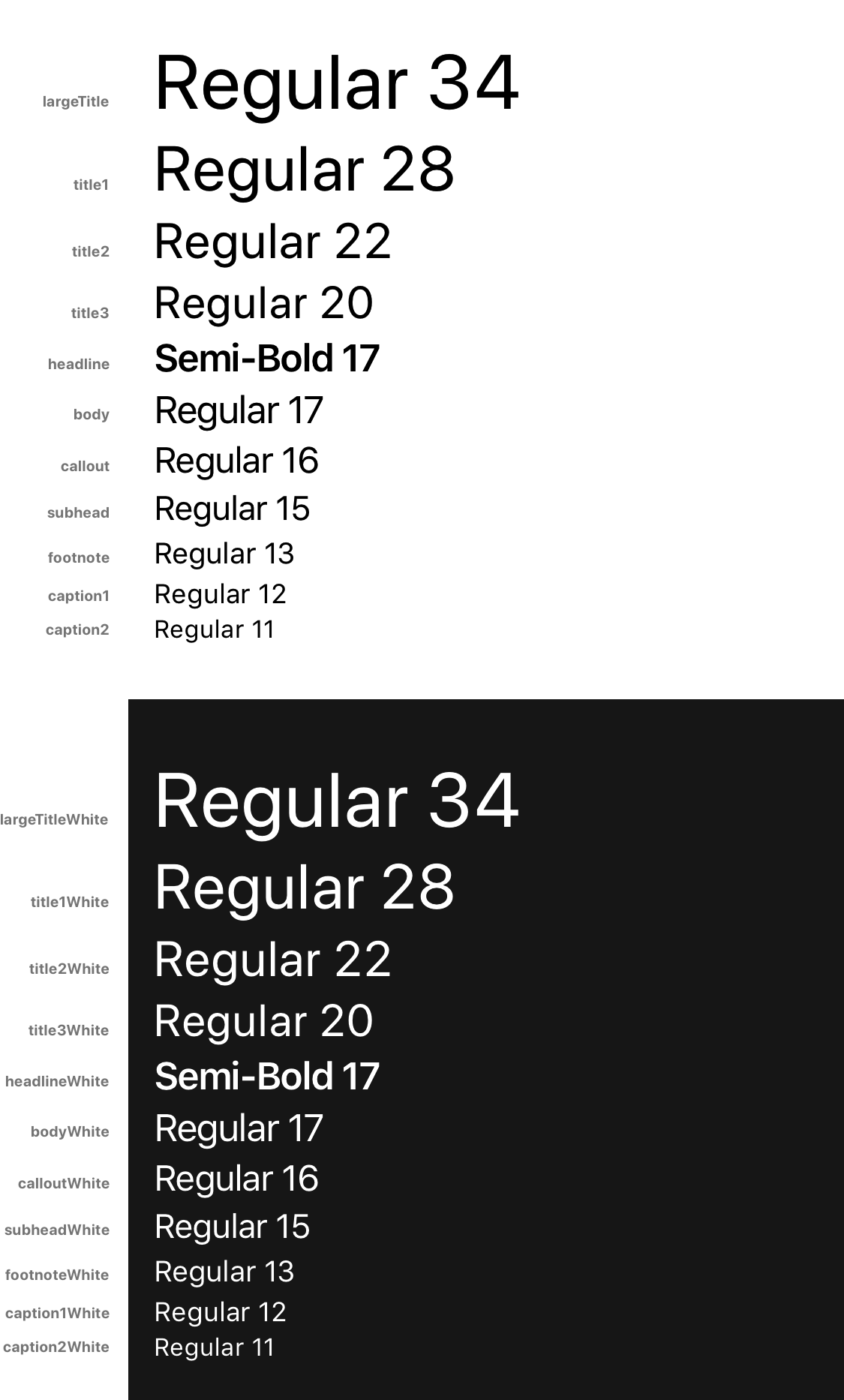
Human Interface Guidelines
Defined in the Human Interface Guidelines. Defines size, weight and color.
import { human } from 'react-native-typography'

<Text style={human.largeTitle}>Hello Human!</Text>
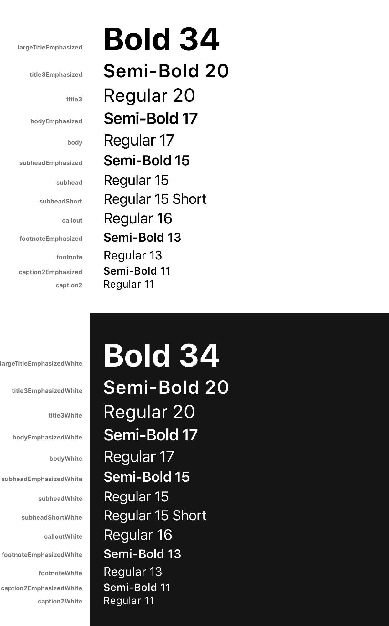
iOSUIKit
Extracted from the official Apple sketch file
These are the text styles that fall under the category of iOS UIKit, and are used to build the UI components of iOS Apps.
They build on top of the Human Interface styles, customizing some properties such as weight or letter spacing.
import { iOSUIKit } from 'react-native-typography'

<Text style={iOSUIKit.largeTitleEmphasized}>Hello iOS UI Kit!</Text>
Customization & Helpers
The collections provide every style in 2 different ways:
- As a StyleSheet, e.g.:
material.title - As a plain object, e.g.:
material.titleObject
The basic way to use them is to set the StyleSheet directly where you would supply a textStyle:
<Text style={material.title}>Title</Text>
To extend the styles, you can spread the object inside your own StyleSheet and override some of its attributes:
const styles = StyleSheet.create({
  yellowTitle: {
    ...material.titleObject,
    color: iOSColors.yellow,
  },
});

<Text style={styles.yellowTitle}>Title</Text>
Another option would be to combine the provided StyleSheet with your own StyleSheet.
const styles = StyleSheet.create({
  yellow: {
    color: iOSColors.yellow,
  },
});

<Text style={[material.title, styles.yellow]}>Title</Text>
Weights
A font weight in React Native is sometimes formed by a pair of a fontFamily and a fontWeight, but not always! It depends on the typeface, sometimes it’s just defined by the fontFamily.
With these helpers, you don’t have to worry about those inconsistencies.
To combine them with a collection style (or your own styles) just spread them, as they are plain objects.
const styles = StyleSheet.create({
  lightTitle: {
    ...material.titleObject,
    ...systemWeights.light,
  },
});

<Text style={styles.lightTitle}>Title</Text>
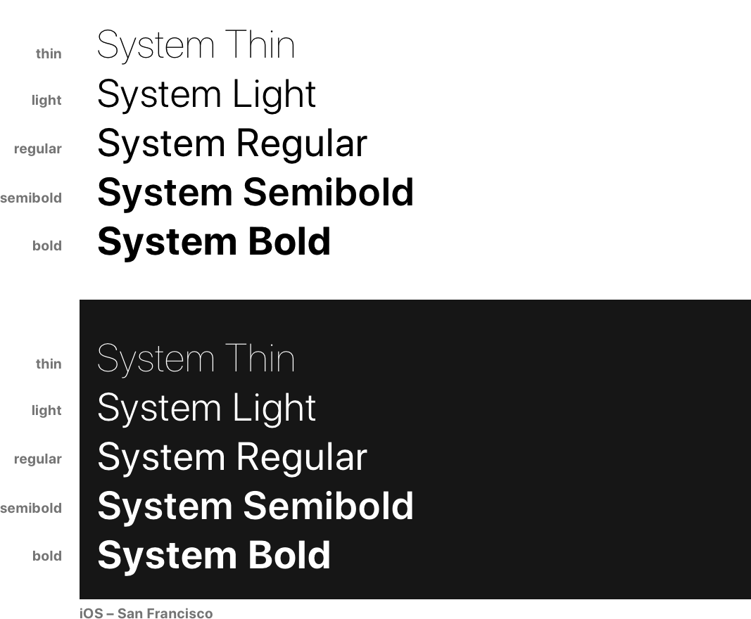
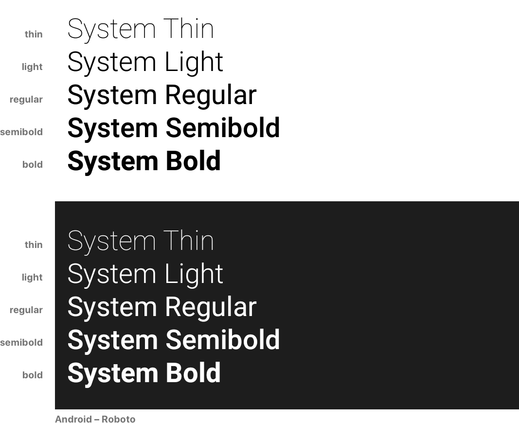
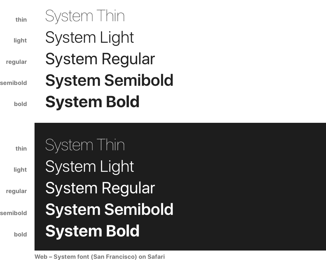
System Weights
import { systemWeights } from 'react-native-typography'
The System weights render visually similar weights of the Native typefaces on each platform. Read more about cross-platform here.
This is the recommended way of customizing your weights unless you really need different visual styles for each platform.
They follow the San Francisco naming convention, as it has more steps, which makes it more future–proof.
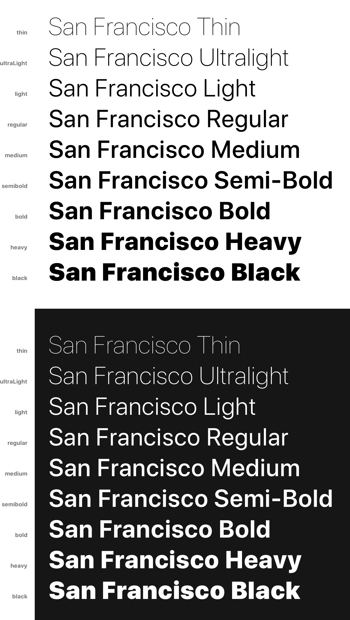
San Francisco Weights
import { sanFranciscoWeights } from 'react-native-typography'
These weights are only intended for iOS, as they directly reference the native San Francisco typeface.
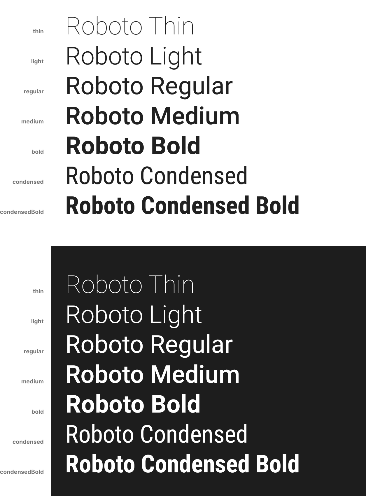
Roboto Weights
import { robotoWeights } from 'react-native-typography'
These weights are only intended for Android, as they directly reference the native Roboto typeface.
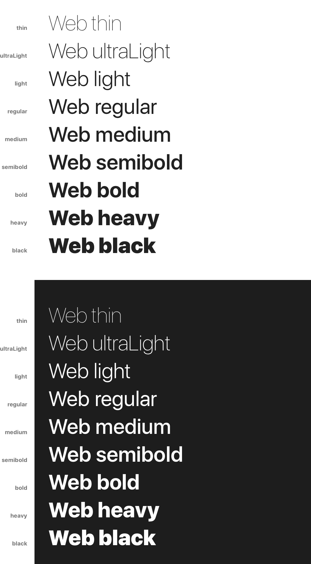
Web Weights
import { webWeights } from 'react-native-typography'
These weights are only intended for the web, and render react-native-web’s system font stack.
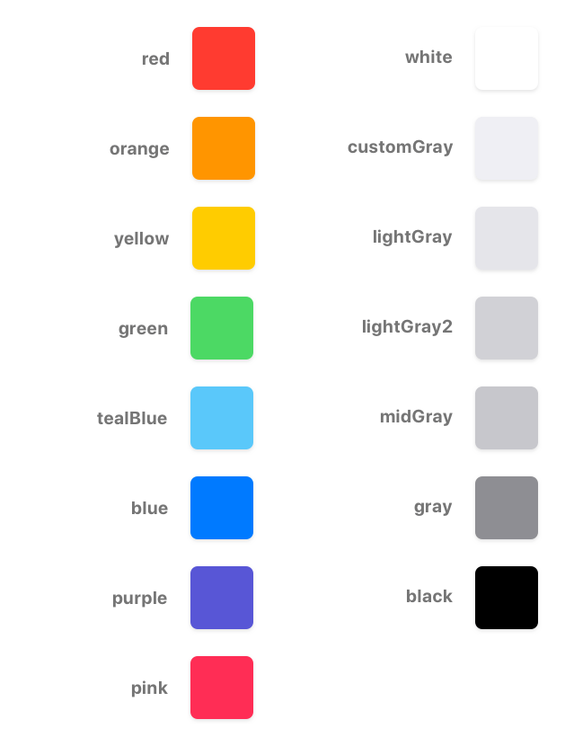
Colors
We also include the default text color hex values for each platform.
iOS
import { iOSColors } from 'react-native-typography'
const styles = StyleSheet.create({
  yellowTitle: {
    ...human.title3Object,
    color: iOSColors.yellow,
  },
});

<Text style={styles.yellowTitle}>Title</Text>
Material
import { materialColors } from 'react-native-typography'
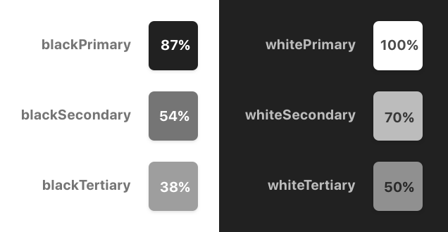
const styles = StyleSheet.create({
  tertiaryTitle: {
    ...material.titleObject,
    color: materialColors.blackTertiary,
  },
});

<Text style={styles.tertiaryTitle}>Title</Text>
Spacing/Kerning
San Francisco
The San Francisco typeface defines its letter spacing via Kerning. This is not compatible with the React Native text style properties, as they take letter-spacing instead.
To perform this conversion on iOS you can use the sanFranciscoSpacing function, which receives the font size and returns the appropriate letter spacing.
This is not needed for the web as the browsers already take care of this.
import { sanFranciscoSpacing } from 'react-native-typography'

const styles = StyleSheet.create({
  customSize: {
    ..., // some other props
    fontSize: 34,
    letterSpacing: sanFranciscoSpacing(34),
  },
});
This is already taken care of on the collections, but if you want to define your own sizes you can adjust the spacing on iOS with this helper.
Dense and tall scripts
Dense and tall scripts are fully supported, check the full documentation here!
import { materialDense } from 'react-native-typography'

<Text style={materialDense.display4}>你好排版!</Text>

Cross-platform
Quoting the Material Design Platform recommendations
The default typeface on iOS is San Francisco. Using this typeface is the easiest way to implement accessibility features like Dynamic Type. Using other typefaces may require making adjustments to get the same accessibility features.
This is the approach that we like to follow, and all the collections exported from this library render nicely on all the supported platforms with their respective native typefaces, for that we use the System weight helper.
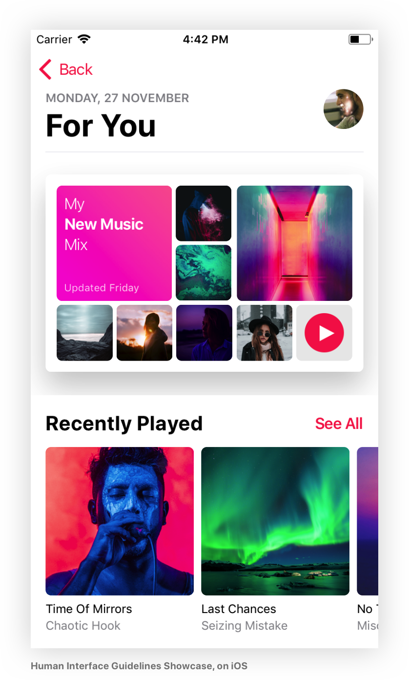
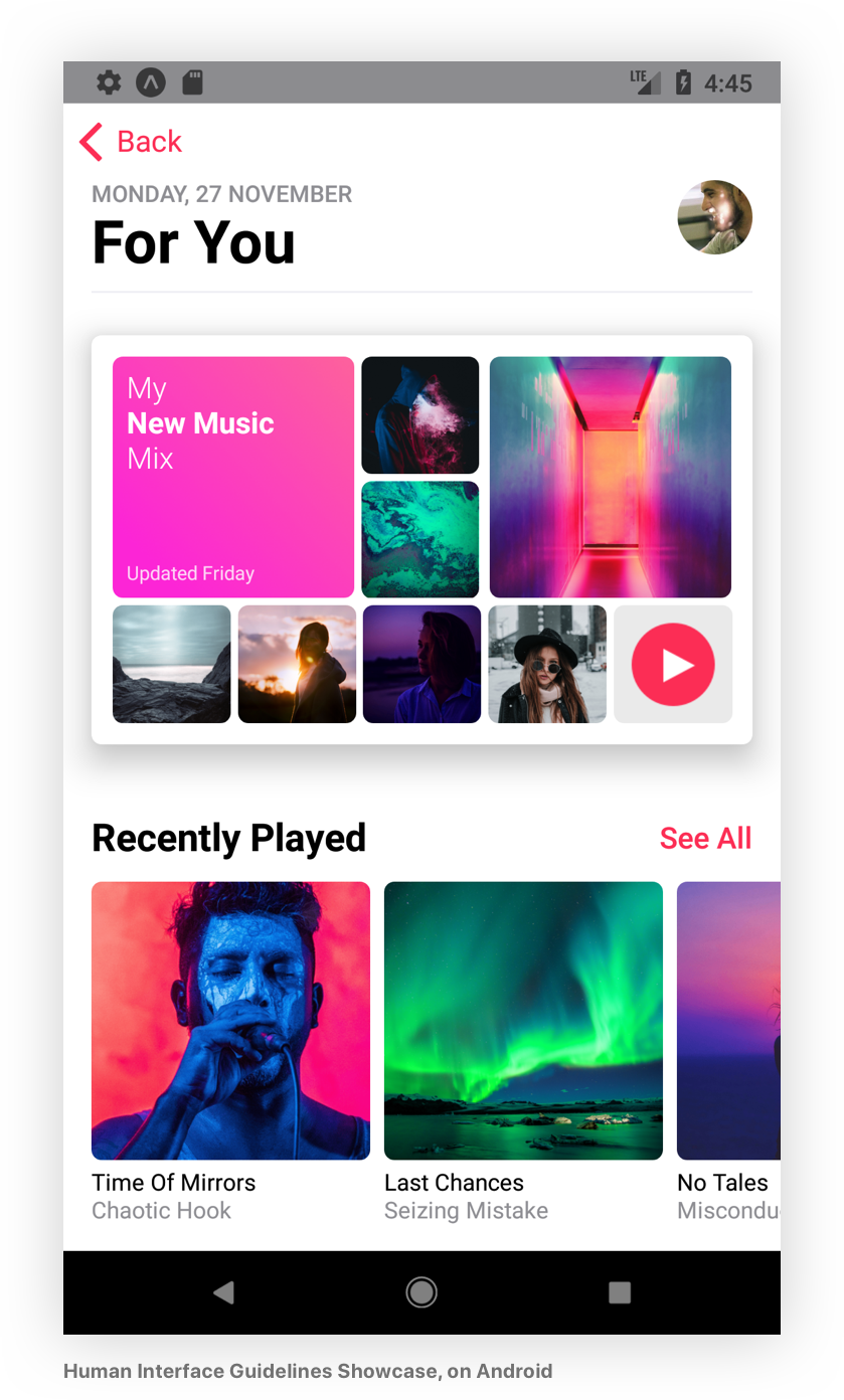
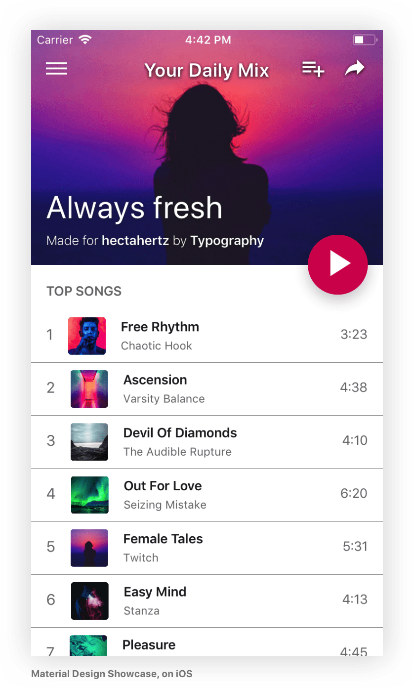
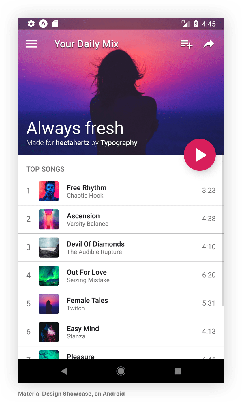
You can check the code of the example app where we included a couple of screens that follow this philosophy, this is how they render on iOS and Android:
Download Details:
Author: hectahertz
GitHub: https://github.com/hectahertz/react-native-typography
#react-native #programming