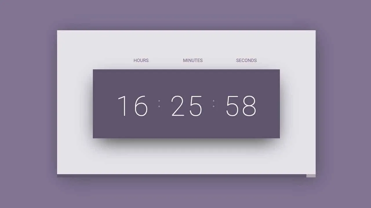
Stylish Digital Clock With Progress Bar
A modern looking digital clock with an animated progress bar counting down to the next minute.
How to use it:
- Code the HTML for the digital clock.
<div class="clock-container">
  <div class="hours">
    <span>Hours</span>
    <p id='hour'> 00 </p>
  </div>
  <div class="colon"></div>
  <div class="minutes">
    <span>Minutes</span>
    <p id='minute'> 00 </p>
  </div>
  <div class="colon"></div>
  <div class="seconds">
    <span>Seconds</span>
    <p id='second'> 00 </p>
  </div>
</div>
- Add a progress bar to the bottom of the digital clock.
<div class="bottom">
  <div class="progress-bar" id="progress"></div>
</div>
3. The necessary styles for the digital clock.
:root {
  --purple-dark: #5F546E;
  --purple-light: #827593;
  --gray-light: #E5E3E8;
  --gray-dark: #A5A2A9;
  --light: #fcf8fb;
  --transition: all 150ms cubic-bezier(.46, 1.13, .67, .87);
}

.clock-container {
  width: 405px;
  height: 150px;
  display: flex;
  align-items: center;
  justify-content: space-between;
  padding: 35px 50px;
  background-color: var(--purple-dark);
  position: absolute;
  left: 50%;
  top: 50%;
  transform: translate(-50%, -50%);
  box-shadow: 0 15px 40px -10px rgba(0, 0, 0, 0.825);
}

.clock-container span {
  text-transform: uppercase;
  font-size: 10px;
  text-align: right;
  display: block;
}

.clock-container p {
  font-size: 60px;
  color: var(--light);
  font-weight: 100;
}

.clock-container p:first-letter {
  letter-spacing: 5px;
}

.colon {
  --size: 3px;
  width: var(--size);
  height: 15px;
  position: relative;
  margin-left: 10px;
  margin-right: 10px;
}

.colon::before {
  content: '';
  width: 100%;
  height: var(--size);
  background-color: #9892a3;
  position: absolute;
  top: 0;
  left: 0;
  border-radius: 50%;
}

.colon::after {
  content: '';
  width: 100%;
  height: var(--size);
  background-color: #9892a3;
  position: absolute;
  bottom: 0;
  left: 0;
  border-radius: 50%;
}
- The CSS styles for the progress bar.
.progress-bar {
  width: 240px;
  height: 100%;
  position: absolute;
  left: 0;
  bottom: 0;
  z-index: 9;
  background-color: #615770;
  transition: var(--transition);
}
- The main JavaScript to enable the digital clock.
const hour = document.getElementById('hour');
const minute = document.getElementById('minute');
const second = document.getElementById('second');
const progress = document.getElementById('progress');
function showCurrentTime() {
    let date = new Date();
    let hr = date.getHours();
    let min = date.getMinutes();
    let sec = date.getSeconds();
    hour.textContent = hr;
    minute.textContent = min;
    second.textContent = sec;
    progress.style.width = (sec / 60) * 100 + '%'
}
setInterval(showCurrentTime, 1000)
Download Details:
Author: asiefmahir
Source Code: https://github.com/asiefmahir/Digital-Clock-with-Dynamic-Progress-Bar
#javascript #css
3.35 GEEK